Wikivoyage/Logo 2013/Submissions

Thank you for submitting and discussing logos for the 2013 Wikivoyage logo selection process. The initial submission period is now closed. The entries have been aggregated at Wikivoyage/Logo/2013/R1/Gallery. The time between now and 00:01 UTC, 26 July 2013 is set aside for the community to review those submissions for obvious copyright issues or other concerns that would prevent their being eligible for selection. Please place any comments at Talk:Wikivoyage/Logo/2013/R1/Gallery.
If you have submitted multiple different proposals, please remember that voters have only 3 votes in total and adding lots of similar proposals may diminish the chances. Further information available at the talk page. If you wish to withdraw one or more logos you have yourself submitted, please note your request at Talk:Wikivoyage/Logo/2013/R1/Gallery. |
- The following discussion is closed. Please do not modify it.
This page is for organizing and discussing initial submissions for the 2013 Wikivoyage logo selection. Please see that page for general information, including rules of participation.
All contributors are invited to submit potential logos for review, in accordance with the rules set out there and at Wikivoyage/Logo 2013. Please note that entering a submission constitutes your acceptance of those rules. Logo submissions should be listed and discussed here.
If you submit multiple different proposals, please indicate clearly which should be taken before the submission period ends. Otherwise all will be added to the voting-gallery; but remember that voters have only 3 votes in total and adding lots of similar proposals may diminish the chances (this depends on how the voters behave, of course). Further information available at the talk page.
Recommendations
editThe ideal new Wikivoyage logo should be distinct from other logos, including other Wikimedia logos! It should be something unique, with a clear relation to Wikivoyage's mission and culture. Creativity is also highly encouraged with the choice of color scheme. Keep in mind that this is a multilingual project with a strong international slant (as it is a travel site!) so consider whether a logo would be appropriate for all language versions, including those with non-Latin scripts.
Option 1 - Flowing Arrow
editI'm not quite sure how to format this, so please feel free to move it around a bit.
-
 Proposed logo
 -
 Proposed combination mark
This suggested logo has popped up previously, but here it is again; an abstract arrow. You can read a full (slightly tongue-in-cheek) explanation of my reasoning and see some implementations, other language versions and the SVG version that Peter very kindly made, here. Comments welcome! --Nick talk 18:38, 10 July 2013 (UTC)
Discussion
editIt's a really nice logo and I really like the baby blue colour, but in order to make it more in line with other Wikimedia projects, I would very much prefer for it to use the same colours as other recent logos, e.g. the Wikimedia logo itself. I also agree with the comments previously voiced that making it somewhat more like both a compass needle and the Eiffel Tower at the same time would make it even more powerful. PrinceGloria (talk) 19:36, 10 July 2013 (UTC)
- Thanks for your comments! :) I confess, I deliberately didn't use the WMF colours as none of the other 'consumer' (that's not the right word) wikis use the WMF colour scheme; if anything, blue is the more popular colour, but I used a brighter shade to differentiate ourselves; I know that some members of the community were not particularly keen on sharing colours with the 'meta' projects.
- I would personally be a little wary of making it look more like the Eiffel Tower and would prefer to keep the shape a little ambiguous in that respect: we don't want to be confused for the Parisian tourist board! I think it's nice that different people might see different things in the shape, but all of them are hopefully travel related. --Nick talk 19:54, 10 July 2013 (UTC)
- I agree. PrinceGloria, I really have no idea what you're thinking with your suggestions. Look at the logos for Wikipedia, Wikibooks, Wiktionary, and Wikiversity. The only thing they have in common is that none of them use the colors of the Wikimedia logo! So why should Wikivoyage? I'm also not sure what's 'powerful' about looking like the Eiffel Tower; can you elaborate? LtPowers (talk) 23:17, 10 July 2013 (UTC)
- I would personally be a little wary of making it look more like the Eiffel Tower and would prefer to keep the shape a little ambiguous in that respect: we don't want to be confused for the Parisian tourist board! I think it's nice that different people might see different things in the shape, but all of them are hopefully travel related. --Nick talk 19:54, 10 July 2013 (UTC)
- I basically like this logo: color, form and thought. It works okay at a small size, but even in the gallery above I think that the version without the wordmark is too simple. I'm not sure what I'd add, but I think it needs something so that it's not a flat circle in bigger versions. Perhaps add continents to the globe (almost invisible at small sizes) or gradients. //Shell 09:27, 11 July 2013 (UTC)
- Too simple?? I'm guessing you don't have formal training in graphic design. One of the most basic precepts of design (graphic or otherwise) is simplicity. LtPowers (talk) 18:13, 11 July 2013 (UTC)
- I basically like this logo: color, form and thought. It works okay at a small size, but even in the gallery above I think that the version without the wordmark is too simple. I'm not sure what I'd add, but I think it needs something so that it's not a flat circle in bigger versions. Perhaps add continents to the globe (almost invisible at small sizes) or gradients. //Shell 09:27, 11 July 2013 (UTC)
- Thanks for your thoughts //Shell! As LtPowers has said, I've aimed to keep this logo as simple as possible in order to make it more powerful: a strong, confident symbol for the project. Some of the most iconic logos in the world are composed of very simple elements. Hopefully this simplicity means that it works well at many different sizes, which is important for a project like this. --Nick talk 19:16, 11 July 2013 (UTC)
- I appreciate the goal to have a simple logo. I still feel that it needs something at the size it will be viewed in most (135px wide with wordmark) and I think this logo is simpler than all other Wikimedia projects'. The Github mark (the silhouette) is one that I like very much - it's simple, yet contains details that make it interesting when large. Nick, what would you consider an iconic logo? //Shell 21:58, 11 July 2013 (UTC)
- Thanks for responding. I'd like to think it's about as simple as the Wikiquote and Wikidata emblems; not unusually so. The GitHub mark, whilst nice, doesn't seem that much more 'exciting' than the logo above and a cat-octopus hybrid might look a tad incongruous here. Personally, I like 'clean' design and that's what I've aimed for here. The use of a world map would, I fear, make the logo seem a little 'fussy', whilst gradients are rather losing their vogue at present - a flat icon can be timeless. Some examples of simple logos that I would deem iconic are: the Apple logo, the Pepsi logo, the Mercedes-Benz logo, the Bell System logo, the British Rail logo and the Nike tick. I believe that simplicity makes a mark memorable and stronger. In reality, it's likely that the image in the top left corner is the largest resolution at which this logo is going to be seen. As such, it is important that it can be reproduced faithfully at a range of much smaller sizes too - if small details were introduced, there's a chance that they could be compressed and unpleasant or lost entirely. --Nick talk 22:24, 11 July 2013 (UTC)
- I'll quote myself just once more as a general statement of support for this submission: it suggests a V for Voyage, flight, a compass, and even a bit of ocean waves, while being very simple and sleek. Nick also explained that part of his inspiration was the three step evolution of our project and community, first developing at Wikitravel, then migrating (i.e., fleeing) to Wikivoyage, and then happily under the umbrella of the WMF. Thinking of the icon this way, the "arrow" acts not just as a compass needle, but also a pointer forward, which could be read as an allegory for our project's forward movement, or movement in general (and travel is, of course, movement). To respond to PrinceGloria and //Shell above, I think that simplicity and distinctiveness should actually be primary goals in creating a new logo, as these qualities imbue the icon with more power and "catchiness."
- I certainly hope to have the opportunity to look at more submissions, which hopefully are on the way, but I can say I'd be happy with this one, as long as there are no legal obstacles this time. Great start to the submissions! --Peter Talk 20:26, 11 July 2013 (UTC)
- I think that this is an attractive logo, I just feel that if I saw it without the Wikivoyage label at the bottom, I wouldn't know it was for Wikivoyage. Qardys (talk) 01:19, 12 July 2013 (UTC)
- (edit conflict) Thanks for your comments! Personally, I don't think a logo should be used to try and convey exactly what a project's about; after a while, any logo would become synonymous with WV simply by association. Other WMF logos seem to have been made with this in mind as well: either that or Wikipedia's developing spherical jigsaw puzzles and Wikisource is building an iceberg!
- A logo should, to my mind, convey the abstract spirit of a project , rather than explicitly say what an organisation stands for. If you look at the selection of logos I posted for //Shell above, none of them states what the company in question does, but gives a pictorial representation which might be used to identify them. That's what I've tried to create for Wikivoyage here. --Nick talk 07:38, 12 July 2013 (UTC)
- I would reuse the font of the current logo. This would be a link with the current one. --Andyrom75 (talk) 07:20, 12 July 2013 (UTC)
- I think that this is an attractive logo, I just feel that if I saw it without the Wikivoyage label at the bottom, I wouldn't know it was for Wikivoyage. Qardys (talk) 01:19, 12 July 2013 (UTC)
- In the context of travelling, the logo reminds me more of a paper plane than an arrow. And a paper plane looks strange in contrast to the massive pollution real aircrafts cause. --Nicor (talk) 09:03, 12 July 2013 (UTC)
- @Nick: Wikiquote & Wikidata have simpler shapes, but the colors make them more interesting to me. My point about the Github silhouette was that the details in the tail make it interesting at high resolutions while lo-res versions are still clear. Those logos are rarely seen as simplified as the versions you linked: Apple's is often on their products, where the logo has some gloss/texture; Pepsi's on a can, also giving gloss; Mercedes-Benz's is chromium-plated and 3D; Nike's on shoes/clothes which give texture/interesting background (don't know about Bell/British Rail). Contrast that with the Wikivoyage logo, which will be viewed on a gray background with no more gloss/texture than it has from the start. I guess Microsoft's new icons are a better comparison, but even those are usually in a smaller format. //Shell 12:06, 12 July 2013 (UTC)
- I created a version showing my idea. To me the continents make it interesting at hi-res, while not taking anything away from the lo-res situations. (I'm not sure whether I can submit this version for Wikivoyage since it uses continents from here) //Shell 14:20, 12 July 2013 (UTC)
- Shell, your version with continent outlines in the blue disk is very interesting. I'd like to see what that looks like with the continents more prominently displayed, maybe like, or not like, a blue marble. --Rogerhc (talk) 19:11, 12 July 2013 (UTC)
- Rogerhc, I don't understand what you mean by "blue marble". Would you like a version with a darker outline? //Shell 19:40, 12 July 2013 (UTC)
- Thanks for posting that //Shell! I'm still not completely sure of it myself: I still like plain and simple, but I do appreciate your input and it is interesting to see! :) Personally, I like bold, simple shapes and 'unfussy' design, even though it's not necessarily everyone's cup of tea. I'd like the logo to look the same at all resolutions if possible, but your opinion is just as valid as mine! --Nick talk 12:50, 13 July 2013 (UTC)
- Under the terms of this process Shell can submit a derivative with those changes as an alternative proposal. · · · Peter (Southwood) (talk): 14:17, 13 July 2013 (UTC)
- Absolutely! Shell's more than welcome to submit a derivative; the above is just my personal opinion. --Nick talk 14:35, 13 July 2013 (UTC)
- Quite so, and for what it's worth I prefer the plainer version. If I can make a suggestion, the curves of the gaps in the arrow could be harmonized a little. This one is on my short list at present. · · · Peter (Southwood) (talk): 15:08, 13 July 2013 (UTC)
- Thanks! I am, unfortunately, away from my computer for the next couple of weeks (doing this on my phone), but once I get back, I'll try and smooth out some of the logo's rougher edges. :) --Nick talk 15:50, 13 July 2013 (UTC)
- Quite so, and for what it's worth I prefer the plainer version. If I can make a suggestion, the curves of the gaps in the arrow could be harmonized a little. This one is on my short list at present. · · · Peter (Southwood) (talk): 15:08, 13 July 2013 (UTC)
- Absolutely! Shell's more than welcome to submit a derivative; the above is just my personal opinion. --Nick talk 14:35, 13 July 2013 (UTC)
- Under the terms of this process Shell can submit a derivative with those changes as an alternative proposal. · · · Peter (Southwood) (talk): 14:17, 13 July 2013 (UTC)
- Thanks for posting that //Shell! I'm still not completely sure of it myself: I still like plain and simple, but I do appreciate your input and it is interesting to see! :) Personally, I like bold, simple shapes and 'unfussy' design, even though it's not necessarily everyone's cup of tea. I'd like the logo to look the same at all resolutions if possible, but your opinion is just as valid as mine! --Nick talk 12:50, 13 July 2013 (UTC)
- Rogerhc, I don't understand what you mean by "blue marble". Would you like a version with a darker outline? //Shell 19:40, 12 July 2013 (UTC)
- Shell, your version with continent outlines in the blue disk is very interesting. I'd like to see what that looks like with the continents more prominently displayed, maybe like, or not like, a blue marble. --Rogerhc (talk) 19:11, 12 July 2013 (UTC)
- I created a version showing my idea. To me the continents make it interesting at hi-res, while not taking anything away from the lo-res situations. (I'm not sure whether I can submit this version for Wikivoyage since it uses continents from here) //Shell 14:20, 12 July 2013 (UTC)
- Peter, Am I though? My version is a combination of Nick's idea and a map. The map wasn't submitted here, so I don't believe I can submit my version without creating my own map or replacing it with one in the public domain. I'm not skilled enough to create my own, so either somebody else can create one or we'll have to find a better one. //Shell 18:28, 13 July 2013 (UTC)
- The shape of the earth is not copyrighted, just find a PD source and use that. You will want an svg anyway. cheers, · · · Peter (Southwood) (talk): 18:47, 13 July 2013 (UTC)
- Shell I like your improvement on Nick's idea. Give yourself a try and submit it. --Andyrom75 (talk) 23:06, 13 July 2013 (UTC)
- I find Shell's version unnecessairly complicated. The power of Nick's version is its simplicity, relative uniqueness (it SUGGESTS a few things, but isn't one, so it has potential to become a universally recognized logo) and scalability (it works just as well as a thumb icon as it does as fullsize logo). PrinceGloria (talk) 19:18, 14 July 2013 (UTC)
- I made one more version, this time with a split color. I don't intend to submit either variant now, since that would just confuse voters, but some people like the idea, I'll do something for the final round if this submission makes it that far. //Shell 20:11, 17 July 2013 (UTC)
- I find Shell's version unnecessairly complicated. The power of Nick's version is its simplicity, relative uniqueness (it SUGGESTS a few things, but isn't one, so it has potential to become a universally recognized logo) and scalability (it works just as well as a thumb icon as it does as fullsize logo). PrinceGloria (talk) 19:18, 14 July 2013 (UTC)
- Shell I like your improvement on Nick's idea. Give yourself a try and submit it. --Andyrom75 (talk) 23:06, 13 July 2013 (UTC)
- The shape of the earth is not copyrighted, just find a PD source and use that. You will want an svg anyway. cheers, · · · Peter (Southwood) (talk): 18:47, 13 July 2013 (UTC)
- Peter, Am I though? My version is a combination of Nick's idea and a map. The map wasn't submitted here, so I don't believe I can submit my version without creating my own map or replacing it with one in the public domain. I'm not skilled enough to create my own, so either somebody else can create one or we'll have to find a better one. //Shell 18:28, 13 July 2013 (UTC)
- I don't like it. The arrow is broken for my POV. Though, I think, it is possible to see something like sail in this arrow and to rework/redraw logo in this direction. Alex Spade (talk) 12:03, 16 July 2013 (UTC)
- It's a little reminiscent to the OpenOffice.org ball logo, but probably not too much. Superm401 | Talk 23:47, 16 July 2013 (UTC)
Can we see what it would look like as a favicon? Maybe even with an actual page having it as a favicon, not just a small picture? Thanks! 81.14.76.167 00:05, 19 July 2013 (UTC)
- Thanks very much for your comments everyone! I'm afraid I'm currently away from my PC and only have my phone, so I'm not going to be able to create a page to use the favicon; however, as soon as I return, I'd be happy to create one for you. Any more comments or questions would be welcome! --Nick talk 02:27, 19 July 2013 (UTC)
![]()
- If you'd like to see it at small icon size, here's a 16 x 16 px version, though when I return to my computer I'll probably tweak it a little. --Nick talk 20:58, 21 July 2013 (UTC)
- Good idea; making the white parts a bit thicker/bigger may make for a clearer favicon at the expense of mathematical precision in relation to the normal-sized icon. I'd be okay with that. I still think this is an outstanding logo. LtPowers (talk) 19:32, 23 July 2013 (UTC)
- Thanks very much LtPowers! I really appreciate your comments! As soon as I get access to a computer I'll get working on an improved and slightly edited favicon. --Nick talk 19:56, 23 July 2013 (UTC)
- Good idea; making the white parts a bit thicker/bigger may make for a clearer favicon at the expense of mathematical precision in relation to the normal-sized icon. I'd be okay with that. I still think this is an outstanding logo. LtPowers (talk) 19:32, 23 July 2013 (UTC)
- If you'd like to see it at small icon size, here's a 16 x 16 px version, though when I return to my computer I'll probably tweak it a little. --Nick talk 20:58, 21 July 2013 (UTC)
Option 2 - Info
editDiscussion
editThe "information desk" icon is used widely. The extra markers around the circle look like old maps. --NaBUru38 (talk) 22:11, 11 July 2013 (UTC)
- Have you tried to reuse the current color palette? This maybe could fit better with some color choices that has been done in the past for maps & articles. --Andyrom75 (talk) 07:21, 12 July 2013 (UTC)
I believe that this submission breaks the rules: it was created by User:Digr while submitted by User:NaBUru38. //Shell 07:31, 13 July 2013 (UTC)
I think Option 11 - Compass Rose with Globe is better. Alex Spade (talk) 12:04, 16 July 2013 (UTC)
Option 3 - Plane 2
edit
Discussion
editIt looks like both an open book and an airplane. It invites to open, read and write. --NaBUru38 (talk) 22:12, 11 July 2013 (UTC)
- I feel like you don't need to confine yourself to the Wikimedia shades. Was that your natural choice for both logos, or was it to reinforce brand identity? Qardys (talk) 23:22, 11 July 2013 (UTC)
- I remember this logo, and I really like the excellet idea that is behind it. Maybe (although I don't know how) I would graphically enforce these two concept, because without the explanation they don't arrive immediately. Once you know them, are clear, and are clear as well after several observation, but in my opinion a logo should be clear since the first glance. --Andyrom75 (talk) 07:26, 12 July 2013 (UTC)
- To me it looks like neither an open book nor an aircraft, even when I am told it should. I can see the attempted resemblance, but for me it just does not gel. That which makes it look somewhat like an aircraft, detracts from the book-like aspects and vice versa. · · · Peter (Southwood) (talk): 09:46, 12 July 2013 (UTC)
- I can see the book but no aircraft. Wikivoyage is not Wikibooks, I dont want confusion. --Pyfisch (talk) 10:09, 12 July 2013 (UTC)
- To me it looks like neither an open book nor an aircraft, even when I am told it should. I can see the attempted resemblance, but for me it just does not gel. That which makes it look somewhat like an aircraft, detracts from the book-like aspects and vice versa. · · · Peter (Southwood) (talk): 09:46, 12 July 2013 (UTC)
- Great idea. It was my first choice during the first round already and it will be my first choice. Really like it. -- DerFussi 13:16, 12 July 2013 (UTC)
I believe that this submission breaks the rules: it was created by User:Isatis78 while submitted by User:NaBUru38. //Shell 07:31, 13 July 2013 (UTC)
- User:Isatis78 has now confirmed agreement to the logo submission rules here. Restoring this one to discussion. I've retitled this section according to the creator's original title. --Maggie Dennis (WMF) (talk) 20:53, 14 July 2013 (UTC)
- I don't see plane, I see only book. Good idea, bad realization. Alex Spade (talk) 12:06, 16 July 2013 (UTC)
- I like it very much. --Pequod76(talk) 08:36, 23 July 2013 (UTC)
- Very Wiki! I vastly prefer this to something 100% travel-generic, even if it might be slightly difficult to interpret for some viewers. Pratyeka (talk) 03:53, 24 July 2013 (UTC)
- Interesting, I see a bird into it, and it reminds me of the logo of Partij voor de Vrijheid (Freedom Party), a controversial Dutch political party. Obviously, it doesn't have my preference. Effeietsanders (talk) 11:05, 24 July 2013 (UTC)
Option 4 - Next Generation Compass
edit
Discussion
editA simple compass logo. Known as Rbrown on Wikivoyage. Youtube2000 (talk) 05:11, 12 July 2013 (UTC)
- Does not show up very well · · · Peter (Southwood) (talk): 09:42, 12 July 2013 (UTC)
- I cropped the image - now it's better visible. //Shell 09:22, 13 July 2013 (UTC)
- Thank you Shell. Youtube2000 (talk) 05:27, 14 July 2013 (UTC)
- I cropped the image - now it's better visible. //Shell 09:22, 13 July 2013 (UTC)
- Too simple. Unoriginal. Сolour match "salad green on white background" is unacceptable. Alex Spade (talk) 12:12, 16 July 2013 (UTC)
- It's a good idea but not very original, unfortunately. A lot of GPS and navigation devices and software use compass icons. Even web browsers. --TMg 23:22, 16 July 2013 (UTC)
Option 5 - The Old Logo
editDiscussion
editThe logo is well known. And the WMF is already the owner. --RolandUnger (talk) 13:43, 12 July 2013 (UTC)
I believe that this submission breaks the rules: it was created by Hansm and Unger , but submitted by RolandUnger 81.178.165.241 12:09, 13 July 2013 (UTC)
- I think submission of the old logo is not a problem. It is created by Hansm and Unger, but the ownership is transferred to the wikivoyage community and if one of them wants it back that should not be made a big problem. Carsrac (talk) 17:18, 14 July 2013 (UTC)
I think that might be stretching the point a bit, only one person can make an edit, or do you dispute that Unger and RolandUnger are the same person?· · · Peter (Southwood) (talk): 12:58, 13 July 2013 (UTC)
- Unger and RolandUnger are the same person. I had to change my name because of SUL. --RolandUnger (talk) 18:32, 14 July 2013 (UTC)
The weak point of this logo and other logo's based on the latin script that wikivoyage is project that is not a latin only project. The Greek and the Hebrew language version would look very funny with this logo. Carsrac (talk) 17:26, 14 July 2013 (UTC)
Virgin Airlines? Alex Spade (talk) 12:20, 16 July 2013 (UTC)
Option 6 - Plane(t)
edit-
 6a. Two planets
 -
 6b. One planet
 -
 6c. One planet blue
 -
 6d. Two planets alt
-
 6e. Plane and planet
 -
 6f. Looping plane and planet
 -
 6g. Plane in front of planet
 -
 6h. Looping plane
 -
 6i. Flying plane
This is my submission for the Wikivoyage logo selection process. The logo emphasizes that Wikivoyage is a free, world-wide travel guide. The airplane represents travel, and considering we're a world-wide travel guide, it is flying around the Earth. The "free" bit is only slightly hinted at, as the airplane is flying in a half-moon-shaped reversed "c", a nod to our copyleft license.
The logo shows not one, but two planets, because we are a project that's a coming together of two worlds (two communities), now operating together in union. That's why the airplane is flying around both planets as if they are one.
I chose orange because it's a unique color not used by any other WMF project. But we can make dozens of variations with many different colors. I'm open for your comments and suggestions. Globe-trotter (talk) 16:07, 12 July 2013 (UTC)
Discussion
editSeems like the Death Star with a bigger hole. ~~EBE123~~ talkContribs 21:58, 12 July 2013 (UTC)
Very nice but it remind me the expedia logo. Inkey (talk) 11:52, 13 July 2013 (UTC)
- I think it's a bit similar to Expedia's previous logo, but not their current. //Shell 18:37, 13 July 2013 (UTC)
- Generally speaking I like the logo, but it doesn't makes me think to a WMF site (I don't recall at all the expedia's one, so I'm not referring to it). Try to use all the RGB colors just to see what comes out. --Andyrom75 (talk) 21:57, 13 July 2013 (UTC)
I'm a fan of this, but would like to see some other versions. The planets to me look more like an eyeball, which probably isn't what you're going for. I don't think the swooshed plane, which I like a lot, is too similar to the old Expedia logo (the whole look is very different). --Peter Talk 19:19, 16 July 2013 (UTC)
- The two planets were no success, so I uploaded a couple of different versions of the logo. I thought it might be an idea to make the plane loop, as it makes the logo a bit more playful and shows how fun travel is (just like how making loops is fun). Globe-trotter (talk) 03:41, 17 July 2013 (UTC)
Upturned planes on 6f and 6h lead to aerophobia. Alex Spade (talk) 15:58, 17 July 2013 (UTC)
- I don't like most of the alternative versions you made, but 6i is excellent, I like a lot! PS The above Alex comment cracks me up! :-D --Andyrom75 (talk) 17:21, 17 July 2013 (UTC)
These are by far my favorite logos here (enough to make me make my first edit on Meta). Simple but interesting, and (my pet peeve) actually has good typography. 6d, 6g, and 6i are my favorites.—Kelvinsong (talk) 18:20, 17 July 2013 (UTC)
- These are very intriguing. I really like 6i out of all the options, but would also like to see a version of 6e flipped vertically (so the plane flies forward to the right) and changed to blue. JamesA (talk) 07:53, 18 July 2013 (UTC)
- This is generally a very nice logo, very dynamic. Only it took me while to recognize the plane in it - it looked like a lizard to me at first :) And also I am not sure if a plane represents traveling very well, it doesn't work with me, anyway. --Danapit (talk) 13:56, 18 July 2013 (UTC)
- You improved it greatly in the later variations, namely 6i. The use of orange and bright blue is really dynamic. On that note, is it possible for us to see 6i in orange? Nick1372 (talk) 15:03, 18 July 2013 (UTC)
- What about some more color? Doc James (talk · contribs · email) 11:32, 19 July 2013 (UTC)
- You improved it greatly in the later variations, namely 6i. The use of orange and bright blue is really dynamic. On that note, is it possible for us to see 6i in orange? Nick1372 (talk) 15:03, 18 July 2013 (UTC)
- This is generally a very nice logo, very dynamic. Only it took me while to recognize the plane in it - it looked like a lizard to me at first :) And also I am not sure if a plane represents traveling very well, it doesn't work with me, anyway. --Danapit (talk) 13:56, 18 July 2013 (UTC)
- 6i is my favorite, and it seems like a few others agree with me. The problem with it is when it needs to be shown without the word Wikivoyage & small, i.e. a favicon. Frankly, it would make a terrible favicon. I like it a lot, though. Does anyone know if it's possible to have a slightly different favicon than full logo? 6g would make a nice favicon. Nick1372 (talk) 06:25, 21 July 2013 (UTC)
- No reason we can't, I guess. Wikipedia does it. JamesA (talk) 12:01, 21 July 2013 (UTC)
- 6i is my favorite, and it seems like a few others agree with me. The problem with it is when it needs to be shown without the word Wikivoyage & small, i.e. a favicon. Frankly, it would make a terrible favicon. I like it a lot, though. Does anyone know if it's possible to have a slightly different favicon than full logo? 6g would make a nice favicon. Nick1372 (talk) 06:25, 21 July 2013 (UTC)
Great concept, but the plane instantly reminded me of a shark swimming in the water...?
Globe-trotter, this is a really good idea for a logo and I love the way it evolved to become more simple and poignant. If you already don't, I believe you could make a living as a graphic / corporate identity designer. This is one of my favourites, because it looks really cool and professional, which will make people think Wikivoyage is not just a bunch of nutters writing crazy stuff about things they didn't like in Tblisi.
Just a few remarks:
- I am a strong believer in using Wikimedia standard colours for newer projects to make clear their association with the foundation. Worked for Species, Commons and Data, should work well for us, because the point we want to make online is that while there are other wiki-based travel sites online, we are the only one thus far that is genuinely free in every sense and run according to all of the Wikimedia principles. Would you be able to try to use the RGB colours on a version of the logo?
- There might be some concern about suggesting travel = airplanes, which is somehow something we might want to avoid, being very inclusive of all modes and types of travelling and throwing cliches outta the door. That said, I am a quite cliche traveller myself and I like planes :)
- I agree I get this "I've seen that somewhere" vibe and you may want to check out whether there aren't some similar logos around
- I absolutely believe the only way the plane should be pointing is upwards and it should point in one direction both in the general logo and favicon, although I am all for having a different favicon than general logo, or even many versions of it, as long as they are instantly recognizable.
- As a sidenote, we may want to later reuse the "inverted plane" logo (6h I believe) or the "plane + mountains" logo from another proposal whenever we would be looking for a logo for WikiAirCrashInvestigation
All from me now. Over and out, PrinceGloria (talk) 15:11, 22 July 2013 (UTC)
- I agree with PrinceGloria that using RGB could highlight the sense of a greated community that we are a part of. Maybe "wiki" and "voyage" could be colored with the two missing color, because I think that the remaining part of the logo is nice as it is. --Andyrom75 (talk) 20:04, 22 July 2013 (UTC)
- What complete rubbish. Wikipedia doesn't use RGB. Wiktionary doesn't use it. Wikibooks doesn't use it. Wikinews doesn't use it. Wikisource doesn't use it. Are they any less a part of the community? Wikipedia especially? Why would we want to look like a meta project? LtPowers (talk) 19:34, 23 July 2013 (UTC)
- Thank you for your kind words. The aformentioned projects, perhaps excluding Wikisource, are very popular in their own right. You can see that the less popular / newer the project, the more coherent its logo is with the general theme (e.g. same shades of blue, similar style). We would want to look "like a meta project" for the reasons mentioned above - for people to immediately know and become familiar with the idea, that this IS a Wikimedia project, not just yet another travel site / wiki. PrinceGloria (talk) 05:33, 24 July 2013 (UTC)
- When I first saw Wikivoyage’s current logo I thought "this looks like an internal project of the Wikimedia foundation, probably something boring and not something useful like Wikipedia or Wiktionary" (of course I was wrong, but having those colors on the logo was very confusing) Fractal (talk) 15:47, 24 July 2013 (UTC)
- Thank you for your kind words. The aformentioned projects, perhaps excluding Wikisource, are very popular in their own right. You can see that the less popular / newer the project, the more coherent its logo is with the general theme (e.g. same shades of blue, similar style). We would want to look "like a meta project" for the reasons mentioned above - for people to immediately know and become familiar with the idea, that this IS a Wikimedia project, not just yet another travel site / wiki. PrinceGloria (talk) 05:33, 24 July 2013 (UTC)
- What complete rubbish. Wikipedia doesn't use RGB. Wiktionary doesn't use it. Wikibooks doesn't use it. Wikinews doesn't use it. Wikisource doesn't use it. Are they any less a part of the community? Wikipedia especially? Why would we want to look like a meta project? LtPowers (talk) 19:34, 23 July 2013 (UTC)
Option 7 - WV logo
edit-

-
 Modified to show components more clearly
 -
 Grey scale rendering
 -
 Line art rendering
20 px rendering ![]() , 16 px rendering
, 16 px rendering ![]() , 10 px rendering
, 10 px rendering ![]()
Colour could be anything that provides sufficient contrast. I like blue or green, which are particularly suitable for the negative version (white on colour or transparent on colour). · · · Peter (Southwood) (talk): 18:57, 12 July 2013 (UTC)
Text is optional and can be chosen by the language version. · · · Peter (Southwood) (talk): 10:48, 14 July 2013 (UTC)
- Reminds me of the Northrop Grumman B-2 Spirit bomber too much. odder (talk) 20:52, 12 July 2013 (UTC)
- It actually does look a little like that, but I don't think many people would think of that when looking at this logo. It's a bit like the w:Rorschach test. ;) If other people agree with that, though, we might want to use a different logo. PiRSquared17 (talk) 01:49, 13 July 2013 (UTC)
- This invites a cease and desist from the VVV. PrinceGloria (talk) 10:45, 13 July 2013 (UTC)
- Their logo is three separate V's in a triangle in a square, this is a combined W and V in a circle. colours are different and can be changed, negative version differs even more. · · · Peter (Southwood) (talk): 08:09, 14 July 2013 (UTC)
- It is also different from the Mitsubishi logo, the Volkswagen logo, the Triangle health and fitness logo, Wyoming valley anthracite logo, West Virginia University logo, VVV Venlo logo and Anton May logo. · · · Peter (Southwood) (talk): 11:13, 14 July 2013 (UTC)
- Modified logo it's definitely better that the original one. --Andyrom75 (talk) 13:02, 14 July 2013 (UTC)
- I thought the simplicity of the original would be better, but now I have got used to the change I think you are right. · · · Peter (Southwood) (talk): 13:38, 14 July 2013 (UTC)
- Our current logo is far more different from the WTC logo than this one from VVV, but it still invited a cease and desist. And the new version bears even more similarity to the VVV, which was born basically of the same idea. I like it, but I would be mega-cautious. PrinceGloria (talk) 19:13, 14 July 2013 (UTC)
- Legal department will make that decision I guess. · · · Peter (Southwood) (talk): 08:48, 16 July 2013 (UTC)
- Our current logo is far more different from the WTC logo than this one from VVV, but it still invited a cease and desist. And the new version bears even more similarity to the VVV, which was born basically of the same idea. I like it, but I would be mega-cautious. PrinceGloria (talk) 19:13, 14 July 2013 (UTC)
- I thought the simplicity of the original would be better, but now I have got used to the change I think you are right. · · · Peter (Southwood) (talk): 13:38, 14 July 2013 (UTC)
- Modified logo it's definitely better that the original one. --Andyrom75 (talk) 13:02, 14 July 2013 (UTC)
- It is also different from the Mitsubishi logo, the Volkswagen logo, the Triangle health and fitness logo, Wyoming valley anthracite logo, West Virginia University logo, VVV Venlo logo and Anton May logo. · · · Peter (Southwood) (talk): 11:13, 14 July 2013 (UTC)
- Their logo is three separate V's in a triangle in a square, this is a combined W and V in a circle. colours are different and can be changed, negative version differs even more. · · · Peter (Southwood) (talk): 08:09, 14 July 2013 (UTC)
- This invites a cease and desist from the VVV. PrinceGloria (talk) 10:45, 13 July 2013 (UTC)
- It actually does look a little like that, but I don't think many people would think of that when looking at this logo. It's a bit like the w:Rorschach test. ;) If other people agree with that, though, we might want to use a different logo. PiRSquared17 (talk) 01:49, 13 July 2013 (UTC)
I don't like it. Very similar with WC room signs or with Volkswagen logo. Alex Spade (talk) 12:53, 16 July 2013 (UTC)
- Which WC room signs would that be? · · · Peter (Southwood) (talk): 14:14, 16 July 2013 (UTC)
- I didn't say, that it was WC room sign. It has similar design for me, I see in proposed logo smth like this with two changes - C on right transformed to V on bottom, or woman triangle (like here) without head. Alex Spade (talk) 16:10, 17 July 2013 (UTC)
- I looked at your examples, and I don't think there is any similarity at all. · · · Peter (Southwood) (talk): 20:15, 23 July 2013 (UTC)
- I didn't say, that it was WC room sign. It has similar design for me, I see in proposed logo smth like this with two changes - C on right transformed to V on bottom, or woman triangle (like here) without head. Alex Spade (talk) 16:10, 17 July 2013 (UTC)
While I like this, particularly some ideas that come to mind using the very simple and stylized version in the first thumb, I share some worries about its similarity to other logos. In particular, the versions with the components separated a bit remind a lot of the Volkswagen logo. The other issue is that the WV initials don't apply to many language versions both currently and going forward. But if the logo is sufficiently abstracted, that is less of an issue. --Peter Talk 19:23, 16 July 2013 (UTC)
- My imediate first thought when seeing this one was the sports teams of the University of West Virginia. I'm not versed enough in the law to know if it is close enough to matter, though. (Aside, the problems mentioned elsewhere about this one not being logical for non-latin script projects holds here.) Courcelles 03:00, 17 July 2013 (UTC)
- I also had the VVV association immediately. --Danapit (talk) 13:57, 18 July 2013 (UTC)
Option 8 - Get Escape
edit-
 8.1 - The original version
 -

8.2 - Alternative version with square shape Request withdrawn
 -

8.3 - Alternative version with spherical shape Request withdrawn -
 8.4 - Alternative version with a bullseye and 2 arrows around a circle
 -

8.5 - Alternative version (as #4, but with a full circle) Request withdrawn -
 8.6 - Alternative version (as #5, but with a generic map of the Earth)
 -

8.7 - Alternative version with a spiral of arrows and an empty circle Request withdrawn -

8.8 - Alternative version (as #7, but with a full circle) Request withdrawn -

8.9 - Alternative version (as #8, but with a map of the Earth) Request withdrawn


16px rendering: ![]()
![]()
![]()
![]()
![]()
![]()
![]()
![]()
![]()
20px rendering: ![]()
![]()
![]()
![]()
![]()
![]()
![]()
![]()
![]()
24px rendering: ![]()
![]()
![]()
![]()
![]()
![]()
![]()
![]()
![]()
I imagine a logo that could resemble a bird while spreading its wings and the letters "W" and "V" (WikiVoyage's initials) at the same time. Moreover, my logo wants to express the escape from the ordinary when someone takes a journey and the possibility to choose different paths before starting a trip. --Mess (talk) 22:55, 12 July 2013 (UTC)
- I like it! Uses the WMF color, it has the circle that recall the world and other WM logos, furthermore there's a W that recall Wikivoyage. Try to make some other alternatives on these theme, don't stop on the first idea. --Andyrom75 (talk) 23:09, 13 July 2013 (UTC)
- Hey, did you maybe read on my mind? I just thought about a squared version this night (dropping out the circle), et voila... --Mess (talk) 08:20, 14 July 2013 (UTC)
- Between the two I'd like more the first one. In the second one there's "too many angles", with the round shape is more balanced (IMO). --Andyrom75 (talk) 13:01, 14 July 2013 (UTC)
- Nice the third version, but I would let let arrows goes out from the circle to give more the idea of freedom. --Andyrom75 (talk) 12:40, 16 July 2013 (UTC)
- Between the two I'd like more the first one. In the second one there's "too many angles", with the round shape is more balanced (IMO). --Andyrom75 (talk) 13:01, 14 July 2013 (UTC)
- Hey, did you maybe read on my mind? I just thought about a squared version this night (dropping out the circle), et voila... --Mess (talk) 08:20, 14 July 2013 (UTC)
I don't see any geo-themed object in this logo. Alex Spade (talk) 12:45, 16 July 2013 (UTC)
- As with some other submissions, I think it would be nice to get away from the WV initials, since they do not apply to many language versions--especially those with non-Latin writing systems. That said, this could be the starting point for a more abstracted logo focusing on the elements of motion out of one's individual sphere and into the rest of the globe. --Peter Talk 19:25, 16 July 2013 (UTC)
- @Andyrom: OK, I'll try to adjust it as soon as possible. @Alex Spade: and so? What's the point? I don't think that some other submissions are strictly connected to a geographic theme. @Peter: it's true, you can see a WV at first sight on my logo, but I took into account non-Latin languages and I render it in order to be seen also as a route that from a starting point could take different directions around the world. Anyway, I thank you and Alex for the critics, maybe I'll create another version that might fit your needs. --Mess (talk) 21:59, 16 July 2013 (UTC)
- Here we go! I revised the third version and added a new one featuring 2 arrows that look like the Tropics (in addition, it recalls in a different key WikiVoyage's current logo). --Mess (talk) 08:16, 17 July 2013 (UTC)
- Update: I build another one from #4, using 4 crossed arrows that form a Union Jack-like pattern. --Mess (talk) 12:38, 17 July 2013 (UTC)
- Yes, some other submissions are not connected to a geographic theme too. But they have another, more important weaknesses (important for my POV). Alex Spade (talk) 16:14, 17 July 2013 (UTC)
- #5 looks like a Xmas ball :-D ... but I think you can work on #4 Try to put a "world" on that sphere, and maybe try also to work on those arrows giving them a more "mellifluous" style. --Andyrom75 (talk) 17:08, 17 July 2013 (UTC)
- Do you mean an abstract representation of Earth? I don't know, it would be too... messy! XD I just want to use simple geometric shapes in order to have a clean work (above all on small icons). --Mess (talk) 20:02, 17 July 2013 (UTC)
- Not abstract, just the map. Regarding the small icon, if you are not too convinced, it could be slightly different form the big one, I meant, with just the blue sphere. --Andyrom75 (talk) 20:28, 17 July 2013 (UTC)
- Map as background? Hmmm... It can be interesting solution. Alex Spade (talk) 21:57, 17 July 2013 (UTC)
- OK, as you wish. Here it is the 6th version, with a map of the Earth that I extracted from this (I specified into the file's description that it's a derivative work, but I don't know if there are copyright issues, I don't want to infringe anything). --Mess (talk) 09:23, 18 July 2013 (UTC)
- I don't think that anyone has the copyright on the world! (Just joking :-D .... in any case we can easily find a free globe map) I like a lot how is it coming out, but I would still work on the arrows. Initially I'll keep the two different colors and, like the current one, running into the different rotation direction of the world giving the idea of "roaming around". Secondly I'll change the shape of the arrows with a more gentle shape. --Andyrom75 (talk) 12:52, 18 July 2013 (UTC)
- Believe me, I don't get how much "gentle" would be the arrows for you. Can you give me an example, please? Regarding the colors, I decided to use the dark red to both the arrows because there's already a lot of green for the lands and blue for the water, so I wanted to balance these 3 colors. --Mess (talk) 14:52, 18 July 2013 (UTC)
- Maybe for the color you are right. Being not good at drawing I can't tell you in detail what to do. I've just describe my feeling looking at it. Try to enlarge the top for a better proportion. Then I don't know if shadow/3D effect can help. --Andyrom75 (talk) 16:47, 18 July 2013 (UTC)
- I retouched the arrows. I hope you like them now. --Mess (talk) 08:38, 19 July 2013 (UTC)
- Much more better! What about a third red line in the middle like a spiral? Try several version, like with just one arrow peak, another increasing the dimension from the tail to the head, or other ideas... --Andyrom75 (talk) 14:41, 19 July 2013 (UTC)
- What do you think about a spiral of 4 arrows? I build it with 3 different backgrounds. --Mess (talk) 22:58, 19 July 2013 (UTC)
- Arrows this time are perefect, very nice, but the latest tries gives me the idea of a dangerous typhoon so the willing of stay at home and not to travel :-D Coming back to 8.6, when I've said spiral, I was thinking on an third line parallel to the others two and positioned in between. So the spiral is something that is not over the globe, but it's all around. --Andyrom75 (talk) 08:14, 20 July 2013 (UTC)
- Ah, I understand what you were thinking now. Well, I made a test with this third line, but looking all together it resembles too much either the WTO logo or the Java one (IMHO), so I prefered to give up this solution. Meanwhile, I discarded the versions #4 and #5 and I redrew them as different variations of #6. --Mess (talk) 13:24, 20 July 2013 (UTC)
- Arrows this time are perefect, very nice, but the latest tries gives me the idea of a dangerous typhoon so the willing of stay at home and not to travel :-D Coming back to 8.6, when I've said spiral, I was thinking on an third line parallel to the others two and positioned in between. So the spiral is something that is not over the globe, but it's all around. --Andyrom75 (talk) 08:14, 20 July 2013 (UTC)
- What do you think about a spiral of 4 arrows? I build it with 3 different backgrounds. --Mess (talk) 22:58, 19 July 2013 (UTC)
- Much more better! What about a third red line in the middle like a spiral? Try several version, like with just one arrow peak, another increasing the dimension from the tail to the head, or other ideas... --Andyrom75 (talk) 14:41, 19 July 2013 (UTC)
- I retouched the arrows. I hope you like them now. --Mess (talk) 08:38, 19 July 2013 (UTC)
- Maybe for the color you are right. Being not good at drawing I can't tell you in detail what to do. I've just describe my feeling looking at it. Try to enlarge the top for a better proportion. Then I don't know if shadow/3D effect can help. --Andyrom75 (talk) 16:47, 18 July 2013 (UTC)
- Believe me, I don't get how much "gentle" would be the arrows for you. Can you give me an example, please? Regarding the colors, I decided to use the dark red to both the arrows because there's already a lot of green for the lands and blue for the water, so I wanted to balance these 3 colors. --Mess (talk) 14:52, 18 July 2013 (UTC)
- I don't think that anyone has the copyright on the world! (Just joking :-D .... in any case we can easily find a free globe map) I like a lot how is it coming out, but I would still work on the arrows. Initially I'll keep the two different colors and, like the current one, running into the different rotation direction of the world giving the idea of "roaming around". Secondly I'll change the shape of the arrows with a more gentle shape. --Andyrom75 (talk) 12:52, 18 July 2013 (UTC)
- OK, as you wish. Here it is the 6th version, with a map of the Earth that I extracted from this (I specified into the file's description that it's a derivative work, but I don't know if there are copyright issues, I don't want to infringe anything). --Mess (talk) 09:23, 18 July 2013 (UTC)
- Do you mean an abstract representation of Earth? I don't know, it would be too... messy! XD I just want to use simple geometric shapes in order to have a clean work (above all on small icons). --Mess (talk) 20:02, 17 July 2013 (UTC)
- #5 looks like a Xmas ball :-D ... but I think you can work on #4 Try to put a "world" on that sphere, and maybe try also to work on those arrows giving them a more "mellifluous" style. --Andyrom75 (talk) 17:08, 17 July 2013 (UTC)
- Here we go! I revised the third version and added a new one featuring 2 arrows that look like the Tropics (in addition, it recalls in a different key WikiVoyage's current logo). --Mess (talk) 08:16, 17 July 2013 (UTC)
- @Andyrom: OK, I'll try to adjust it as soon as possible. @Alex Spade: and so? What's the point? I don't think that some other submissions are strictly connected to a geographic theme. @Peter: it's true, you can see a WV at first sight on my logo, but I took into account non-Latin languages and I render it in order to be seen also as a route that from a starting point could take different directions around the world. Anyway, I thank you and Alex for the critics, maybe I'll create another version that might fit your needs. --Mess (talk) 21:59, 16 July 2013 (UTC)
[a capo] I see a good potential in 8.4, but the arrows should be "fatter". --Pequod76(talk) 16:35, 20 July 2013 (UTC)
- Thanks for the tip, I enlarged them. --Mess (talk) 20:23, 21 July 2013 (UTC)
- Anyway, which of my logos do you like much? I would like to choose up to 3, because I don't want to submit too much proposals. --Mess (talk) 17:40, 23 July 2013 (UTC)
- I'd be careful with the four red arrows - it gets a bit close to a swastika - and especially with the red color give a bad vibe. If you do part green, part red, it is much less. Effeietsanders (talk) 11:08, 24 July 2013 (UTC)
- You're perfectly right, they look very ambiguous with that configuration. I choose to withdraw that design (together with other proposals), so I'll keep only #1, #4 and #6 for the contest. --Mess (talk) 13:22, 24 July 2013 (UTC)
- I'd be careful with the four red arrows - it gets a bit close to a swastika - and especially with the red color give a bad vibe. If you do part green, part red, it is much less. Effeietsanders (talk) 11:08, 24 July 2013 (UTC)
- Anyway, which of my logos do you like much? I would like to choose up to 3, because I don't want to submit too much proposals. --Mess (talk) 17:40, 23 July 2013 (UTC)
Option 9 - sailboat
editCreated by Isarra (talk · contribs) in R1 of the original contest. I like it, so I think it deserves another shot. ℳono 05:06, 13 July 2013 (UTC)
- Reopened. Isarra has consented to the submission rules, here. --Maggie Dennis (WMF) (talk) 00:44, 16 July 2013 (UTC)
- This is a nice design, and the colors work well together. It fits the theme of Wikivoyage of being free, etc., and it's a bonus that it depicts and actual voyage. Could I possibly see it with the word Wikivoyage under it? Nick1372 (talk) 02:09, 16 July 2013 (UTC)
- While pretty, and suggesting travel quite well, it is a bit cluttered and may not work as an icon or in greyscale.
- How does it look to the colourblind? · · · Peter (Southwood) (talk): 07:10, 16 July 2013 (UTC)
- I agree with Peter S. that this looks pretty, but a little cluttered. Maybe we could try it without the circles, just the boat? --Peter Talk 20:15, 16 July 2013 (UTC)
- This is far and beyond my favorite. Ed [talk] [en] 00:13, 17 July 2013 (UTC)
- Love the blue version! Pratyeka (talk) 03:49, 24 July 2013 (UTC)
- I really do like this one, and would like to see a verson with "Wikivoyage" written under it. It looks good to the colourblind as well (speaking as an expert on being colour blind) - the colours are different enough that the brain can separate which is which, even in the red/blue/green version. 142.109.6.2 17:34, 24 July 2013 (UTC)
Option 10 - signpost
edit| While nice, this logo is improperly submitted. Rule one states: Eligibility. You can submit logos for consideration only if (i) you are the original creator, or (ii) they are attributed modifications of other logos submitted through this process. By submitting, you implicitly acknowledge that you have read and agree to these rules. The original creator is encouraged to resubmit. Philippe (WMF) (talk) 06:14, 13 July 2013 (UTC) |
|---|
|
This one is nice too. ℳono 05:06, 13 July 2013 (UTC) |

Option 11 - Compass Rose with Globe
edit-
 Version 0.4a
I liked this one too. ℳono 05:06, 13 July 2013 (UTC)
I liked it (second one). Alex Spade (talk) 12:21, 16 July 2013 (UTC)
- I agree with Alex: the second one is better. --Andyrom75 (talk) 12:44, 16 July 2013 (UTC)
- I like version 0.4a.--Patafisik (talk) 15:11, 16 July 2013 (UTC)
While I like this a lot when considered independently, I think it's (much) too similar to the Meta logo. While that doesn't present trademark issues, since the WMF would own both, it still fails to give our project a unique look. (Actually, given Wikivoyage's greater visibility than Meta, it might be better to say that we'd be robbing Meta of its unique look!) At a minimum, I think the globe element would need to be completely rethought. The compass element in 0.4a is really nice, though. --Peter Talk 20:19, 16 July 2013 (UTC)
- I like Version 0.4a even if it is similar to the Meta log: Meta's looks concentrating and stable, this one moving outward dynamically.--miya (talk) 05:08, 17 July 2013 (UTC)
Second one really elegant. Jon Davies (WMUK) (talk) 07:51, 17 July 2013 (UTC)
I have said, I liked it (0.4a), but image must be cleared (see full size on image description page). Alex Spade (talk) 22:40, 17 July 2013 (UTC)
Version 0.2 delete. We can change Globe. Digr (talk) 19:14, 18 July 2013 (UTC)
I like this one. --Alex rollin (talk) 18:26, 22 July 2013 (UTC)
I like it . good work.Kbda3200
Though it looks good, in fact it is totally generic and uninspiring. As a creative community we should be able to do far better than this. Pratyeka (talk) 03:54, 24 July 2013 (UTC)
Option 12 - Arrows
edit-
 Main logo
 -
 Same logo - greyscale version (ie for greyscale printing)
 -
 Same logo - black version (ie for Fax / monochrome printing)
 -
 only the arrows for special purposes (ie favicon)
 - Favicon proposal
  -
- 
 - better favicon proposal in 16, 24 and 32px
My proposal for the new logo. The arrows represent the directions of travel, I took the colours from Wikimedia Design guidelines. Best --AleXXw (talk) 23:57, 13 July 2013 (UTC)
- Very nice. Doc James (talk · contribs · email) 01:01, 14 July 2013 (UTC)
- I agree. Very nice. -- DerFussi 04:54, 14 July 2013 (UTC)
- Very striking. The text can be translated while the logo remains recognizable for all languages. Works for me. · · · Peter (Southwood) (talk): 07:59, 14 July 2013 (UTC)
- I agree. Beautiful and versatile. Nice work. --Nanae (talk) 09:43, 14 July 2013 (UTC)
- Great. Simplicity is the best. Re the favicon: suggesting to remove either preferrably both letters (ie. as the last example is - some languages even don't use latin alphabet and ie. chinese/japanese characters probably wouldn't be legible, or consider azbuka, where the first letter is similar to latin B) or at least the "V" (mind translations, where "voyage" could be translated to the word beginning with the different letter). Favicons should be icons (preferably of the logotype) only. In any case, again, very nice work!
Technical: What is the font and is it free?
— Danny B. 12:38, 14 July 2013 (UTC)- Beautiful! I like a lot this one! In particular the first version (i.e. main logo)! It has all the feature that I was looking for (i.e. WMF logo & recall to the current one), furthermore, for future use it can be streched to the "only arrows version". Currently it's my favourite! Regarding the letters I don't consider it a problem, because we can have exactly the same approach of the wikipedia logo: an image with a text translated in each language. (e.g. ko, it, fa)--Andyrom75 (talk) 12:57, 14 July 2013 (UTC)
- It would work well with a wide variety of fonts, so that would be a separate issue. Each language could make their own decision on what best suits their name. · · · Peter (Southwood) (talk): 13:44, 14 July 2013 (UTC)
- Beautiful! I like a lot this one! In particular the first version (i.e. main logo)! It has all the feature that I was looking for (i.e. WMF logo & recall to the current one), furthermore, for future use it can be streched to the "only arrows version". Currently it's my favourite! Regarding the letters I don't consider it a problem, because we can have exactly the same approach of the wikipedia logo: an image with a text translated in each language. (e.g. ko, it, fa)--Andyrom75 (talk) 12:57, 14 July 2013 (UTC)
- Great. Simplicity is the best. Re the favicon: suggesting to remove either preferrably both letters (ie. as the last example is - some languages even don't use latin alphabet and ie. chinese/japanese characters probably wouldn't be legible, or consider azbuka, where the first letter is similar to latin B) or at least the "V" (mind translations, where "voyage" could be translated to the word beginning with the different letter). Favicons should be icons (preferably of the logotype) only. In any case, again, very nice work!
- I agree. Beautiful and versatile. Nice work. --Nanae (talk) 09:43, 14 July 2013 (UTC)
- Very striking. The text can be translated while the logo remains recognizable for all languages. Works for me. · · · Peter (Southwood) (talk): 07:59, 14 July 2013 (UTC)
- I agree. Very nice. -- DerFussi 04:54, 14 July 2013 (UTC)
- Very nice. Doc James (talk · contribs · email) 01:01, 14 July 2013 (UTC)
Thx for your feedback!
- I was not thinking about different character systems at the moment of creating the favicon, I think just the arrows will work better.
- If anyone here could translate wikivoyage to a language with different character systems (hebrew, any asian, kyrilic,...) I'd love to present them as demo.
- To clarify: the first three logo versions are the same logo for different purposes.
- The font I used was Gill Sans bold. The creator Eric Gill died in 1940, so it should be free in most countries. If there is any problem: I think most of the bold sanserif typeface would work as well.
Best --AleXXw (talk) 20:28, 14 July 2013 (UTC)
-
 most latin languages
 -
 greek
greek -
 spanish
 -
 hebrew
 -
 polish
 -
 russian
 -
 ukrain
Slightly new version using DejaVu sans, an open source font, the other languages for demo. Which version do you like more? Best --AleXXw (talk) 05:54, 15 July 2013 (UTC)
- There is one simple rule in typeface design and it is that Gill Sans always wins. Seriously though - drop the bold, it doesn't look good. Either Sans is fine to me, but not with bold. A very good design, I am only slightly worried it is not very travel-themed and could just as well be used by many other projects. PrinceGloria (talk) 19:04, 15 July 2013 (UTC)
I don't like concept "Three arrows". Four arrows are classic for geo-projects. Alex Spade (talk) 12:23, 16 July 2013 (UTC)
- I confirm my appreciation for this logo, so I suggest you to invest part of your time in searching over the web if there's any similar registered logos that may arise legal issues. --Andyrom75 (talk) 12:54, 16 July 2013 (UTC)
- And I like the three arrows because it is different from the conventional four directions arrows and allows use of the three primary colours. · · · Peter (Southwood) (talk): 13:43, 16 July 2013 (UTC)
I think this is a very attractive, strong submission. The idea of an unconventional compass (which maybe I'm projecting onto the submission), is really cool. Working the name into the center of the logo is also a cool step. How would this work with a caption, if we choose to use one (we don't have to). --Peter Talk 20:23, 16 July 2013 (UTC)
- I wasn't expecting to like anything better than Nick's arrow, but I like this submission best of all the ones that have been submitted so far. Ikan Kekek (talk) 20:08, 17 July 2013 (UTC)
- I like the plain 3 arrows (favicon) (also produces a closure illustion of a cube!) Shyamal (talk) 11:36, 18 July 2013 (UTC)
- Very pretty. Simple and flexible. --Danapit (talk) 13:50, 18 July 2013 (UTC)
It's a good looking logo, but why the hell does everyone want to use red, green, and blue?? Of all the content (as opposed to meta) projects, only Wikispecies uses this color scheme, and theirs is muted. If we use red, green, blue, we look like a meta project. LtPowers (talk) 01:38, 19 July 2013 (UTC)
- I see a great potential on this logo. I was thinking on video where the 3 arrows goes out to show something in the middle, and/or to draw something on their trails as they pass by. Or, in static pages, the smallest ones (with no letter inside), could be used as bullet points on some institutional list or brochure. --Andyrom75 (talk) 08:21, 20 July 2013 (UTC)
- I agree. Very nice... -- DerFussi 08:11, 22 July 2013 (UTC)
- Answer to LtPowers: Because it's pretty. Ikan Kekek (talk) 22:28, 23 July 2013 (UTC)
I really like this logo – very clean and striking. I like the font of the original version better than the DejuVu Sans one. I've never been a fan of the clunky-looking DejuVu Sans, open source or not. Kaldari (talk) 04:56, 31 July 2013 (UTC)
Option 13 - W-route
edit- All removed from submission by 6 icon, on submitter request
-
 1
1 -
 2
2 -
 3
3 -
 4
4 -
 5 with plane
 -
 6 icon only (my submission)


16 px favicon: ![]()
My logo shows a dynamic route (in shape of a curved "W") on a globe. The text uses the same font as the original logo (with new kerning). The structure is the same as in the Wikipedia- or the Wikimedia logo: A round sign at the top und the text at the bottom. —The preceding unsigned comment was added by Giweddah (talk • contribs) .
- I suggest a more obvious "W" for the "route". · · · Peter (Southwood) (talk):
- first it is a route – and with a little fantasy it becomes a "W". I like logos with a slight "secret": for example the (bavarian) air-screw in the BMW logo or air/land/water in the Mercedes star. Giweddah
- It has a vague similarity to the GE logo :-) --Andyrom75 (talk) 12:54, 14 July 2013 (UTC)
- Maybe it is because of the color. Here are some variations:
- It has a vague similarity to the GE logo :-) --Andyrom75 (talk) 12:54, 14 July 2013 (UTC)
- first it is a route – and with a little fantasy it becomes a "W". I like logos with a slight "secret": for example the (bavarian) air-screw in the BMW logo or air/land/water in the Mercedes star. Giweddah
I don't like "W" in this logo. It is very Arabic-like. Moreover, first logo (wroute2) is still GE-like. Second variant... (my proxy-server cutted out it). Third one (wroute4) is similar to Eurovision Baku (Azerbaijan) logo. Alex Spade (talk) 12:36, 16 July 2013 (UTC)
- "Baku" is over and what is wrong with arabic?
- Proposed variant of "W" letter is similar with Arabic letters. Such imitation (accidental or intentional) is good for Arabic organization or for travel agency working with Arabic states. And it is not good for international, interlanguage project about all countries of the World. Alex Spade (talk) 22:10, 17 July 2013 (UTC)
- "Baku" is over and what is wrong with arabic?
- Maybe I'm still conditioned from the first impression but I still see the GE logo. Have you consider to modify the "dynamic route"? --Andyrom75 (talk) 12:52, 16 July 2013 (UTC)
- Consider: yes. But I like the actual form. And I see no "vague similarity" to the GE logo in the later suggestions, yes there are white lines in a circle – but that is the only similarity. Giweddah
- I like this conceptually and visually, particularly in the third thumb above using our soon-to-be discarded logo's colors. The path is stylized/abstracted enough where I don't think using a W is problematic for language versions that do not use a Latin W in their name. But I also share concerns about the similarity to the GE logo. I guess that will be a question for Legal. --Peter Talk 20:26, 16 July 2013 (UTC)
- Consider: yes. But I like the actual form. And I see no "vague similarity" to the GE logo in the later suggestions, yes there are white lines in a circle – but that is the only similarity. Giweddah
- It probably doesn't help much but I like the very first one very much. A path around a globe that forms a W, all made with so less strokes. This is brilliant. I also like the dark blue color. Number 5 confuses me a bit. It's like the stroke is going the wrong direction, getting thinner from right to left. Maybe it's because the tip of the brush that forms the stroke is mirrored. You can't use a brush that way when you are right handed. Yea, I know, this is nitpicking. ;-) --TMg 19:29, 18 July 2013 (UTC)
Option 14 - Lines and Arrow
editOkay. This is the first of several designs I will be presenting. This one is an arrow formed with four lines, each one representing something. The grey line represents the roads, the green line the forests and national parks, the red line represents the attractions, and the blue line, the water. Together, they form an arrow, a symbol used to point directions across the globe, and well-known in the traveling world. The red semi-circle (which I originally planned to be blue, though) represents the land above which all those elements coexist; e.g. the earth. Any thoughts? — ΛΧΣ21 02:01, 15 July 2013 (UTC)
Second version
editI have done this little tweak that I do like and adds a different meaning to the logo. Cheers. — ΛΧΣ21 08:27, 16 July 2013 (UTC)
- Generally speaking it doesn't inspire me, because the logo itself, doesn't give me the idea of the voyage, and with the wiki.label is applied below of it, they screech a little bit, because I don't perceive them as a whole thing. --Andyrom75 (talk) 12:49, 16 July 2013 (UTC)
- I like that this is very visually distinct, but share Andyrom75's concern that it's relation to travel is pretty hard to discern without an explanation. --Peter Talk 20:29, 16 July 2013 (UTC)
I don't like these. I see smth like "subway/railroad map" here (in both sections). It can be good for land transport system (subway or railroad company), but it is not good for WV. Alex Spade (talk) 22:32, 17 July 2013 (UTC)
- This may also have trademark problems; it looks a lot like the British Rail logo to me. Daniel Case (talk) 19:26, 23 July 2013 (UTC)
I'm sorry to say that but the lines look like something is broken. They don't form something bigger, they are fighting each other. The second version is a bit better because it's more balanced. But it still reminds me of this. --TMg 19:37, 18 July 2013 (UTC)
Option 15 - Feet
edit-
 Version 1
 -
 Version 5 (1 w/o disc)
 -
 Version 2
 -
 Version 3
 -
 Version 4


At 20px: ![]()
![]()
![]()
My logo is based on the primitivity primality (thanks en:User:AshLin) of feet in travel placed on a globe with some jut, here not accurately placed but could be designed with more geometrical accuracy and suggesting the same jigsaw theme of Wikipedia and using the same colour scheme (not adjusted exactly in the first version). Variants based on this can be considered. Shyamal (talk) 05:32, 15 July 2013 (UTC)
- I like it. Give us an example without the grey disc. It might be a more powerful image. · · · Peter (Southwood) (talk): 15:36, 15 July 2013 (UTC)
- Have added two other variants. Shyamal (talk)
- Versions 2 and 3 are very much like a logo that I saw on a google search for "Footprints logo", so may be a Copyvio or TM issue. 4 is OK, but would still like to see a clean version of the first with only the footprints.
- The original version is evocative of going out in various directions from a centre, it is fresh and dynamic, whereas the others all suggest a circularity of motion. I think an outward looking logo is most appropriate to our project. There is no need to dilute the message with any circular component.
- The grey disc will reduce legibility in greyscale and B&W. A simple clean graphic works best as an icon. First version without circle has potential for all these things. Try icons at 16 or 20px to see what I mean. · · · Peter (Southwood) (talk): 07:06, 16 July 2013 (UTC)
- Added simple version. Shyamal (talk) 07:31, 16 July 2013 (UTC)
- I think it is the best of the variants. Crisp and clean and most clear at small sizes. · · · Peter (Southwood) (talk): 08:41, 16 July 2013 (UTC)
- Very nice and original. My favourite is #4. That said, it doesn't recall me a "voyage". --Andyrom75 (talk) 12:31, 16 July 2013 (UTC)
- I think it is the best of the variants. Crisp and clean and most clear at small sizes. · · · Peter (Southwood) (talk): 08:41, 16 July 2013 (UTC)
- Added simple version. Shyamal (talk) 07:31, 16 July 2013 (UTC)
- Have added two other variants. Shyamal (talk)
Good idea on the whole, but small icons is very muddy. May be, it is possible to use only one feet for small variant (heel is green, toes are red or smth like this). Alex Spade (talk) 12:43, 16 July 2013 (UTC)
- I like version 3, clean work.--Patafisik (talk) 15:13, 16 July 2013 (UTC)
- Love version 4! It also looks good when shrunk... sort of like a rattan ball! Pratyeka (talk) 03:57, 24 July 2013 (UTC)
Option 16 - Destination
edit| Extended content |
|---|
The logo shows a dotted route with a cross for the destination. The text uses the same font as the original logo (with new kerning). Giweddah
(about the 2nd version) This logo would be perfect for the Finnish version ;-) :-P --Andyrom75 (talk) 13:01, 16 July 2013 (UTC)
My first reaction was that it looks like there is a Christian slant to our travel info ;) Maybe rotate the cross a little closer to an X, as in X marks the spot on a treasure map? I really like the thought bubble effect, though, which suggests dreaming of travel. --Peter Talk 20:32, 16 July 2013 (UTC)
I think I cancel this submission. It's the weakest of my designs for this contest. Giweddah |


Option 17 - Take off
edit- 4 V3 icon the only submission from this section on submitter request
-
 1
1 -
 2
2 -
 3
3 -
 4 V3 icon only (and my submission)


16 px favicon: ![]()
The logo shows an arrow (in Wikimedia colors) that starts to a voyage. The text uses the same font as the original logo (with new kerning). Giweddah
- I find version 1 more interesting. Version is is more like "come with me" while version 2 is "go that way". Try to make the gaps between the three colors a bit wider. --TMg 14:26, 16 July 2013 (UTC)
- Thank you. In version 3 the gaps are a little bit wider and the curve has a new form (a real ellipse). Giweddah
- I have to say I like this one a lot (the curved one) - probably my favourite on this page! Nice and simple. However it is possible that I only think this way because of its resemblance to the previous logo? -- Chuq (talk) 23:32, 16 July 2013 (UTC)
- I like this idea and I think it isn't so linked to the previous logo (in the old one we have a globe with arrows, in this one we have only an arrow). It could be a good point for start. -- Yiyi (talk) 22:26, 23 July 2013 (UTC)
- I liked the first more. I'm not sure about the colors but the 3D like effect is nice. It's like the arrow is coming from the back. --TMg 16:44, 24 July 2013 (UTC)
Option 18 - Simplified sailboat
edit-

 Sailboat 2.0
 -

 2.1
2.1 -

 2.2 (this is my submission)
I liked #Option 9 - sailboat but found it to complicated. This is my first try to make it simpler. Please tell me what you think. I will try to add more versions depending on the input I get. --TMg 14:24, 16 July 2013 (UTC)
- Why aren't all of the sections of the outside the same color? I think it would be better just as one color.
- I'm slightly concerned about how a sailboat design will be when the logo has to be small, so can wee see it small? Nick1372 (talk) 21:17, 16 July 2013 (UTC)
- The green section is an island in the distance, blue is the water. The Wikimedia logo uses similar coloring. But you are right, I could try a single color. --TMg 23:09, 16 July 2013 (UTC)
- The wave below the boat can be stylized better. Shyamal (talk) 01:58, 17 July 2013 (UTC)
- Despite its name, Wikivoyage is not primarily about sailing (although coverage of sailing is most welcome!). That said, if you'd like to try simplifying the design even more, let's have a look. Ikan Kekek (talk) 20:13, 17 July 2013 (UTC)
- The wave below the boat can be stylized better. Shyamal (talk) 01:58, 17 July 2013 (UTC)
- The green section is an island in the distance, blue is the water. The Wikimedia logo uses similar coloring. But you are right, I could try a single color. --TMg 23:09, 16 July 2013 (UTC)
- This is my favourite of the sailboat ones :) Ross Hill (talk) 17:31, 18 July 2013 (UTC)
- I added two color variations. I also retouched the wave and made the sail a bit smaller in the new versions. --TMg 19:17, 18 July 2013 (UTC)
- I like version 2.2 best of all submissions in there. Wikivoyage is not about sailing but I think that sail boat says voyage like no other logos in here. Colour theme goes well with Wikimedia's other projects. I think it is working well in small size too. – linnea (talk) 10:06, 19 July 2013 (UTC)
- I agree that 2.2 it's the better version beacuse it's leaner. --Andyrom75 (talk) 14:44, 19 July 2013 (UTC)
Option 19 - Snake on a magic towel
edit
Ok guys, I admit it, I draw terribly, but damn all those logos look so boring for a fun, comunity-driven travelling site! I bring you a traveller snake, it still doesn't have name, it is up to the Wikivoyagers to decide how to call it. It flies on a towel and goes everywhere! That is why it is so happy. It could even have the tongue out like a dog enjoying a car ride with the windows down. The colors can be taken from the official scheme, and this snake likes to form a W, the magic word (how else could a magic towel fly?!). Sometimes it likes to pose sideways and then you have a stilized W with a towel underscoring it. Artists, designers... help! This snake is angry at me for such a poor rendition, it says it can look much better! Materials used: pen on post-it. --Micru (talk) 16:04, 16 July 2013 (UTC)
- Totally agree most of these logos are boring and generic - go snakey! Pratyeka (talk) 04:00, 24 July 2013 (UTC)
- There is a big, big smile on my face :) --Peter Talk 20:33, 16 July 2013 (UTC)
- As a general rule, logos should be as simple as possible, but I am definitely intrigued. If you get someone to "computerize" it, it could have potential. Nick1372 (talk) 21:21, 16 July 2013 (UTC)

- It is such a cute "mascot" idea that I had to help out :) Shyamal (talk) 01:27, 17 July 2013 (UTC)
- A girly snake with long eyelashes ! Yeahhhh Anthere (talk) 05:48, 17 July 2013 (UTC)
- Oh! Really great, Shyamal and Micro. Just one thing bothers me about the new image - the tongue is a bit longue proportional to the body. (And forked on both ends?) –SJ talk 11:01, 17 July 2013 (UTC)
- Too complicated for a wiki logo that has to be instantly recognizable, even when it's very small. However, this could be Wikivoyage's unofficial (or even official) mascot, our version of Wikipe-tan. Simon Peter Hughes (talk) 13:56, 17 July 2013 (UTC)
- Not for the logo, but it could be a nice and funny mascot :-) --Andyrom75 (talk) 17:00, 17 July 2013 (UTC)
- I like the sketch better ;)--Arnaugir (talk) 17:21, 17 July 2013 (UTC)
- I'd be happy to keep snakey as a mascot floating around the site either way, but I still think this could be made into an icon. It would just have to be simplified a good bit. Unfortunately, my icon generating skills are poor. --Peter Talk 19:14, 17 July 2013 (UTC)
- I don't think there's any potential as a logo, but it's fantastic as a mascot for the site, something we would significantly benefit from. Any reason it is a snake, though? They seem to have a negative, dangerous and poisonous connotation. JamesA (talk) 07:48, 18 July 2013 (UTC)
- I'd be happy to keep snakey as a mascot floating around the site either way, but I still think this could be made into an icon. It would just have to be simplified a good bit. Unfortunately, my icon generating skills are poor. --Peter Talk 19:14, 17 July 2013 (UTC)
- I like the sketch better ;)--Arnaugir (talk) 17:21, 17 July 2013 (UTC)
- Not for the logo, but it could be a nice and funny mascot :-) --Andyrom75 (talk) 17:00, 17 July 2013 (UTC)
- Too complicated for a wiki logo that has to be instantly recognizable, even when it's very small. However, this could be Wikivoyage's unofficial (or even official) mascot, our version of Wikipe-tan. Simon Peter Hughes (talk) 13:56, 17 July 2013 (UTC)
- Oh! Really great, Shyamal and Micro. Just one thing bothers me about the new image - the tongue is a bit longue proportional to the body. (And forked on both ends?) –SJ talk 11:01, 17 July 2013 (UTC)
- A girly snake with long eyelashes ! Yeahhhh Anthere (talk) 05:48, 17 July 2013 (UTC)
- It is such a cute "mascot" idea that I had to help out :) Shyamal (talk) 01:27, 17 July 2013 (UTC)
By the way, I just wanted to commend Micru for bringing up the tone aspect to our logo considerations. There are 3-4 extremely strong logo submissions above, but all are pretty masculine and "techy." The masculine, techy demographic is not one we Wikimedians have trouble attracting. Having something really fun, bright, and whimsical (like a snake on a flying carpet) could be a good way to make our project more approachable for other demographics that we need to fill out a well-rounded travel guide to the world with lively writing—I hope we see some more submissions in this vein. Despite not being all that good at it, I'm going to try and vectorize and scale down this idea. Hopefully I'll generate something useful. --Peter Talk 01:52, 18 July 2013 (UTC)
- Thank you all for your positive feedback :) The new drawing looks so, so much better! And we even have some name proposals "Snakey" or "Hoopy". I have a friend who is designer and said that he would also try to do a "logo-ified" version. So exciting! --Micru (talk) 14:15, 18 July 2013 (UTC)
- I LOVE the Snakey! We need more fun in the projects! :D --Waithamai (talk) 02:06, 20 July 2013 (UTC)
Why not take Option 6 up there and replace the plane around the Wikivoyage word by Snakey? Or you could even use Snakey as the W and spell out the rest of Wikivoyage name beside him (her?). Amqui (talk) 17:25, 23 July 2013 (UTC)
- If I could draw better I would do it! You can also take a look to the stylized versions below :) --Micru (talk) 23:19, 23 July 2013 (UTC)
Cartoonish version
edit-
 Snakey with text, font Lenka
 -
 Snakey without text
This is an eleventh hour attempt to keep this idea alive ;) If you have suggestions, well, I won't be around to make the fixes until after the submission period ends today! I tried to preserve the cartoonishness of the original drawing, hopefully people like it. I think it works very well with a handwriting style font like Lenka (which we use in our current, soon-to-be defunct logo). --Peter Talk 21:39, 23 July 2013 (UTC)
- Great submission, Peter! I like the choice of colors and the style has improved a lot :) --Micru (talk) 23:19, 23 July 2013 (UTC)
- I agree this is important to keep alive and develop further! I can see the potential of using it as a tool to explain geography and foreign cultures to children. Pratyeka (talk) 04:02, 24 July 2013 (UTC)
Simple version
edit
I made version where the W shape of snake is clearer and voyage is text on towel. This is free drawn with finger (didn't find stylus) on my tablet. I agree that sometimes logos can be fun. Now looking preview of the small version of this it kinda looks like ticket. --– linnea (talk) 22:59, 23 July 2013 (UTC)
- Thanks for the submission! What about adding one eye :) or better said .) --Micru (talk) 23:24, 23 July 2013 (UTC)
- I think this is a great logo with only one flaw--I don't think it will work well for language versions that use non-Latin scripts. How would Викигид work with that? Or ויקימסע? --Peter Talk 00:44, 24 July 2013 (UTC)
Stylized versions
edit-
 Book plane
 -
 Wikivoyage snake
 -
 Wikivoyage snake


These are the stylized versions that my friend Lluis has made for Wikivoyage: a fantasy ballon, two stylish snakes and a book plane.--Micru (talk) 23:19, 23 July 2013 (UTC)
- I have moved the balloon and all the comments to option 46.--Micru (talk) 18:23, 24 July 2013 (UTC)
Option 20 - Suitcase
edit-

 Suitcase
You might recognize this logo from Wikivoyage/Logo/Round 1#Option 8 Suitcase. It´s simple and recognizable, even in a small version, as a logo should be. Some logos are to generic, it could be a logo for just anything, or they make the viewer associate it to something else than travels. All people think of travelling when they see a suitcase, it couldnt be about anything else. / Elinnea (talk) 13:43, 17 July 2013 (UTC)
- Maybe I've been spoiled by wheeled rollaboards, but I see a briefcase here, not a suitcase. Courcelles 17:43, 17 July 2013 (UTC)
- Coming from someone that carries suitcases on a flight like a man (
 ), I like this concept. It's unique enough that I don't think there's going to be any issues this time around. Signalizing (talk) 19:24, 17 July 2013 (UTC)
- I respect the effort that went into creating and submitting this proposed logo, but I don't find it elegant. There's a lot more to travel than luggage. Travel, to me, is above all about flexibility, imagination, discovery, and people learning more about the rest of the human race. Ikan Kekek (talk) 20:10, 17 July 2013 (UTC)
- Exactly! Travel is motion. Luggage is hand/legcuffs. Alex Spade (talk) 22:17, 17 July 2013 (UTC)
- I respect the effort that went into creating and submitting this proposed logo, but I don't find it elegant. There's a lot more to travel than luggage. Travel, to me, is above all about flexibility, imagination, discovery, and people learning more about the rest of the human race. Ikan Kekek (talk) 20:10, 17 July 2013 (UTC)
- Coming from someone that carries suitcases on a flight like a man (
Option 21 - Compass Rose Variation
edit-

 Version 1
 -

 Version 2
Two variations with the Compass rose. Lionel Allorge (talk) 11:50, 18 July 2013 (UTC)
- Although it's not my favourite, I can state that it's very nice, in particular the second one that recall me a dynamic "Catherine wheel" (I hope the word it's correct :-P). --Andyrom75 (talk) 13:00, 18 July 2013 (UTC)
- I like number 2. Maybe bigger Ⓦ, and wider triangles would look better. Ross Hill (talk) 17:36, 18 July 2013 (UTC)
- Ugly. Version 2 it's swastika. Digr (talk) 19:10, 18 July 2013 (UTC)
- Too much like the Wikitravel logo, and the colours don't suit it. · · · Peter (Southwood) (talk): 13:55, 22 July 2013 (UTC)
- Not a big fan of this one, but the left one (with the border) is definitely clearer than the right one. Effeietsanders (talk) 11:12, 24 July 2013 (UTC)
- Too much like the Wikitravel logo, and the colours don't suit it. · · · Peter (Southwood) (talk): 13:55, 22 July 2013 (UTC)
Option 22 - The dhow (II)
edit-

 Old version
 -

 2nd version
 -

 3rd version
 -

 4th version
 -

 5th version
.png)
.png)
.png)
.png)
.png)
Already proposed last October. This is a proposal which focuses on the dhow, a vessel used in the Red Sea and Indian Ocean region, imho an excellent example of crosscultural connector. I was unhappy with the old version, made for the last year contest, because it wasn't enough "rounded". I've tried to smooth it out. I'm just an amateur graphic designer, so please help me with suggestions and svg-ification. --Pequod76(talk) 21:00, 18 July 2013 (UTC)
- The red line needs a white border or something if you but it on a colored background. --TMg 21:06, 18 July 2013 (UTC)
- Thank you. I've put a white background. --Pequod76(talk) 21:35, 18 July 2013 (UTC)
- I definitely prefer the old version, since the new one looks to have grabbed an element directly from the Meta logo. --Peter Talk 20:59, 19 July 2013 (UTC)
- Definitely true. But... don't you think that the old one is too less rounded? Maybe I can quit the grabbed elements and leave the new version with no borders? I perceive the new versione better centered. Thanks for your comment. --Pequod76(talk) 11:54, 20 July 2013 (UTC)
- There's a third option now. :) These are all sketches, bad realized in terms of graphic technique. --Pequod76(talk) 16:06, 20 July 2013 (UTC)
- And a fourth. --Pequod76(talk) 16:28, 20 July 2013 (UTC)
- I don't see any need for a circle in the logo. The first option looks cleanest and simplest to me, and those are things to aim for! --Peter Talk 18:12, 20 July 2013 (UTC)
- Thank you for your suggestions. I've put a fifth attempt. --Pequod76(talk) 23:34, 20 July 2013 (UTC)
- Fifth option is by far the best. Simple, but dynamic. Nick1372 (talk) 22:14, 21 July 2013 (UTC)
- I agree with Nick: 5° it's the best (same reasons) --Andyrom75 (talk) 23:25, 21 July 2013 (UTC)
- Fifth option is by far the best. Simple, but dynamic. Nick1372 (talk) 22:14, 21 July 2013 (UTC)
- Thank you for your suggestions. I've put a fifth attempt. --Pequod76(talk) 23:34, 20 July 2013 (UTC)
- I don't see any need for a circle in the logo. The first option looks cleanest and simplest to me, and those are things to aim for! --Peter Talk 18:12, 20 July 2013 (UTC)
- And a fourth. --Pequod76(talk) 16:28, 20 July 2013 (UTC)
- There's a third option now. :) These are all sketches, bad realized in terms of graphic technique. --Pequod76(talk) 16:06, 20 July 2013 (UTC)
- Definitely true. But... don't you think that the old one is too less rounded? Maybe I can quit the grabbed elements and leave the new version with no borders? I perceive the new versione better centered. Thanks for your comment. --Pequod76(talk) 11:54, 20 July 2013 (UTC)
- I definitely prefer the old version, since the new one looks to have grabbed an element directly from the Meta logo. --Peter Talk 20:59, 19 July 2013 (UTC)
- Thank you. I've put a white background. --Pequod76(talk) 21:35, 18 July 2013 (UTC)
- That is a very strange rig. Does not look like any lateen I have ever seen. What is the blue supposed to be? · · · Peter (Southwood) (talk): 13:53, 22 July 2013 (UTC)
- Hi! This was my point of departure. I've seen myself some dhows in East Africa, but with many different sets of rigs. (I'm not an expert!). --Pequod76(talk) 07:55, 23 July 2013 (UTC)
- I see. The sails are set in opposite directions. Very strange. I wonder if they ever actually do that. the yards would more normally be set parallel. · · · Peter (Southwood) (talk): 09:50, 23 July 2013 (UTC)
- It seems you are right. Anyway, it's easy to divert the blue lateen, in order to give it the same shape as the green one. Do you think is it worth it? :) --Pequod76(talk) 20:58, 23 July 2013 (UTC)
- I see. The sails are set in opposite directions. Very strange. I wonder if they ever actually do that. the yards would more normally be set parallel. · · · Peter (Southwood) (talk): 09:50, 23 July 2013 (UTC)
- Hi! This was my point of departure. I've seen myself some dhows in East Africa, but with many different sets of rigs. (I'm not an expert!). --Pequod76(talk) 07:55, 23 July 2013 (UTC)
Option 23 - W-Plane
editAuthor : User:Hugo Salt
-
 version A Blue
 -
 version A Classic


-
 version B Blue
 -
 version B Classic


-
 version C Blue
 -
 version C Classic
 -
 version C Classic n°2


-
 version Mountain Blue
 -
 version Mountain Classic
 -
 version Mountain Classic n°2


Here's my entry : A plane to symbolize "Voyage" with the "W" in the background for "Wiki". Two color schemes proposed.
As proposed by Andyrom75 , the version B includes a thicker circle (looks much nicer I think). Version C is lighter as the "W" background was removed.
- 21:11, 18 July 2013 User:Hugo Salt
Discussion
edit- Maybe make another version with either are darker background, or W. 99.245.192.218 23:07, 18 July 2013 (UTC)
- I like the plane. Less the background. I would increase also the thickness of the circle. --Andyrom75 (talk) 06:20, 19 July 2013 (UTC)
- Road sign? 81.178.175.163 19:50, 19 July 2013 (UTC)
- While it has an attractive simplicity to it, I don't like the W for two reasons. The "crashed V" font looks very similar to Wikipedia's W icon, and as mentioned for other submissions, W is not used in non-Latin language versions. --Peter Talk 21:05, 19 July 2013 (UTC)
- C are far and away better than the previous one. I like them. Although you would sacrifice their simplicity (that is one strong point of that version), try to think on versions with one or two elements more, just to enrich it a little bit. I don't have tremendous idea at the moment :-) make&post some try, for example with four compass triangles on the circle (with the peak versus the outside), or maybe just two arrows with the head pointing the line of the circle itself as if the circle is rotating (to give an idea of moving). Something like that. --Andyrom75 (talk) 08:30, 20 July 2013 (UTC)
- I like the C blue (I don’t really like the colors of C classic). Maybe you could try to add a shape of mountain under the plane? Fractal (talk) 10:07, 20 July 2013 (UTC)
- Here is something like what I have in mind: http://commons.wikimedia.org/wiki/File:HugoWikiVoyage1C-bis.png. Feel free to do whatever you want with it. Fractal (talk) 10:30, 20 July 2013 (UTC)
- I'm not feeling very good about the width of the circle. The first proposal is so skinny that it's kind of hard to see, but I prefer it over the wider circle, which is clunky and too obvious. Can I see it with a circle with a width in between the two? Nick1372 (talk) 06:14, 21 July 2013 (UTC)
- With the red circle, it looks like a "no airplanes taking off" or perhaps "no airplane traffic allowed" traffic-sign-style sign to European eyes. Amusing, but not really good for a Wikivoyage logo, I believe. In terms of logos comprising airplanes (slightly questionable - as if travel was only by airplane), I prefer Globe-trotter's submission by far. PrinceGloria (talk) 06:22, 21 July 2013 (UTC)
- version Mountain Classic it's very nice. --Andyrom75 (talk) 23:23, 21 July 2013 (UTC)
- The mountains are nice, thanks! But please, do not use the Meta-Wiki colors, Wikivoyage has nothing to do with Meta-Wiki and using the same colors is *very* confusing (at least I found it very confusing when I discovered Wikivoyage with the current logo). Fractal (talk) 13:52, 22 July 2013 (UTC)
- Thanks everyone for your comments. Now I have to decide which one to submit. I'm still not sure whereas I should submit two color variations or only one logo. I think the mountain versions are the best looking indeed.HugoSalt 19:21, 22 July 2013 (UTC)
- I think you should submit version "Mountain Blue". It's the best, IMO. If it gets accepted, you can always submit other colors in Round 2. Nick1372 (talk) 19:51, 23 July 2013 (UTC)
- Thanks everyone for your comments. Now I have to decide which one to submit. I'm still not sure whereas I should submit two color variations or only one logo. I think the mountain versions are the best looking indeed.HugoSalt 19:21, 22 July 2013 (UTC)
- The mountains are nice, thanks! But please, do not use the Meta-Wiki colors, Wikivoyage has nothing to do with Meta-Wiki and using the same colors is *very* confusing (at least I found it very confusing when I discovered Wikivoyage with the current logo). Fractal (talk) 13:52, 22 July 2013 (UTC)
- I'm not feeling very good about the width of the circle. The first proposal is so skinny that it's kind of hard to see, but I prefer it over the wider circle, which is clunky and too obvious. Can I see it with a circle with a width in between the two? Nick1372 (talk) 06:14, 21 July 2013 (UTC)
- C are far and away better than the previous one. I like them. Although you would sacrifice their simplicity (that is one strong point of that version), try to think on versions with one or two elements more, just to enrich it a little bit. I don't have tremendous idea at the moment :-) make&post some try, for example with four compass triangles on the circle (with the peak versus the outside), or maybe just two arrows with the head pointing the line of the circle itself as if the circle is rotating (to give an idea of moving). Something like that. --Andyrom75 (talk) 08:30, 20 July 2013 (UTC)
- While it has an attractive simplicity to it, I don't like the W for two reasons. The "crashed V" font looks very similar to Wikipedia's W icon, and as mentioned for other submissions, W is not used in non-Latin language versions. --Peter Talk 21:05, 19 July 2013 (UTC)
- Road sign? 81.178.175.163 19:50, 19 July 2013 (UTC)
- I like the plane. Less the background. I would increase also the thickness of the circle. --Andyrom75 (talk) 06:20, 19 July 2013 (UTC)
- Maybe make another version with either are darker background, or W. 99.245.192.218 23:07, 18 July 2013 (UTC)
- It's quite unlikely a passenger aircraft could achieve such a high climb angle, and if it could, it wouldn't do so anyway. --YMS (talk) 20:33, 23 July 2013 (UTC)
- This is a logo, not a technical illustration, It is not required to be realistic. · · · Peter (Southwood) (talk): 20:54, 23 July 2013 (UTC)
- I like the blue one with mountains. Very nice. Ikan Kekek (talk) 22:30, 23 July 2013 (UTC)
- I also think that the version Mountain Blue is the best one Fractal (talk) 15:36, 24 July 2013 (UTC)
- Thanks everyone for your feedbacks :). --Hugo Salt 19:59, 24 July 2013 (UTC)
- I also think that the version Mountain Blue is the best one Fractal (talk) 15:36, 24 July 2013 (UTC)
- Of course a logo doesn't have to be realistic, but if it says "We're not going to survive this", I don't think it's a good logo. --YMS (talk) 20:21, 24 July 2013 (UTC)
- I like the blue one with mountains. Very nice. Ikan Kekek (talk) 22:30, 23 July 2013 (UTC)
- This is a logo, not a technical illustration, It is not required to be realistic. · · · Peter (Southwood) (talk): 20:54, 23 July 2013 (UTC)
- Sorry to say that but they all look like information signs on an airport. --TMg 16:49, 24 July 2013 (UTC)
- And aren't airports among the most used areas when traveling ? If it reminds airports, then it reminds travel, then it fits well the term "Voyage" ;). --Hugo Salt 19:59, 24 July 2013 (UTC)
Option 24 - Circle and arrows
edit

Meant to look similar to Meta logo, with arrows like on a compass rose. I don't know why it turned out so small. Ross Hill (talk) 00:08, 19 July 2013 (UTC)
- Why in the world would we want a logo similar to Meta-Wiki's?? LtPowers (talk) 01:44, 19 July 2013 (UTC)
- I agree--we want a distinctive and unique logo. Given that Meta and Wikivoyage are incredibly different projects, why would Wikivoyage inspire a similar design? --Peter Talk 21:01, 19 July 2013 (UTC)
- I think you could reasonably say we don't want a logo that looks like any of the other WMF logos in shape or colour, we want a logo that is distinctive and different, like Wikipedia, Wikiversity, Wikisource etc. · · · Peter (Southwood) (talk): 13:49, 22 July 2013 (UTC)
- Why? Half of the icons of Wikimedia projects (including Wikidata and Wikispecies) use the same colors. And Wikivoyage is a Wikimedia project! What's wrong with the colors? If it would a specification not to use the Wikimedia colors, why couldn't I read someting about it in the contest rules? Logos: http://www.wikimedia.org (i'm not a native speaker. Please feel free to correct my text)Giweddah
- There is no rule that you can't use these colors, but Wikivoyagers have consistently said that they prefer a more unique logo, with a color scheme that is aims to be more reflective of the culture individual project in question, which probably means brighter colors, or colors in some way inspired by the idea of travel. (That recommendation is now at the top of this page.) Since the vote will be weighted towards Wikivoyagers, it might be worthwhile to take this preference seriously ;) --Peter Talk 18:43, 23 July 2013 (UTC)
- Why? Half of the icons of Wikimedia projects (including Wikidata and Wikispecies) use the same colors. And Wikivoyage is a Wikimedia project! What's wrong with the colors? If it would a specification not to use the Wikimedia colors, why couldn't I read someting about it in the contest rules? Logos: http://www.wikimedia.org (i'm not a native speaker. Please feel free to correct my text)Giweddah
- I think you could reasonably say we don't want a logo that looks like any of the other WMF logos in shape or colour, we want a logo that is distinctive and different, like Wikipedia, Wikiversity, Wikisource etc. · · · Peter (Southwood) (talk): 13:49, 22 July 2013 (UTC)
- I agree--we want a distinctive and unique logo. Given that Meta and Wikivoyage are incredibly different projects, why would Wikivoyage inspire a similar design? --Peter Talk 21:01, 19 July 2013 (UTC)
Option 25 - White-blue world
editI prefere the white-blue logo. Which one do you prefere? let me know because I would like to use only one of them. Thank you in advance. Ah, Is the meaning of the image understandable? Horizon, mountains, route and W of Wikivoyage...Polloepollo (talk) 10:27, 24 July 2013 (UTC)
- It's a very good idea and has a lot of potential. The problem is that W. You cannot integrate the latin alphabet into the design, because not all countries covered by Wikipedia use it. Try to replace the W with something else and put the word Wikivoyage on the bottom.
- By the way, I like the first one far better. Try keeping it one solid color. Nick1372 (talk) 15:05, 20 July 2013 (UTC)
- Thank you Nick for your advices. I think you are right, so I came up with this new logo, which is my favorite one.
- The third is the best. As a thumbnail, it is hard to say if it looks good :
 . Cantons-de-l'Est (talk) 02:40, 23 July 2013 (UTC)
- I like the third, but I'm slightly concerned about the fact that taking away the W broke the circle-ness (is that a word?). I could get used to it, though. Nick1372 (talk) 04:02, 23 July 2013 (UTC)
- Maybe "circularity". :P πr2 (t • c) 04:08, 23 July 2013 (UTC)
- Yes, The logos are not perfect, but I ran out of (simple) ideas and the deadline is tomorrow. So I added a W in the first logo and then I'm going to wait for voting response. Thank you both for your hints. Finally it's my intention to submit to the voting only the logo with the constellations and the white-blue logo with the "W" mountain and the entire name wikivoyage written on the right (So it can be written in any alphabet).
- Maybe "circularity". :P πr2 (t • c) 04:08, 23 July 2013 (UTC)
- I like the third, but I'm slightly concerned about the fact that taking away the W broke the circle-ness (is that a word?). I could get used to it, though. Nick1372 (talk) 04:02, 23 July 2013 (UTC)
- I'm sorry, but with all of the options above it takes me a lot of staring and reading the description to understand what it depicts. Not the strongest contender in its current shape I'm afraid. Effeietsanders (talk) 11:14, 24 July 2013 (UTC)
- The third is the best. As a thumbnail, it is hard to say if it looks good :
- Thank you Nick for your advices. I think you are right, so I came up with this new logo, which is my favorite one.
- If the blue-green-red is used, I think it would be better for it to be the Wikimedia colors. Also, integrating the "W" right in the logo is a bit problematic for other languages. --Yair rand (talk) 11:50, 24 July 2013 (UTC)
- It's supposed to be upside-down mountains, not really a W. It's been brought up already.Nick1372 (talk) 20:27, 24 July 2013 (UTC)
Option 26 - Travel modes
edit
My first submission. Don't know if it is to be my last.
After going over the other submissions, I'm surprised none have use the plane and boat together yet! As per advice from other people, I've been gathering some details needed, and this is end result #1. I need some room for improvisation, though, like the square version.
As for the font, I have no idea of it yet.
I'm also planning to add a tagline, but just like the main one, I'm not sure of the font here, too... NJKFalcon (talk) 18:00, 19 July 2013 (UTC)
- ...Why two couple of brackets?
- It's a "wiki" reference. Don't know exactly how to put it in a way... NJKFalcon (talk) 18:00, 19 July 2013 (UTC)
- Similar idea to the MediaWiki logo. PiRSquared17 (talk) 18:11, 19 July 2013 (UTC)
- It's an In joke is it not? That's not helpful when reaching out to the public 81.178.175.163 19:38, 19 July 2013 (UTC)
- Honestly I don't like it, but I'm writing you for a general suggestion. Wiki-brackets works for an internal logo, where all the audience knows exactly what they are (like the MediaWiki one). Wikivoyage has a different target, a much more wider one, that potentially they don't know how to write a wiki-article and they will never do, so for them the brackets will remain meaningless. Try something different. --Andyrom75 (talk) 08:36, 20 July 2013 (UTC)
- I don't mind the brackets themselves, but they need to go. They're making the central part of the design way too small. Nick1372 (talk) 15:09, 20 July 2013 (UTC)
- Vertically stretch the brackets and remove the bold (not [[ ]], but [[ ]]). Put them in gray. They could be like less square, more round, like a wind symbol (). You should be able to enlarge the boat-plane. Cantons-de-l'Est (talk) 02:17, 23 July 2013 (UTC)
- I don't mind the brackets themselves, but they need to go. They're making the central part of the design way too small. Nick1372 (talk) 15:09, 20 July 2013 (UTC)
- Honestly I don't like it, but I'm writing you for a general suggestion. Wiki-brackets works for an internal logo, where all the audience knows exactly what they are (like the MediaWiki one). Wikivoyage has a different target, a much more wider one, that potentially they don't know how to write a wiki-article and they will never do, so for them the brackets will remain meaningless. Try something different. --Andyrom75 (talk) 08:36, 20 July 2013 (UTC)
- It's an In joke is it not? That's not helpful when reaching out to the public 81.178.175.163 19:38, 19 July 2013 (UTC)
- Similar idea to the MediaWiki logo. PiRSquared17 (talk) 18:11, 19 July 2013 (UTC)
- It's a "wiki" reference. Don't know exactly how to put it in a way... NJKFalcon (talk) 18:00, 19 July 2013 (UTC)

Option 27 - Top-Plane
editAuthor : User:Hugo Salt
(I decided to submit only version 1, I've removed version 2 from the voting gallery.)
-
 Version 1
 -
 Version 2


Here's a second entry : A plane seen from top. We can find this kind of plane top-view representation in airports. Here are two variations.
- Looks like a road sign 81.178.175.163 19:39, 19 July 2013 (UTC)
- As with some other submissions above, this is very similar to the Meta logo, and I think we should be going for something unique, and more inspired by Wikivoyage itself. --Peter Talk 21:02, 19 July 2013 (UTC)
- The right one (version 2) is much clearer than version 1. However, I don't like the plane so much as symbol here. It looks too much like an airport-sign at the side of the road to me. It also suggests that Wikivoyage is only for 'far travels' which is (as far as i know) not necessarily the case. Effeietsanders (talk) 11:16, 24 July 2013 (UTC)
- As with some other submissions above, this is very similar to the Meta logo, and I think we should be going for something unique, and more inspired by Wikivoyage itself. --Peter Talk 21:02, 19 July 2013 (UTC)
Option 28 - V for voyage
edit- Only 2 submitted, per submitter request
-
 1
1 -
 2 (my submission)


The logo shows 3 colored pieces that forms a globe and a "V" for voyage. Giweddah
- I really like this one! --Stryn (talk) 14:13, 20 July 2013 (UTC)
- The problem is that the V is not used in all of the languages that Wikivoyage covers. Therefore, in half the world, it will just be two lines and a circle... Nick1372 (talk) 15:14, 20 July 2013 (UTC)
- I know, but this is still nice. --Stryn (talk) 16:19, 20 July 2013 (UTC)
- I think, it is not a big problem. VW, Mazda or Lexus sell cars in China and no one there can read the letters (VW, M, L) in the logos. A logo has to be unique and simple but not necessarily readable. Giweddah
- I share Nick's concern, though--I think we should be an assertively multilingual project. Also, would you mind experimenting a bit with the colors. It's a little sad to see the Meta logo colors used in so many submissions! But yes, otherwise a nice, clean logo ;) --Peter Talk 18:21, 20 July 2013 (UTC)
- Clean and nice as a logo should be. I don't see as a problem the presence of latin characters, an infinity of global successful logo have. --Andyrom75 (talk) 21:02, 20 July 2013 (UTC)
- As a sidenote, I believe that Japanese pupils learn the Latin alphabet at school, so it is not true to say "no one there can read the letters". There is a fair amount of Latin characters and whole words and phrases written out using them in Japanese everyday life. That said, I am with Peter and Nick. PrinceGloria (talk) 06:25, 21 July 2013 (UTC)
- The same for chinese pupils, AFAIK. :) --Pequod76(talk) 09:54, 21 July 2013 (UTC)
- I share Nick's concern, though--I think we should be an assertively multilingual project. Also, would you mind experimenting a bit with the colors. It's a little sad to see the Meta logo colors used in so many submissions! But yes, otherwise a nice, clean logo ;) --Peter Talk 18:21, 20 July 2013 (UTC)
- The problem is that the V is not used in all of the languages that Wikivoyage covers. Therefore, in half the world, it will just be two lines and a circle... Nick1372 (talk) 15:14, 20 July 2013 (UTC)
Which one is better (straight vs curves, red vs grey)? Giweddah
- In my opinion #2 non both counts 81.178.173.30 12:51, 22 July 2013 (UTC)
- I immediately thought of the South African flag, but really it is not very much like it at all. Maybe I am biased. · · · Peter (Southwood) (talk): 13:41, 22 July 2013 (UTC)
- I think I will submit the second one – it looks softer. And the meaning of the (second) three colors: blue stands for water/sea, green stands for (natural) land and grey stands for man-made travel destinations (e.g. Buildings, cities) Giweddah
Option 29 - Earth Compass
edit-
 Logo without Text
 -
 Combination Logo


This logo shows a compass on the Earth. I tried to make it quite simple. (Drawn with Adobe Illustrator) Alexander95015
Discussion
edit- Sorry, but that's barely distinguishable as the Earth. The shapes don't really look like continents. Can you try it again? Nick1372 (talk) 18:14, 21 July 2013 (UTC)
- Thanks for the feedback. How do you think it can be more recognizable as continents? Alexander95015 (talk) 01:32, 22 July 2013 (UTC)
- Perhaps you could shape the continents to look like the actual continents? Top left could resemble North America, bottom left could be South America, top right could be Europe, etc. Just remember to keep it simple… Nick1372 (talk) 19:58, 23 July 2013 (UTC)
Option 30 - Means of transport
edit-
 Basic form of logo
 -
 Line of hole in handle of same thickness as rest of suitcase
 -
 Without hole in handle
 -
 Without suitcase


-
 Icon (without details on means of transport and hole in handle)
 -
 Icon without suitcase


10 px icons: ![]()
![]()
16 px icons: ![]()
![]()
20 px icons: ![]()
![]()
24 px icons: ![]()
![]()
10 px basic logos: ![]()
![]()
![]()
![]()
16 px basic logos: ![]()
![]()
![]()
![]()
20 px basic logos: ![]()
![]()
![]()
![]()
24 px basic logos: ![]()
![]()
![]()
![]()
This logo shows three means of transport: aeroplane, bus and ship. Ship is blue, as water is blue. Bus (I thought about a car first, but I think the bus is "more community" mean of transport, as Wikivoyage is a community peoject) is green, as grass on land is green. And aeroplane is red because red is just last color recommended by Wikimedia Foundation Design. I hope you find it enough simple to become a logo and enough nice to look at it so often. --Mimarik 17:00, 22 July 2013 (UTC)
Discussion
editNice concept. I like the ship and the bus. My problem is with the plane. It's really an unappealing shape. Can you just change that? In addition, please do not limit yourself to WMF colors!! There are so many other colors that would look better, and we want to show uniqueness in our logo. Nick1372 (talk) 22:09, 21 July 2013 (UTC)
- I just don't know what colors to use! Has anybody an opinion? --Mimarik 17:00, 22 July 2013 (UTC)
- Ask for help on the en:Portal:Color. Cantons-de-l'Est (talk) 02:30, 23 July 2013 (UTC)
- I have an idea for the colors. Can you try this for the plane, this for the bus, and this for the ship? Each recalls where each mode of transportation is used (sky, land, ocean), yet share a primary color to show how they're all connected. Nick1372 (talk) 04:49, 23 July 2013 (UTC)
- What does it mean when you say "primary color"? Background? Color inside suitcase? --Mimarik (talk) 18:19, 23 July 2013 (UTC)
- Sorry, I meant that using the colors of dark green, light blue, and blue-green are similar colors, binding them together. It doesn't need a background color. Nick1372 (talk) 20:10, 23 July 2013 (UTC)
- What does it mean when you say "primary color"? Background? Color inside suitcase? --Mimarik (talk) 18:19, 23 July 2013 (UTC)
- I have an idea for the colors. Can you try this for the plane, this for the bus, and this for the ship? Each recalls where each mode of transportation is used (sky, land, ocean), yet share a primary color to show how they're all connected. Nick1372 (talk) 04:49, 23 July 2013 (UTC)
- Ask for help on the en:Portal:Color. Cantons-de-l'Est (talk) 02:30, 23 July 2013 (UTC)
- half of the icons of Wikimedia projects (including Wikidata and Wikispecies) uses the same colors. And Wikivoyage is a Wikimedia project. What's wrong with it? Logos: http://www.wikimedia.org Giweddah
- I agree. Good reason to use WMF colors. --Mimarik (talk) 18:19, 23 July 2013 (UTC)
- With the exception of Wikispecies (which uses muted versions of the usual RGB), all of the projects that use the RGB colors are meta-projects, not projects that end users use. LtPowers (talk) 19:40, 23 July 2013 (UTC)
- Most people haven't a clue what the Wikimedia Foundation is. If non-users have ventured into the MetaWiki site (or any other meta project) , they were probably very confused (as I was when I first became a user). If Wikivoyage were to have the same colors, they might recall those feelings of confusion and decide it wouldn't be worth the trouble to explore Wikivoyage. Nick1372 (talk) 20:10, 23 July 2013 (UTC)
- This submission is interesting but somehow seems a little busy to me, probably because there are three many means of transport that seem too close to each other for my taste. Ikan Kekek (talk) 22:34, 23 July 2013 (UTC)
- I agree, a bit too busy. However, the ones with windows are much clearer than the ones without (especially the train becomes hard to recognize). At the same time, leaving out the suitcase helps too. Effeietsanders (talk) 11:17, 24 July 2013 (UTC)
- This submission is interesting but somehow seems a little busy to me, probably because there are three many means of transport that seem too close to each other for my taste. Ikan Kekek (talk) 22:34, 23 July 2013 (UTC)
- Most people haven't a clue what the Wikimedia Foundation is. If non-users have ventured into the MetaWiki site (or any other meta project) , they were probably very confused (as I was when I first became a user). If Wikivoyage were to have the same colors, they might recall those feelings of confusion and decide it wouldn't be worth the trouble to explore Wikivoyage. Nick1372 (talk) 20:10, 23 July 2013 (UTC)
- With the exception of Wikispecies (which uses muted versions of the usual RGB), all of the projects that use the RGB colors are meta-projects, not projects that end users use. LtPowers (talk) 19:40, 23 July 2013 (UTC)
- I agree. Good reason to use WMF colors. --Mimarik (talk) 18:19, 23 July 2013 (UTC)
Option 31 - circular path
edit-
 1
1
-
 2
2
-
 3
3
Discussion
editNice designs, but too much details. --Andyrom75 (talk) 20:10, 22 July 2013 (UTC)
- I've fixed the submission in the gallery. I would try something without text in order to see how it is at 20px. I like them all. Who is the author? :) --Pequod76(talk) 08:49, 23 July 2013 (UTC)
Option 32 - Satellite view
edit-
 Logo Wikivoyage 13

The idea was to see the world more global, like pictures from a satellite.
Discussion
editWhat exactly is it? All I see is a green box and some arrows. Nick1372 (talk) 04:27, 23 July 2013 (UTC)
Option 33 - Flying Proa
edit-
 Original
 -
 With text
 -
 Lenka font
 -
 Smaller blue sector
 -
 greyscale 1
 -
 greyscale high contrast
 -
 greyscale low contrast
![]() (20px)
And now for something (not quite) completely different. A silhouette of a more exotic (Wiki)voyager in a flying proa. A bit rough as it is a first draft. Romance, adventure and a different colour scheme. · · · Peter (Southwood) (talk): 15:34, 22 July 2013 (UTC)
(20px)
And now for something (not quite) completely different. A silhouette of a more exotic (Wiki)voyager in a flying proa. A bit rough as it is a first draft. Romance, adventure and a different colour scheme. · · · Peter (Southwood) (talk): 15:34, 22 July 2013 (UTC)
![]() (50px)
(50px)![]() (75px)
(75px)
Discussion
editNumber 2 is nice. The thumbnail is easy to remember. Cantons-de-l'Est (talk) 02:33, 23 July 2013 (UTC)
- I like the third one a lot. Nick1372 (talk) 04:25, 23 July 2013 (UTC)
- I like this too, and think that Lenka or fonts with a similar feel work well with the, ah, curvaceousness of the icon. Could we see how this looks when small? --Peter Talk 05:34, 23 July 2013 (UTC)
- How small? legibility of text is lost at 50px, but that would happen for many logos with text. At 75 it is marginal. The graphic does quite well at both 50 and 75px because of the clean lines, low clutter and high contrast. Lenka has an organic feel which goes well with the boat type. · · · Peter (Southwood) (talk): 07:32, 23 July 2013 (UTC)
- As small as the icons that get placed in browser tabs, I guess, which don't need to have text. --Peter Talk 18:46, 23 July 2013 (UTC)
- The colors are very high-contrast... very 16-bit. Less saturation and less contrast between them would improve this logo significantly. LtPowers (talk) 19:42, 23 July 2013 (UTC)
- Colour change is easy. The main point was to avoid WMF colour combination. High contrast can be useful for small icons, but name your colours and I will run up a sample. · · · Peter (Southwood) (talk): 20:27, 23 July 2013 (UTC)
- Yellow and blue are fine, but try decreasing the saturation on them. Maybe move one of them a tad closer to green. LtPowers (talk) 20:11, 24 July 2013 (UTC)
- It's not necessary to decrease the size of the blue section. It might even create problems with other languages, which could possibly have longer names. Nick1372 (talk) 20:21, 24 July 2013 (UTC)
- Yellow and blue are fine, but try decreasing the saturation on them. Maybe move one of them a tad closer to green. LtPowers (talk) 20:11, 24 July 2013 (UTC)
- Colour change is easy. The main point was to avoid WMF colour combination. High contrast can be useful for small icons, but name your colours and I will run up a sample. · · · Peter (Southwood) (talk): 20:27, 23 July 2013 (UTC)
- The colors are very high-contrast... very 16-bit. Less saturation and less contrast between them would improve this logo significantly. LtPowers (talk) 19:42, 23 July 2013 (UTC)
- As small as the icons that get placed in browser tabs, I guess, which don't need to have text. --Peter Talk 18:46, 23 July 2013 (UTC)
- How small? legibility of text is lost at 50px, but that would happen for many logos with text. At 75 it is marginal. The graphic does quite well at both 50 and 75px because of the clean lines, low clutter and high contrast. Lenka has an organic feel which goes well with the boat type. · · · Peter (Southwood) (talk): 07:32, 23 July 2013 (UTC)
- I like this too, and think that Lenka or fonts with a similar feel work well with the, ah, curvaceousness of the icon. Could we see how this looks when small? --Peter Talk 05:34, 23 July 2013 (UTC)
Option 34 - A walker on the globe
edit-
 A Request withdrawn
 -
 B
B -
 B without grid
 -
 C Logo with others colors and different background Request withdrawn
 -
 C without "W" and keeping two colors only
 -
 D a new version from B & C


I propose two logos: the silhouette of a walker with his bag on a background of globe with the colors of wikimedia. --Dyolf77 (talk) 17:15, 22 July 2013 (UTC)
Discussion
editI like a lot the shape of a walking man, but the background doesn't convince me. --Andyrom75 (talk) 20:12, 22 July 2013 (UTC)
- The same. Try removing the grid. Cantons-de-l'Est (talk) 02:35, 23 July 2013 (UTC)
- Don't feel forced to use WMF colors. Are there others you'd rather use? Nick1372 (talk) 04:30, 23 July 2013 (UTC)
I tried with a new background in C. --Dyolf77 (talk) 07:37, 23 July 2013 (UTC)
- I like this idea a lot too, but why is he walking in front of the Meta logo? ;) --Peter Talk 05:32, 23 July 2013 (UTC)
- I love the Meta logo :) --Dyolf77 (talk) 07:37, 23 July 2013 (UTC)
- I like "B". Digr (talk) 11:48, 23 July 2013 (UTC)
C is a huge improvement and is something we could really work with. The 'W' needs to go, though. LtPowers (talk) 19:43, 23 July 2013 (UTC)
- C without "W" --Dyolf77 (talk) 20:45, 23 July 2013 (UTC)
 (20px)
 (50px)
  (75px)
- C without the W is by far the best. I like it. Nick1372 (talk) 21:48, 23 July 2013 (UTC)
- While the logo looks OK, I dislike it because it focuses on (A) men; and (B) walking/budget travel/backpacking. We should not alienate our potential audience with the logo. Pratyeka (talk) 04:04, 24 July 2013 (UTC)
- Sorry about that, but I think it is not a question of sexism, at the first sight we feel that this is a traveler. Besides, if you look closely at the silhouette you can not say 100% that this is a man :) Thanks for the review. Regards Dyolf77 (talk) 16:42, 24 July 2013 (UTC)
- My favourite is B without grid. --Andyrom75 (talk) 06:47, 24 July 2013 (UTC)
- One of the better submissions. I strongly prefer without grid and without W. Both B-without and C-without I could live with. I am unsure if this would start a discussion about gender equality though, possibly best to run this by some more people, and see if you can adjust for that. Effeietsanders (talk) 11:20, 24 July 2013 (UTC)
- My favourite is B without grid. --Andyrom75 (talk) 06:47, 24 July 2013 (UTC)
Here a new version with B & C ![]() (20px)
(20px) (50px) (75px) --Dyolf77 (talk) 16:42, 24 July 2013 (UTC)
- Oh, I like this one !! The contrast is good. Might require a bit more refinement on the edges of the silhouette, but for me this is definitely one of the best proposals ! TheDJ (talk) 10:02, 2 August 2013 (UTC)
Hi, I like this logo but I'm afraid it's pretty close to the Guide du Routard logo. Risky one. --Flappiefh (talk) 17:52, 10 August 2013 (UTC)
Option 35 Kite
edit-
 kite
kite -
 hand drawn varient
 -
 cropped version for voting gallery
I propose the concept of Kite to show the attitude of traveller. It is freely flying kite same as freely wondering traveller. Note: I do not have computer right now and i dont know coreldraw also. Anybody can help by redrawing concept and modofying it to suit as a logo. Here is just proposed concept. I have drawn it in mobile app so its poor. Just consider the concept. Please help me artists here. Thanks. -Nizil Shah (talk) 08:12, 23 July 2013 (UTC)
- I suggest that you upload cropped versions and mark them to be added to the voting gallery only. -- Rillke (talk) 22:58, 23 July 2013 (UTC)
- cropped version added but still waiting to be computerised by someone. :( -Nizil Shah (talk) 16:08, 24 July 2013 (UTC)
Option 36 - Shoe mark
edit-
 shoe mark
I propose this shoe mark as a concept here. Travellers leave their shoe marks everywhere. Note: I have just added concept pic here as i do not have computer. It is drawn in mobile app so its poor. Just consider the concepts. Anybody can redraw it to suit as a logo. Artists are welcome. Thanks. -Nizil Shah (talk) 10:12, 23 July 2013 (UTC)
Option 37 - Simple Wikivoyage
edit-
 Proposed logo for Wikivoyage

Quite a simple design. -Alexander95015
Discussion
edit- How is it linked to sense of Wikivoyage? --Mimarik (talk) 18:12, 23 July 2013 (UTC)
- It has nothing to do with travel. It's possible to be too simple, you know. Nick1372 (talk) 20:16, 23 July 2013 (UTC)
Option 38 - The geographical zones
edit-
 1: Simple version
 -
 2: With a gray arrow
 -
 2.1: With a shorter gray arrow (it could blend into the red background...)
 -
 3: With axial tilt
 -
 4: With axial tilt and a shorter gray arrow
 -
 4.1: More squared...
 -
 5: With two arrows
 -
 5.1
5.1
20 px rendering ![]() , 16 px rendering
, 16 px rendering ![]()
This logo looks like the current logo that we are forced to change. I thought about the geographical zones that divide the Earth and I associated them with the colour of the Wikimedia logo: blue (that is a cool colour) stand for the frigid zones, green (that recall the forests, or the nature) represent the temperate zones, and red (a warm colour) is the torrid zone. In order to give the idea of traveling around the world i added an arrow in the second version. --Mystère Martin (talk) 16:39, 23 July 2013 (UTC)
- Nice logo, I like it. It's not easy to reproduce a globe without copying directly the MetaWiki globe. --Mess (talk) 17:47, 23 July 2013 (UTC)
- It's not bad, but I think we need a cleaner break from the current logo, if only to satisfy the WTO. LtPowers (talk) 19:45, 23 July 2013 (UTC)
- Nice logo that is a perfect link between the current voy logo e the wikimedia one. Despite Lt observation I don't see any kind of similarities with the WTO one. Maybe I would only apply some variation on the arrows that doesn't convince me too much. --Andyrom75 (talk) 06:45, 24 July 2013 (UTC)
- I uploaded a new version with a better arrow, thinner and with rounded corners. Moreover, I think that my logo is very different from the WTO one, but it recalls the current logo that I've always liked. --Mystère Martin (talk) 09:04, 24 July 2013 (UTC)
- I like 2.1 and 3. I would mix them. Add an arrow (don't know where :-) ...mayb in the same position) on 3, because I like the torsion, but without the arrow it seems "static". Try two version, one with the same arrow (the latest) and another one longer that would reach near the end of the globe on the opposite side. --Andyrom75 (talk) 14:03, 24 July 2013 (UTC)
- I made the fourth version. These are the 20 px renderings:
 and
and  --Mystère Martin (talk) 14:34, 24 July 2013 (UTC)
- I didn't say it looked like the WTO logo. I'm saying the WTO may not be satisfied that this logo is sufficiently different from the one to which they objected. LtPowers (talk) 20:06, 24 July 2013 (UTC)
- I made the fourth version. These are the 20 px renderings:
- I like 2.1 and 3. I would mix them. Add an arrow (don't know where :-) ...mayb in the same position) on 3, because I like the torsion, but without the arrow it seems "static". Try two version, one with the same arrow (the latest) and another one longer that would reach near the end of the globe on the opposite side. --Andyrom75 (talk) 14:03, 24 July 2013 (UTC)
- I uploaded a new version with a better arrow, thinner and with rounded corners. Moreover, I think that my logo is very different from the WTO one, but it recalls the current logo that I've always liked. --Mystère Martin (talk) 09:04, 24 July 2013 (UTC)
- Nice logo that is a perfect link between the current voy logo e the wikimedia one. Despite Lt observation I don't see any kind of similarities with the WTO one. Maybe I would only apply some variation on the arrows that doesn't convince me too much. --Andyrom75 (talk) 06:45, 24 July 2013 (UTC)
- It's not bad, but I think we need a cleaner break from the current logo, if only to satisfy the WTO. LtPowers (talk) 19:45, 23 July 2013 (UTC)
Option 39 - Travel Bag
edit-
 This logo captures the spirit of Wikivoyage - which is travelling to distant places across the globe.
I propose a Travel Bag for Wikivoyage Logo. It captures the concept of going places.Imadmemon (talk) 07:32, 24 July 2013 (UTC) added by Imadmemon (talk · contribs), 19:30, 23. Jul. 2013
- Unsigned entry may not be valid. · · · Peter (Southwood) (talk): 21:03, 23 July 2013 (UTC)
- Where is this stated? The contribs are recorded in the revision history, though it is inconvenient digging through it. -- Rillke (talk) 23:03, 23 July 2013 (UTC)
- Can someone kindly guide me how to submit a Signed Entry.
- Type four tildes ~~~~ at the end of your edit. · · · Peter (Southwood) (talk): 06:24, 24 July 2013 (UTC)
- Greatly appreciated.Imadmemon (talk) 07:34, 24 July 2013 (UTC)
- Type four tildes ~~~~ at the end of your edit. · · · Peter (Southwood) (talk): 06:24, 24 July 2013 (UTC)
- Can someone kindly guide me how to submit a Signed Entry.
- Where is this stated? The contribs are recorded in the revision history, though it is inconvenient digging through it. -- Rillke (talk) 23:03, 23 July 2013 (UTC)
Option 40 - Flying Witch
edit-
 The name 'Wikivoyage' reminds of a 'Wicked Witch' flying on magic broom around the globe. That's the basic theme behind this logo.
Not sure why but a Wicked Witch flying across the globe seems appropriate to me as Wikivoyage Logo. May be its the rhyming sound of a Wicked witch & Wiki :)Imadmemon (talk) 07:36, 24 July 2013 (UTC) added by Imadmemon (talk · contribs), 19:30, 23. Jul. 2013
- Unsigned entry may not be valid. · · · Peter (Southwood) (talk): 21:04, 23 July 2013 (UTC)
- Funny but not appropriate :-) --Andyrom75 (talk) 13:56, 24 July 2013 (UTC)
- Maybe we could use this on Halloween or something. ;) I don't think this would give a good impression of Wikivoyage. PiRSquared17 (talk) 18:35, 24 July 2013 (UTC)
- Funny but not appropriate :-) --Andyrom75 (talk) 13:56, 24 July 2013 (UTC)
- Make the witch larger. A lot larger. --TMg 17:04, 24 July 2013 (UTC)
Option 41 - Exploring World
edit-
 This logo captures the spirit of Wikivoyage - which is exploring distant places across the globe.
I've tried to capture the concept of exploring the world in this logo. The magnifying glass symbolizes the exploration & search part.Imadmemon (talk) 07:37, 24 July 2013 (UTC) added by Imadmemon (talk · contribs), 19:30, 23. Jul. 2013
- Unsigned entry may not be valid. · · · Peter (Southwood) (talk): 21:04, 23 July 2013 (UTC)
- It really represents what is Wikivoyage. Amqui (talk) 00:00, 24 July 2013 (UTC)
- Thanks Amqui. Imadmemon (talk) 07:37, 24 July 2013 (UTC)
- The idea is simple and perfect. I like the style of drawing, but it's a kind of style that I don't see very fitting with a logo concept. --Andyrom75 (talk) 13:55, 24 July 2013 (UTC)
- Thanks Amqui. Imadmemon (talk) 07:37, 24 July 2013 (UTC)
- It really represents what is Wikivoyage. Amqui (talk) 00:00, 24 July 2013 (UTC)
- Very sorry to say that but this is one of the most common ideas in the world. Magnifying glasses on globes were used many, many times before. Definitely not a good idea to copy that. --TMg 17:03, 24 July 2013 (UTC)
Option 42 - Par Avion
edit-
 This logo shares the mission behind Wikivoyage web site, i.e., travelling across the globe like an Air Mail envelope.

Just like a letter sent via Air Mail, the users of Wikivoyage can travel across the globe. That's the concept behind this logo.Imadmemon (talk) 07:38, 24 July 2013 (UTC) added by Imadmemon (talk · contribs), 19:30, 23. Jul. 2013
- Unsigned entry may not be valid. · · · Peter (Southwood) (talk): 21:05, 23 July 2013 (UTC)
- I will be grateful if you can explain how to submit signed entry.
- Type four tildes ~~~~ at the end of your edit.
- Thanks again Peter. Imadmemon (talk) 07:38, 24 July 2013 (UTC)
- Type four tildes ~~~~ at the end of your edit.
- I will be grateful if you can explain how to submit signed entry.
- I may be wrong but this looks like a copyright violation for me. It looks like you edited an existing picture of an envelope. --TMg 16:59, 24 July 2013 (UTC)
Option 43 - Navigational Sextant
edit-
 Proposed logo
Author: Michelle
This logo of a navigational sextant depicts the idea of travel and exploration. The blue circle symbolizes the Earth, as the majority of our planet is water. It's clean, simple design is easily recognizable and can be scaled down considerably while maintaining it's quality. The colors were chosen for several reasons - 1) Primary colors being easy to detect by the human eye. 2) The red and blue also ties into the nautical theme in which the sailors used these sextants which in turn relates to 'voyage' in Wikivoyage. 3) These colors would also work when converted to gray-scale or be viewed by someone that is colorblind. 208.50.124.65 10:57, 24 July 2013 (UTC)
Discussion
editSorry but it seems a masonic logo :-P --Andyrom75 (talk) 06:41, 24 July 2013 (UTC)
- There is no sextant on a masonic logo, they use a divider and square. · · · Peter (Southwood) (talk): 07:30, 24 July 2013 (UTC)
- I haven't said that is equal, I've said that it recalls that symbol at the first glance. ...well, also at the second glance :-D --Andyrom75 (talk) 13:52, 24 July 2013 (UTC)
- There is no sextant on a masonic logo, they use a divider and square. · · · Peter (Southwood) (talk): 07:30, 24 July 2013 (UTC)
Option 44 - Compass Face
edit
Here are my submissions for the new logo. I could think of nothing better to represent travel and freedom than a compass. I tried to incorporate 'flat' design (seeing as its so popular nowadays). Enjoy! Hardwigg (talk) 23:58, 23 July 2013 (UTC)
Option 45 - WV Arrow
edit-
 WV arrow
For my submission, I combined some other suggestions i found intersting :
- wikimedia colors
- Arrow (option 1)
- WV logo (option 7)
- Compass (options 4, 11, 44)
the result like a Compass with a green arrow made of WV letters into the red and blue Wikimedia Circle
Raznow (talk) 09:16, 24 July 2013 (UTC)
- Nice combination. --Andyrom75 (talk) 13:52, 24 July 2013 (UTC)
- Really nice. Would the Latin initials translatable to other non-Latin scripts though? ✒ Bennylin 18:48, 27 July 2013 (UTC)
Option 46 - Fantasy balloon
edit-
 Fantasy balloon
 -
 Fantasy balloon (cropped)
 -
 Fantasy balloon (SVG)

These are the stylized balloon that my friend did (originally option 19).--Micru (talk) 18:23, 24 July 2013 (UTC)
- The balloon is a surprise, and a really good one. It's simple, stylish, appropriate, and unique! That would be a great logo. --Peter Talk 00:39, 24 July 2013 (UTC)
- What about Snakey in the cradle? Amqui (talk) 04:26, 24 July 2013 (UTC)
- Unbelivable how we have arrived here from "Snake on a magic towel". Simply amazing! Good job and very nice result. --Andyrom75 (talk) 06:51, 24 July 2013 (UTC)
- What about Snakey in the cradle? Amqui (talk) 04:26, 24 July 2013 (UTC)
- That balloon is so great idea! The colors are done so nicely. I also like the last snakey, it shows the W shape great. – linnea (talk) 09:09, 24 July 2013 (UTC)
- I realy liked Balloon. Its surprising how Snakey lead us to such a nice design with great colors. I liked Cartoonish snakey too. It should be turned into mascot of WV. Well done Micru and friends.-Nizil Shah (talk) 16:26, 24 July 2013 (UTC)
- I love them all, especially the balloon and the "burning" snake. The colors are great. There is no need to stick to the same colors again and again for such a project. I will definitely vote for these. --TMg 16:48, 24 July 2013 (UTC)
I think balloon should be submitted separately as it has a potential to be chosen as a logo. It has W and V nicely woven into ballon. Great colors. Simplicity. Recognisable. Appropriate to travel. I will vote for this even thaught I have submitted some ideas. Awesome. -Nizil Shah (talk) 16:53, 24 July 2013 (UTC)
- I added a cropped version of the balloon. This should be definitely added to the voting as a separate entry. --TMg 17:34, 24 July 2013 (UTC)
- Sepparated and added SVG. If anyone could crop that one too it would be great. The font is Arista 2.0 Alternate light.ttf --Micru (talk) 18:28, 24 July 2013 (UTC)
 Done. -- Rillke (talk) 19:45, 24 July 2013 (UTC)
- Sepparated and added SVG. If anyone could crop that one too it would be great. The font is Arista 2.0 Alternate light.ttf --Micru (talk) 18:28, 24 July 2013 (UTC)
I really, really like this submission. The icon reminds of a hot air balloon, which is probably the coolest way to travel, with plenty of thematic possibilities that we can make use of in various on-site promotions (Jules Verne-ish ideas coming to mind). It also reminds of a parachute, which makes me think of parachuting off into unknown lands. That dovetails really nicely with our motto of voy:Wikivoyage:Plunge forward! The color scheme is distinct, classy, and yet still fun. The snakey connection is just icing on the cake. --Peter Talk 20:42, 24 July 2013 (UTC)
Option 47 - Feet of the world
edit-
 Original
 -
 Without type
A cheerful concept that is meant to represent the spirit of traveling. The footprint represents the most ecologically sensitive way to travel. Along with the blue globe background, the feet represents the east and west of the modern world and how traveling makes us one. The typeface used is Courgette Regular (open source) and was chosen for its adventurous character. 3 color artwork and unique features makes it identifiable even in small size ![]() --Planemad (talk) 21:09, 24 July 2013 (UTC)
--Planemad (talk) 21:09, 24 July 2013 (UTC)
Option 48 - Azimuthal map
edit-

-

-

-
 A
A -
 B
B -
 C
C


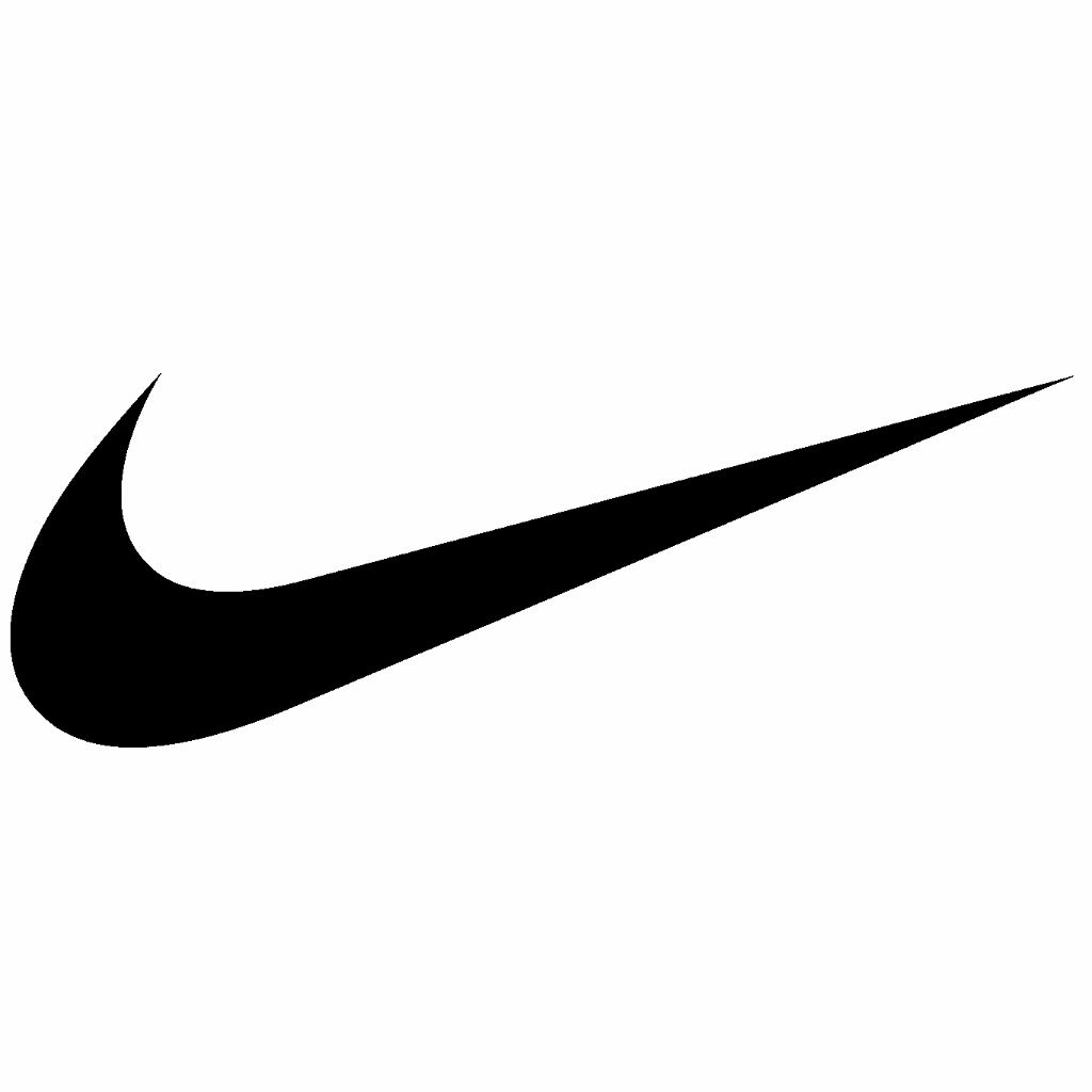
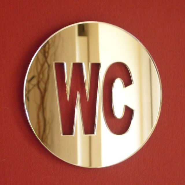
- 16px:


 32px:
32px: 


I used WMF logo's blue color and an azimuthal map similar to the one used in United Nations' emblem, you can check the 16 and 32 pixel favicon sizes above. please visit the file pages to see the logos with text. ■ MMXX talk 21:50, 24 July 2013 (UTC)
- I've added designs A and C to the voting gallery. ■ MMXX talk 22:27, 24 July 2013 (UTC)
- While very attractive, I think it is too similar to the UN logo. (Which is a concern, given that our current problems stem from being too similar to that of another international organization!) --Peter Talk 22:30, 24 July 2013 (UTC)
- Maybe you should compare it side-by-side with the UN logo, although the map is taken from the UN logo, but they are very different IMO. please also see the Wikinews logo which uses the exact same map, it is more similar to the UN logo, but we didn't have any issue with using it. ■ MMXX talk 22:54, 24 July 2013 (UTC)
- While very attractive, I think it is too similar to the UN logo. (Which is a concern, given that our current problems stem from being too similar to that of another international organization!) --Peter Talk 22:30, 24 July 2013 (UTC)
- The above discussion is preserved as an archive. Please do not modify it.