Talk:Community Wishlist Survey 2022/Better diff handling of paragraph splits
2023?
editOut of curiosity, why is this under Community Wishlist Survey 2023? --Matěj Suchánek (talk) 12:48, 12 November 2022 (UTC)
- Thanks for pointing this out! We moved the page to the right path, since the wish was voted on in 2022. NRodriguez (WMF) (talk) 18:40, 14 November 2022 (UTC)
Scope
editSuper excited for this! In the interest of seeing this long-standing wish come true, it might be worth cutting scope to just the paragraph handling within the wikitext diff (mw:Wikidiff2).
Just to clarify re: those usability materials, is the focus of this project just on handling paragraph breaks better (per the wish) or to revisit the general usability of diffs? I could see some of the proposed changes for the latter being controversial whereas the former is universally needed (and supported by the usability test scoring). Similarly, if the mw:VisualEditor mw:visual diff is still in beta, I would worry that good insights from the presentation like the usability of the carriage return symbol mid-sentence could bloat the scope of this project whereas the feedback could be passed to the team working on the VE visual diff (there are existing extensions that already implement some of the research's advice like strikethroughs). I'd be curious to see usage numbers but I imagine most users are seeing wikitext diffs (Wikidiff2) and their biggest issue is the paragraph breaks. czar 04:25, 28 November 2022 (UTC)
Interest in research
editOpen Questions: Are you interested in conducing user research on the new proposed interface to diff paragraph splits? If so, will you please post that you're interested in the Talk Page?
- Is this asking if we want to participate in the research or if we want to conduct it ourselves? If the former, I'd be interested, and I would recommend pinging those who participated in the wish if you'd like other participants. czar 04:27, 28 November 2022 (UTC)
Other pain points when viewing the diff
editOpen Questions: What other pain points manifest themselves when you view the diff?
- In the example of the wikitext diff paragraph breaks, one important distinction is not just understanding that text was removed and re-added but understanding what happened within that text move. For example, if someone cut a part of a paragraph and moved it later down the page, that whole part will show as a removal and not show whether words or references were changed within the moved text. This gives the misleading impression that the text was simply moved from one place to another when it's possible that the text was changed. And since it's hard to compare the text, I think many don't try, which hurts the text-source integrity of Wikipedia. Okay, hope that helps! czar 04:25, 28 November 2022 (UTC)
- Hello! This is to acknowledge your feedback in all three sections. –– STei (WMF) (talk) 13:42, 1 December 2022 (UTC)
- Another issue I’ve found is that I’ve found that if a a number of lines are all changed with no added or deleted lines, the diff works really well. But if additionally a line is added or removed immediately before the block of changed lines, the tool compares corresponding lines, eg the 23rd-29th lines in the left file with the 23rd-29th lines in the right file, when it really should be comparing 23 with 24 and so on because the 23rd line in the right file was an insertion. This is really apparent if you add a new row to a pipe markup table. The tool matches the pipe-dash row marker that matches and then gets confused. YBG (talk) 04:10, 2 December 2022 (UTC)
- Your feedback has been well received. –– STei (WMF) (talk) 08:30, 6 December 2022 (UTC)
Ideas for addressing confusion around paragraph splits
editOpen Questions: How might we address the root pain points that address the confusion around paragraph splits?
- Darker highlight within a highlight[1][2] seems like an elegant solution to showing what within the affected line was changed. Also if the "added" (i.e., moved) text was highlighted, similar to the examples I just linked, it would indicate a direct substitution rather than how the current diff currently looks like some text was removed and an unrelated new paragraph happened to be written beneath it. czar 04:38, 28 November 2022 (UTC)
Use of color
editOpen Questions: How does the use of color indicate what is
- The proposal to use red and green for removals/additions makes sense. This is what GitHub Desktop's diff viewer and the popular delta viewer does. Even better would be to put a color toggle in user settings. As for strikethrough, I think it makes a lot more sense in the VE visual diff than the wikitext diff, whose side-by-side comparison view makes the strikethrough redundant and would make the text harder to read. czar 04:38, 28 November 2022 (UTC)
Better diffs update
editHello, thank you for your involvement in Better diff handling for paragraph splits, the #1 wish in the Community Wishlist Survey 2022! So far, we have been working on different design alternatives, and we would love your valuable feedback at this stage of the process.
We are inviting you to sign up for usability tests where you can share your thoughts and insights. If you are interested, here is how to participate: please reply to this message and we will email you a form on wiki. You will provide us with your username and email address, and also agree to the general privacy statement for the survey and user tests.
For discoverability, we will be selecting 5 users out of the responders and contacting them via email via usertesting.com.
We look forward to hearing from you –– The Community Tech team. –– STei (WMF) (talk) 13:47, 1 December 2022 (UTC)
- 👍 Lectrician1 (talk) 13:54, 1 December 2022 (UTC)
- I would be interested OwenBlacker (Talk) 14:43, 1 December 2022 (UTC)
- ✔️ Virum Mundi (talk) 14:49, 1 December 2022 (UTC)
- --YodinT 15:08, 2 December 2022 (UTC)
Pinging users: STei (WMF) (talk) 13:48, 1 December 2022 (UTC)
- I'd be interested. Tol (talk | contribs) @ 21:19, 1 December 2022 (UTC)
Pinging more users: STei (WMF) (talk) 13:48, 1 December 2022 (UTC)
Pinging more users: STei (WMF) (talk) 13:49, 1 December 2022 (UTC)
- I'm interested! The Grid (talk) 19:48, 1 December 2022 (UTC)
- Sure, I'm interested. Geniac (talk) 00:00, 2 December 2022 (UTC)
Pinging last group of users: STei (WMF) (talk) 13:50, 1 December 2022 (UTC)
- +1 Mako001 (talk) 13:55, 1 December 2022 (UTC)
- I'm in! --Waldyrious (talk) 14:03, 1 December 2022 (UTC)
- I'm interested. Geraki TL 14:05, 1 December 2022 (UTC)
- Would be happy to help. Best, Barkeep49 (talk) 14:50, 1 December 2022 (UTC)
- I'm interested. Qwerfjkl (talk) 16:53, 1 December 2022 (UTC)
- I'm interested. -BRAINULATOR9 (TALK) 17:02, 1 December 2022 (UTC)
- I'm interested. —The Editor's Apprentice (talk) 17:35, 1 December 2022 (UTC)
- I'm interested. Betseg (talk) 09:06, 2 December 2022 (UTC)
- I'm interested. {{u|Sdkb}} talk 22:58, 2 December 2022 (UTC)
- I'm interested. Thingofme (talk) 11:11, 3 December 2022 (UTC)
- I'm interested. Shuipzv3 (talk) 12:51, 3 December 2022 (UTC)
- I'm interested. Fakescientist8000 (talk) 14:49, 4 December 2022 (UTC)
- I'm interested. - Darwin Ahoy! 19:31, 4 December 2022 (UTC)
Thank you all so much. We will contact 5 responders via email via usertesting.com and we will keep everyone updated. –– STei (WMF) (talk) 08:32, 6 December 2022 (UTC)
How paragraph moves get mangled
editI run into this issue multiple times a week so I wanted to share an example here, if it would help to illuminate the trouble:
- I took an edit I would normally make as a single commit and broke it into two steps to show how the diff viewer handles it. I moved sentences from the first paragraph into the second, and then swapped the order of those two paragraphs. But from this diff, it's impossible to tell.
- Breaking this into two parts, in part one you can see the sentences moved and where they went.
- In part two, you can see the paragraphs swapped with no content changes.
- Yet when combined (or made in the same diff, which is the same function), the diff viewer make it look like a bunch of random words were changed in the original (on how it works around the template curly brace format) rather than a part copy/pasted verbatim elsewhere in the article.
As an editor, I want to see where text is moved verbatim without having to manually check each passage side-by-side. At the very least, it should look like a combination of those two-step diffs, but I would think there are smarter ways to portray this content, per the examples of how other sites' diff viewers do it (in sections above). czar 18:39, 18 December 2022 (UTC)
- Here's another example in which I removed two headings and edited paragraphs without changing their order but the diff viewer interprets it as the removal and addition of new paragraphs rather than side-by-side comparisons. czar 02:48, 23 December 2022 (UTC)
Better Diff Updates and Feedback Request
editHey everyone!
Thanks so much for your involvement in the Better diff handling of paragraph splits wish.
We wanted to provide you all with an update on where we are at now, along with a feedback request for our design explorations!
We launched user tests last week– we received three recordings providing feedback on our proposed designs. We would like to thank users @Barkeep49, @Brainulator9 and @The Editor's Apprentice for sharing their input with us! We listened to your thoughts and are working on improvements based on what you told us. On the other hand, engineers are working on looking at the codebase in order to improve how the diff recognizes and renders certain changes.
We would now like to share our design explorations on a larger scale here in the talk page with all of you so that we can get wider feedback!
Things we would like you to know
editWe would like to list some discoveries we came across while doing research for this project, since this will impact the work we do and the decisions we make.
- At the start of this project, we carried out an unmoderated user testing with people that were new to diffs. This led us to gather insights on how difficult it was for new users to understand the changes in an article and how to read those changes in the diff. We then decided to try and make some improvements to other elements of the diff, to make it more friendly to new users.
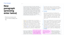
- We learned that there is a difference in how the diff is represented when you press enter once vs. when you press enter twice. When you press enter once, the diff does not takes it as adding a new line. There isn’t a paragraph break. When you press enter twice, the diff takes it as a new line, and the paragraph is broken. We needed to differentiate these two different cases in our designs.
- We also learned that besides the two columns approach, there’s also an in-line approach if you add &diff-type=inline to the URL. We decided to also expose this in our designs.
Design proposals
editParagraph improvements
editFollowing the main request on the wish, one of the main improvements we will introduce is to paragraph splits. As we mentioned above, there is a difference between pressing enter once and pressing enter twice– when you press enter twice, the paragraph is indeed split into two separate paragraphs.
Our design explorations for these two cases are:
#1 This is an exploration for pressing enter once, where the paragraph is not broken. This exploration is for the two columns diff.

#2 This is an exploration for pressing enter once, where the paragraph is not broken. This exploration is for the inline diff.

#3 This is an exploration for pressing enter twice, where the paragraph is effectively separated into two. This exploration is for the two columns diff.
_in_two_columns.png)
#4 This is an exploration for pressing enter twice, where the paragraph is effectively separated into two. This exploration is for the inline diff.
_inline.png)
Addition and deletion improvements
Another proposal we would like to introduce is related to addition and deletion of content. We noticed new users got confused about what the yellow and blue meant, why those two colors were appearing at the same time, why the two symbols (minus and plus) were appearing at the same time too, etc. We tried to simplify this:
#5 Design proposal for addition of content on the two columns diff. To expose this change, we would only use the blue highlight and plus sign – we would not make use of the yellow highlight and the minus sign to solely represent addition.

#6 Design proposal for addition of content on the inline diff. To expose this change, we would use a blue highlight.

#7 Design proposal for deletion of content on the two columns diff. To expose this change, we would only use the yellow highlight and minus sign – we would not make use of the blue highlight and the plus sign to solely represent deletion.

#8 Design proposal for deletion of content on the inline diff. To expose this change, we would use a yellow highlight and a strikethrough.

Switching between wikitext in two columns, wikitext inline, and Visual Editor diffs (the last one only if applicable: if the user has enabled “Visual differences” in their Beta preferences).
edit#9 Design proposal for switching between the 3 different diffs – dropdown in its default state would inform the user which diff they’re seeing at the moment.

#10 Design proposal for switching between the 3 different diffs – dropdown in its active state would show the different options.

Call for feedback and disclaimer
We are looking forward to hearing from you on this talk page about what you think about our explorations, and especially about the following questions:
- What do you think about the approaches outlined above?
- Do you think each design proposal accurately represents the change that was made to the article?
- Some of the design explorations are referred to, for example, content addition and deletion. Given a request for an improvement on these diff representations wasn’t mentioned on the original wish, what are your thoughts on the team also working on design alternatives for them?
- Dropdown: What are your thoughts on it? Do you think it’s easy or difficult to find?
- Take a look at the different options. Do you think they are clear or difficult to understand?
Please understand that design decisions are subjective and we consider an aggregate of what is most intuitive to most users. While you may individually prefer an option over the other, we will select the designs that are most intuitive to most users.
–– Thank you, Community Tech Team STei (WMF) (talk) 21:44, 1 February 2023 (UTC)
- #1 and #3 work confusingly differently: #1 makes the first and second part of the paragraph blue, #3 leaves them gray (only the blank line is highlighted). I have no preference, but either unchanged lines of split/merged paragraphs should be highlighted regardless of the presence of the empty line, or they should not be highlighted regardless of the presence of the empty line.
- #2 and #4 are also different: #2 highlights the rest of the line, #4 doesn’t. As a long-time wikEdDiff user, not highlighting the rest of the line seems more natural to me.
- It’s strange at first that only one half of the diff is colored, but I can probably get used to it.
- Dropdown: the “Visual Editor” explanation looks strange, especially given that the other two explanations are “Wikitext” and not “Wikitext editor”. I think they should be real explanations, like:
- Visual
- Highlight differences in the rendered content (beta, may miss some changes)
- Two columns
- Highlight differences in the wikitext, shown in two columns
- In-line
- Highlight differences in the wikitext, shown in-line
- —Tacsipacsi (talk) 16:30, 3 February 2023 (UTC)
- Thank you @Tacsipacsi. ––– STei (WMF) (talk) 12:02, 8 February 2023 (UTC)
- Hello. Most of the proposition seems nice to me. The only one that seems misleading to me is #1, because there is a large visual gap between the 2 § (which are in fact the same §). #2, #3 and #4 seems more accurate to me. Dropdown seems fine. Best, — Jules* talk 13:34, 8 February 2023 (UTC)
- Hello.
- All proposals make sense.
- I'm a bit more doubtful regarding the dropdown: VisualDiffs offer two buttons, that make it very easy to switch between modes. A dropdown requires more moves. I agree with Tacsipacsi's proposal on the explainations.
- Do you plan to work on VisualDiffs performances as well? It takes a lot of time to load.
- Thank you. Trizek from FR 15:24, 8 February 2023 (UTC)
- Do you plan to work on VisualDiffs performances as well? It takes a lot of time to load.
Hey there, VisualDiffs is out of scope for this work, thanks for the feedback! We'll relay the load issues to the team that is in charge of maintaining VisualDiffs. NRodriguez (WMF) (talk) 15:33, 9 February 2023 (UTC)
- Do you plan to work on VisualDiffs performances as well? It takes a lot of time to load.
- Hello. Most of the proposition seems nice to me. The only one that seems misleading to me is #1, because there is a large visual gap between the 2 § (which are in fact the same §). #2, #3 and #4 seems more accurate to me. Dropdown seems fine. Best, — Jules* talk 13:34, 8 February 2023 (UTC)
- Hello, I like the 3 different diffs options. I also prefer the wording of @Tacsipacsi. Thanks! Jurbop (talk) 15:16, 8 February 2023 (UTC)
- I was completely unaware of the existence of inline diff. It's great, and should be exposed more, thanks! I don't often switch between diff mode (as VisualDiff is too slow), so I wouldn't mind a dropdown menu's extra click.
- #1 does not represent the diff well in my view. The + implies added text where there was none. #5 also doesn't work for me, as the plus seems to refer to the entire paragraph, rather than the two words. All of the others work well (except for the colours being unintuitive still after like 20,000 edits)
- Diffs are superimportant. I'm happy with more attention from the team on this.
- Overall, I think this wish has made me realise how much clearer diffs can be, and how much we can copy what github does (https://www.matthewsetter.com/better-git-diff-support/) in terms of red/green colours and using two layers of colours. Imagine if you can actually find a comma added to a paragraph, because it's sentence is highlighted + the comma double highlighted!
- Femke (talk) 17:17, 8 February 2023 (UTC)
- Thank you @Tacsipacsi. ––– STei (WMF) (talk) 12:02, 8 February 2023 (UTC)
- Hi, on #6 I suggest adding an underline under the added text ("Do not rely to color alone") if not bold. Geraki TL 18:35, 8 February 2023 (UTC)
- Since diffs are used all the time, and get lots of wishlist votes, then I completely agree with taking a less narrow view, and exploring other details at the same time that weren't covered in the original wish, as you've done here; working on other incidental improvements at the same time seems like a good investment
- In terms of specifics: I agree with others that #1 & #3 are confusing: maybe using a new symbol to the left of the split paragraphs instead of + (in the same way that moved paragraphs have a curled arrow symbol, a different symbol for split paragraphs would make it clear what the difference is)
- #2 & #4: another difficult one: I'm not sure the suggestions given are perfect (for example, what if the last line of the paragraph for #2 reaches the end of the line?), but they seem much better than at present, and I can't think of a better way to implement this
- #5 #6 #7 & #8: this seems exactly right
- #9 & #10: another good idea, but clearer descriptions suggested by Tacsipacsi would be better still
- I also completely agree with Femke about GitHub highlighting as a better way to do this
- --YodinT 13:52, 13 February 2023 (UTC)
- Hi, I have a question, maybe it's not very relevant to the main topic. Can the team public the APIs of three type of diffs (visual, split, inline) for client to use (for instance: use in a user script)? I posted a similar question on mw:API talk:Compare, but no one cares. Thanks! Plantaest (talk) 15:46, 20 March 2023 (UTC)
- Hey there, I will cc our Tech Lead who may have more details about this @DMaza NRodriguez (WMF) (talk) 14:09, 24 March 2023 (UTC)
- @Plantaest there is a chance we'll add the inline option to Compare API. On the other hand, visual diffs are part of the VisualEditor extension and it is unlikely that we'll be touching it. DMaza (WMF) (talk) 18:17, 27 March 2023 (UTC)
- @DMaza: Thanks. Inline diff API is necessary for many use cases. Plantaest (talk) 23:49, 27 March 2023 (UTC)
- @Plantaest there is a chance we'll add the inline option to Compare API. On the other hand, visual diffs are part of the VisualEditor extension and it is unlikely that we'll be touching it. DMaza (WMF) (talk) 18:17, 27 March 2023 (UTC)
- Hey there, I will cc our Tech Lead who may have more details about this @DMaza NRodriguez (WMF) (talk) 14:09, 24 March 2023 (UTC)
Pinging editors
editPinging users who voted for Better Diffs and might be interested in the the feedback request above.
–– STei (WMF) (talk) 12:41, 8 February 2023 (UTC) Pinging more users: –– STei (WMF) (talk) 12:42, 8 February 2023 (UT Pinging an additional group of users: –– STei (WMF) (talk) 12:44, 8 February 2023 (UTC)
Pinging last group of users: –– STei (WMF) (talk) 12:45, 8 February 2023 (UTC)
- It's been the bane of my existence whenever I can't add. A. Blank. Line. If there's a pattern to
- behavior, I haven't been able to suss it out. (Oh, and "vis-à-vis" is accurate; "vs. is not. A
- hobbyhorse of mine...) Kencf0618 (talk) 12:54, 8 February 2023 (UTC)
- I only use two-column editing. I think #5 and #7 are good improvements. Schazjmd (talk) 22:36, 8 February 2023 (UTC)
- I think it was good to take the opportunity to rethink other features of the diff viewer. The ideas looks sensible to me. I'm a bit concerned about the strikethrough: doesn't it make the text less readable? Like many above, I also feel like #1 and #3 look confusingly different (though I can't immediately think of a clearer alternative). I also hope that the changes aren't going to break how diffs are handled in wikEdDiff and Navigation popups, which are two of the most widely used gadgets. I like the idea of having the column and inline views easily selectable. Personally, I think I'd continue to use wikEdDiff as it shows both an inline diff and the column view. Most of the time I use the former, but for more complex edits (like rewrites) I need to look at both, and it's helpful to have both the inline and the column view accessible on the same page one after the other without having to click buttons or wait for page loads. I would like that to remain functional (though obviously, having both views on the same page wouldn't work as a default option for everyone). Uanfala (talk) 14:09, 11 February 2023 (UTC)
New update posted
editHello all,
We've posted a new update inside of the project page and wanted to make you aware in case you're interested in seeing the designs going into engineering or trying out the Demo of the underlying changes to the diff engine. Thank you. NRodriguez (WMF) (talk) 17:16, 13 March 2023 (UTC)
Pinging users who voted for Better Diffs and might be interested in the the feedback request below:
Pinging users: –– STei (WMF) (talk) 17:35, 20 March 2023 (UTC)
Pinging more users: –– NRodriguez (WMF) (talk) 15:19, 17 March 2023 (UTC)
Pinging an additional group of users: NRodriguez (WMF) (talk) 15:19, 17 March 2023 (UTC)
Pinging last group of users: –– NRodriguez (WMF) (talk) 15:19, 17 March 2023 (UTC)
Hello folks,
We'd love to hear from you! We've published an update on March 10th. We're especially curious to hear your thoughts on:
- How the rows align in the new designs inside the screenshots for "New paragraph" pressing enter twice and Paragraph deletion (pressing delete n times)? Does this alignment seem intuitive to you?

- The modifications to the yellow left hand column when nothing is in fact removed no longer displaying as yellow. We found beginners to the diff were confused by the yellow thinking something had changed due to the yellow and minus symbol, so now we only highlight the blue. See phabricator task with screenshots. What are your thoughts?
- There is a demo of the changes we included in the update-- have any of you gotten a chance to try it? We've been documenting the changes in the current diff versus the one in the demo.
- Thanks so much in advance! NRodriguez (WMF) (talk) 15:19, 17 March 2023 (UTC)


Feedback
edit![]() Comment
Comment
- I don't see what the difference is with the last proposal.
- Looks like an improvement on what is there now!
- I still feel like yellow is not the right colour for deleted text (yellow is neutral to me, whereas red is removing text). I assume we're not stealing the more intuitive colours from GitHub because of green-red colourblindness?
- Can we make the highlighting darker or more pronounced (underlined?)? Or do the double highlighting that GitHub does (so highlight the sentence that is changed mildly, and highlight the change in a darker colour? It takes me ages to find where in a large paragraph a comma is added.
- Femke (talk) 17:48, 20 March 2023 (UTC)
![]() Comment
Comment
- The demo seems to be using the old diff viewer? If I type hello hello on the left and the same with an enter on the right, it does not show the 'new line', and indicates on the left that the old hello has been deleted (rather than moved).
- The changes in the plus an minus at phab seem logical. As an experienced user, I'm still confused about that. Great work! Femke (talk) 17:53, 20 March 2023 (UTC)
![]() Comment
Comment
- Good work. I can now tell the difference between adding a newline and completely replacing a paragraph, which was the brief. I would also prefer the highlighting to be much more visible. Backgrounds of #80c0ff for .diff-addedline.diffchange and #ffc080 or even #ffa040 for .diff-deletedline.diffchange would enable us to find that elusive added or removed comma hidden in a twenty-line paragraph. Certes (talk) 18:57, 20 March 2023 (UTC)
- Thanks for your feedback! We are working on the highlight colors with our design system team and will definitely take your input into consideration. JSengupta-WMF (talk) 17:07, 24 March 2023 (UTC)
![]() Comment
Comment
- On first glance, the "line added" and "line deleted" are confusing. They look like they're stand-ins for characters that have been abridged or redacted. One doesn't think of an empty line when one hears "line" with no adjective; I think what you really mean here is a "line break" or "empty line", though at that point just "↲" would be far less disruptive and more intuitive (with the background color indicating removal or addition).
- Also, why is the last "line added" in the first ("New paragraph") screenshot not in its own row (when the second one is)? "Pressing enter once on the last line of a paragraph" ([sic]—I assume you actually mean "at the end of a line") is just another way of saying inserting an empty line between two lines, so it makes more sense to me to represent it as a whole new row (the status quo).
- I completely agree with MusikAnimal at T327193#8703223. To me the gray background means "nothing was changed in this part", so it makes no sense to use it in parts that involved any change, however small, including addition or removal of line breaks.
- On a meta level, I doubt we can really give meaningful feedback without actually seeing it in the day-to-day use of the sites we visit. It takes some mental energy to imagine how it'd feel and even then we can only have an incomplete vision.
- (And please do not use phrases describing key strokes like "pressing enter" and "pressing delete" when what you're actually referring to are the resultant actions when the focus/cursor are in specific places—which can be achieved in a host of ways, not just those strokes. Just say "splitting a paragraph", "deleting a line break", etc.) Nardog (talk) 01:22, 21 March 2023 (UTC)
- Hi @Nardog, thanks for your feedback and recommendations.
- We had a similar discussion regarding the terminologies on the diff-view and one of the initial proposals was to use “line break”. We simplified the language to be more mindful and inclusive towards users who are not well versed with formatting terms on word processors or on screen. It’s also the reason why we are refraining from using special characters such as "↲" or “¶” to denote line break, paragraph break etc., unless we have a clear indication through analytics that more than 70-80% of the diff users understand these symbols. Our qualitative analysis showed most users didn’t understand what "↲" mean
- The last “line added” is not in its own row due to the screen width. I wanted to capture an edge case where the “line added” tag could wrap to the next line due to insufficient space
- I had a discussion with @MusikAnimal on this topic and we both agreed that introducing a third state visually, (i.e. something between grey, yellow or blue to indicate that something has changed in the new version but nothing has been removed from the previous version) might introduce additional cognitive load to the users where they need to learn what it means. We are going to test it out and if we see concerns in the live environment, I will come up with a better solution. Super appreciative about your comment about the meta level, that we need to roll out something to see things in action and under various conditions to improve them. UX design is an iterative process and the quicker we can roll out a version to the users, the faster we will be able to capture insights to improve it
- JSengupta-WMF (talk) 17:12, 24 March 2023 (UTC)
- Thank you for your reply.
- We're talking about representing line breaks in diffs of wikitext source. By definition, "users who are not well versed with formatting terms" are not going to understand even the concept of a line break. Or anything about the diff I imagine. Source diffs are by their very nature only accessible to advanced or intermediate users who know some things about wiki syntax.
- What's even more baffling to me is that in an attempt to make it understandable to novices, you chose a wording that is confusing even to advanced users ("line added"/"line deleted"). I also submit that any use of words in those places is inherently confusing and disruptive because it looks like part of the diff. It did take a while for me to get a hold of "↪/↩" (which was added a few years ago IIRC) too, but it's perfectly intelligible.
- The last “line added” is not in its own row due to the screen width. No, I mean a table row (
<tr>). I don't understand why the second "line added" in the first image gets its own row but the last one does not. Currently, the number of rows in each column reflects the number of lines in the corresponding source (unless of course interrupted by a line number), so any change that makes it not so would be fundamentally disruptive and confusing. - I wasn't suggesting a third state. Currently, if you just add characters to a line, the left side results in a yellow "−" cell with no
<del>. So the obvious thing to do to a line that was split into several is to show it in a yellow "−" cell with no<del>. I don't understand why line breaks must be treated any differently from characters. - Taking a closer look, I don't understand why the third line on the right in the first screenshot is framed in gray or why there's space beneath the first cell on the left. Simply using rowspans would be far more intuitive AFAIC:
- Hi @Nardog, thanks for your feedback and recommendations.
The Atlantic Ocean consists of four major, upper water masses with distinct temperature and salinity. The Atlantic Subarctic Upper Water in the northernmost North Atlantic is the source for Subarctic Intermediate Water and North Atlantic Intermediate Water. |
The Atlantic Ocean consists of four major, upper water masses with distinct temperature and salinity. The Atlantic Subarctic Upper Water in the northernmost North Atlantic is the source for Subarctic Intermediate Water and North Atlantic Intermediate Water. |
||
North Atlantic Central Water can be divided into the Eastern and Western North Atlantic central Water since the western part is strongly affected by the Gulf Stream and therefore the upper layer is closer to underlying fresher subpolar intermediate water. The eastern water is saltier because of its proximity to Mediterranean Water. North Atlantic Central Water flows into South Atlantic Central Water at 15°N. |
- The more I look at the screenshots the less they make sense to me, and the more terrified I get at the words "Final design" 😅 Nardog (talk) 01:05, 25 March 2023 (UTC)
- It looks like you are changing the style for "something has changed in the new version but nothing has been removed from the previous version". In that case, using the "white background, gray border, no +/−" scheme (as in the third right cell in the first image) for that situation makes a lot of sense to me (just please preserve the gray background for context lines). But then the first right cell should be shown like that too, and the first left cell should still be in yellow and with −, as long as the space between "Water." and "North" was deleted:
The Atlantic Ocean consists of four major, upper water masses with distinct temperature and salinity. The Atlantic Subarctic Upper Water in the northernmost North Atlantic is the source for Subarctic Intermediate Water and North Atlantic Intermediate Water. |
The Atlantic Ocean consists of four major, upper water masses with distinct temperature and salinity. The Atlantic Subarctic Upper Water in the northernmost North Atlantic is the source for Subarctic Intermediate Water and North Atlantic Intermediate Water. |
||
North Atlantic Central Water can be divided into the Eastern and Western North Atlantic central Water since the western part is strongly affected by the Gulf Stream and therefore the upper layer is closer to underlying fresher subpolar intermediate water. The eastern water is saltier because of its proximity to Mediterranean Water. North Atlantic Central Water flows into South Atlantic Central Water at 15°N. |
- I know technically two line breaks have been added, but that's what an empty line is, and the empty cell represents that accordingly. Nardog (talk) 01:35, 25 March 2023 (UTC)
- I find the last mock-up by Nardog quite intuitive :). Maybe keep it blue (something has changed), but omit the plusses, as nothing has been added? Femke (talk) 16:32, 25 March 2023 (UTC)
- I know technically two line breaks have been added, but that's what an empty line is, and the empty cell represents that accordingly. Nardog (talk) 01:35, 25 March 2023 (UTC)
- Can the inline diff view be made monospace? Aaron Liu (talk) 11:29, 14 September 2023 (UTC)
- @Aaron Liu: (volunteer comment) Just as an interim thing, you could override the CSS for the inline diff view with something like:
.inline-diff-row {
	font-family: monospace;
	font-size: 13px;
}
- in your common.css / global.css
 — TheresNoTime (talk • they/them) 13:26, 14 September 2023 (UTC)
- Thank you! Aaron Liu (talk) 15:06, 14 September 2023 (UTC)
- this i agree with. ltbdl (talk) 14:07, 14 September 2023 (UTC)
Is this over?
editThe latest status update is quite confusing given the previous calls for feedback. Is the whole "Better Diffs" project complete now, or are changes other than the paragraph split detection still forthcoming? Nardog (talk) 18:05, 10 September 2023 (UTC)
- @Nardog can you let me know which status update is creating confusion so I can attend to it? The work is complete. I am using complete in the sense that we are at a point where we only now monitoring for users to report issues so we can attend to them. See https://phabricator.wikimedia.org/T341753 if you haven't already.
- We are also working on documentation and more announcements about the completion of the project, beyond what we have posted on the project page and Tech News. Have a good weekend! –– STei (WMF) (talk) 09:59, 22 September 2023 (UTC)
- I said The latest status update on 10 September 2023, so it can only mean the 30 August 2023 one. But later the inline switch widget was rolled out so it clearly wasn't complete at that point.
- My question was mainly about the call for feedback which I answered (see the section immediately above this one). I naturally wanted to know if my feedback was being heeded. I see T327193 is now closed as declined, so I assume the changes proposed in the previous calls for feedback on this page have been abandoned (or shelved indefinitely). Am I correct in this assumption? Nardog (talk) 10:19, 22 September 2023 (UTC)
- Thanks for letting me know. We will be posting an improved status update section by the end of the week with newer screenshots.
- Also I think some feedback was taken. I have started using the new features (trying things out in my sandbox) and I see that "line added" and "line deleted" which you found confusing was no longer used. It's now "newline" "deleted" with arrows added.
- Overall, things have changed since the screenshots were last shared, so can you can assess the final look of things by toggling your switch on/off (I believe you have done this already since you work closely with us and may know what we have done so far?).
- But like I said, by the end of this week, a much helpful update will be added.
- Thanks for always engaging. –– STei (WMF) (talk) 22:47, 27 September 2023 (UTC)
- Thanks for the reply, but you're yet again leaving me confused. I don't see "newline" or "deleted" unless I switch the inline mode on. The last calls for feedback were about the traditional two-column diff. Are you saying "newline"/"deleted" are also coming to the two-column diff? What "switch" are you talking about? Nardog (talk) 12:08, 28 September 2023 (UTC)
- Apologies, I think I understand you better now. We did not push through with the two-column enhancements in the screenshots we shared earlier. It was decided that we should focus on the inline format user experience since it was that format that we were going to make accessible in this project. Additionally our main goal was to fulfil the wish by improving the algorithm in Wikidiff2 so that better diffs is able to better identify paragraph splits in the Wikitext formats (two-column and inline), which has been completed and deployed. –– STei (WMF) (talk) 18:42, 28 September 2023 (UTC)
- Thanks for the reply, but you're yet again leaving me confused. I don't see "newline" or "deleted" unless I switch the inline mode on. The last calls for feedback were about the traditional two-column diff. Are you saying "newline"/"deleted" are also coming to the two-column diff? What "switch" are you talking about? Nardog (talk) 12:08, 28 September 2023 (UTC)