International logo contest/Final logo variants
| ←historical pages | 2003 Wikipedia international logo contest (final logo variants) | |||
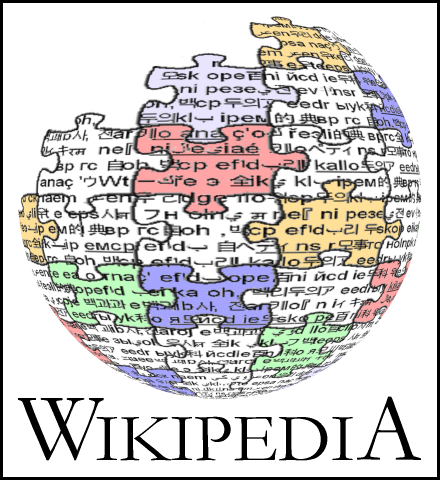
This was an international contest held from July 20 to August 27 2003, gathering 150 proposals. After the early proposal by Chuck Smith on October 12, 2002, the contest was first proposed on June 14, 2003 by Erik Moeller, who argued that the logo (adopted in January 2002 from the Logo suggestions) was unaesthetic, not international, and portrayed a text-only Wikipedia.
| ||||
This final logo variants is to formalize the process of selecting user-created variants of the winning PM logo, for use on all language Wikipedias. Separate development of rasterized text for each language should be done at Wikipedia raster name. (rasterized is important so that people without fonts for all the types can still import text for their logo variants. For information on the history of the wikipedia logos and the contest see Logo history.
- Note: This process is ongoing, with no set deadline. The International logo contest/Ratification process is parallel and distinct from this one--This process is only concerned with making the winning logo better-- and most widely acceptable.
design concepts
edit(added Oct 20) There has been some discussion of the significance of some of the design concepts which were included in the winning logo and which have been discussed in comments on the variations. To assist the designers, please say how important the following concepts are to you and add any others which you believe the winner of the voting process included but which aren't listed already:
How important is the presence of different colors (not variations of gray)?
- very: Robert Lee, GillianAnderson, Ryan_Cable (3)
- middle:
- not: Barbarossa(1)
- should not be color: Fruggo (1)
How saturated/bright/intense should the colors be?
- more than original: Robert Lee (1)
- about the same as original: GillianAnderson, Ryan_Cable (2)
- less than original: Barbarossa(1)
- should not be color: Fruggo (1)
Does the design have to be a sphere/globe?
- must: GillianAnderson, Robert Lee, Ryan_Cable, Fruggo, Barbarossa (5)
- don't care:
- must not:
Does the design have to include puzzle pieces?
- yes, bigger pieces than original: Robert Lee, Ryan_Cable (2)
- yes, about the same size as original: GillianAnderson, Fruggo, Barbarossa (3)
- yes, smaller than original:
- don't care:
- must not:
Should there be a gap/broken piece in the upper left, like the original?
- yes, bigger than original:
- yes, about the same as original: GillianAnderson, Ryan_Cable, Fruggo, Barbarossa (4)
- yes, smaller than original
- don't care:
- no:
For pieces between the color/selected pieces, if any, how dark should they be? (darker will tend to make the pieces vanish in grayscale and bicolor, lighter will tend to make them be more visible, if the colors are bright, the opposite if they are pale)
- darker than original:
- about the same as original: Ryan_Cable, Barbarossa (2)
- lighter than original: GillianAnderson (1)
In bicolor (black on white), what should happen?
- black circle with missing pieces in upper left, like original:
- something else, add options:
Must the design have text on the sphere/globe?
- yes, more than on original:
- yes, about the same as original: GillianAnderson, Ryan_Cable, Barbarossa (3)
- yes, less than original: Robert Lee, Fruggo (2)
- don't care:
- no:
Must the design have "Wikipedia" text below the sphere/globe/picture part?
- yes: GillianAnderson, Robert Lee, Ryan_Cable, Fruggo, Barbarossa. Rlwelch (6)
- don't care:
- should not:
What have I missed? Please add other concepts here. 427745299181
Revisions of original
edit![]()
![]()

![]()
Discussion moved to International logo contest/Final logo variants/Paullusmagnus
Third-party variants
editDgrant's variant
edit|
|
|
- Better than original logo: Dgrant
- About as bad/good as current logo: JamesDay (more saturated colored pieces and I'd say best) (1)
- Worse than original logo: Ryan_Cable, Erik Zachte,BCorr ¤ Брайен , Angela (4)
Discussion moved to International logo contest/Final logo variants/Dgrant
Gutza's variant
edit![]()
- Better than original logo: Diftong (de) Elian (2)
- About as bad/good as current logo: —Eloquence, JDG, Stevertigo, Tillwe, KRS, Kurt Jansson, Anthere (un peu triste)7)
- Worse than original logo: Fruggo, Uwe, Tali, Dr Bug JamesDay (no color), Looxix, Ryan_Cable, BCorr ¤ Брайен , Angela (9)

- Better than original logo: —Eloquence, KRS(except that the colours need some changing), Karl Stas, Fruggo, Tali (5)
- About as bad/good as current logo: Kurt Jansson (1)
- Worse than original logo: JDG, Diftong (de), Stevertigo, Tillwe, Elian, Uwe , Dr Bug(Interesting,but?) , JamesDay (no text, ok in bicolor though), Anthere (colors too lively), Looxix, Ryan_Cable, BCorr ¤ Брайен , Angela (13)

- Better than original logo: KRS (except that the colours need some changing), Tillwe (except that the concept is much better than the actual way it is done with all that white spots etc. ;-)), Kurt Jansson (3)
- About as bad/good as current logo: Fruggo, BCorr ¤ Брайен JamesDay (scales, grayscale and bilevel work, more complexity full size would be nice)(changed vote from better) (3)
- Worse than original logo: —Eloquence, JDG, Diftong (de), Stevertigo, Elian, Uwe, Tali , Dr Bug, Anthere, Looxix, Ryan_Cable, Angela (12)
Discussion moved to International logo contest/Final logo variants/Gutza
Nohat's variant
edit![]()
(see International logo contest/Final logo variants/Nohat for versions in other languages)
- Better than original logo: Nohat, Maveric149 (by far the best!), Jdforrester, Ezel, asr (by far the best!), —Eloquence, Angela, Joakim Ziegler Flyingbird,RobLa (10)
- About as bad/good as current logo:
- Worse than original logo: BCorr ¤ Брайен , Ryan_Cable JamesDay Lorax ska(no color, no variety) (5)
![]()
- Better than original logo: —Eloquence (much), Nohat (I like all my logos :-), MH (beautiful and doesn't dominate the page as much as the color logos do), User:anthere, Menchi, JDG, Diftong (de), Head, Maveric149 (me like), Angela, KRS(surface a bit too shiny, more improved in other versions), Dysprosia (different caption font?), Tillwe, Elian, Tarquin, Uwe, The Anome, Kurt Jansson (much) , Dr Bug(But below is better), Jake (I would like to see a softly colored version of this) , snoyes, Erik Zachte (could use some sharpening?) Joakim Ziegler, Kalki (24)
- About as bad/good as current logo:
- Worse than original logo: Fruggo, CabalamatReally(black and white is boring), JamesDay (no color), Lorax (I like words better than individual characters), Looxix, Jrincayc (so shiny you could fry an ant with it, doesn't say Wikipedia to me), Ryan_Cable, Jdforrester, BCorr ¤ Брайен , Andrewa None of Nohat's versions look like variants to me, IMO they are new logos, and I particularly dislike removing the mystery of how much of the back was completed in the original. Robert Lee (No color.), Jay (too dark) ska(let's fry ants!)(12)
![]()
- Better than original logo: —Eloquence (much), Nohat, JDG, Diftong (de), Angela,KRS, Karl Stas, Elian, Tarquin, Dgrant (hands down the best variant), Kurt Jansson (much) , Dr Bug, Jdforrester Joakim Ziegler (14)
- About as bad/good as current logo: Tillwe Anthere(2)
- Worse than original logo: Fruggo, Uwe, CabalamatReally JamesDay (no color), Lorax (I like words better than individual characters), Looxix, Ryan_Cable,BCorr ¤ Брайен JamesDay (bilevel works well, not complex enough, not color), (9)
![]()
- Better than original logo: Anthere 18:23, 10 Oct 2003 (UTC), Nohat, Robert Lee, Menchi, JDG, Diftong (de), Tillwe, Fruggo, Kurt Jansson, Tali , Dr Bug, Jdforrester (12)
- About as bad/good as current logo: —Eloquence (1)
- Worse than original logo: Uwe JamesDay (too little text), Looxix, Ryan_Cable, BCorr ¤ Брайен , Angela (6)
![]()
- Better than original logo: Anthere 18:23, 10 Oct 2003 (UTC), Nohat, Menchi, JDG , Diftong (de), —Eloquence, KRS, Tarquin (much), Uwe, Kurt Jansson, Dgrant, Stevertigo, The Anome (much, now add chunky per-language text below, and we're there), Jdforrester Joakim Ziegler (15)
- About as bad/good as current logo: Tillwe, Angela (2)
- Worse than original logo: Fruggo, CabalamatReally, JamesDay (no color), Lorax (I like words better than individual characters), Robert Lee (Color is required for website logo, this can be print logo), Looxix, Ryan_Cable (7)
![]()
- Better than original logo: Anthere 18:23, 10 Oct 2003 (UTC), Nohat, Robert Lee (my fav so far, superb), grin (I like that one), Menchi, JDG, Diftong (de), Fantasy (wow),KRS( could be a good option if the colours and surface treatment are rethought), Tillwe, Kurt Jansson, Tali, Stevertigo , Dr Bug(THE BEST!) Almacha (color+letters=the best) , plasmagunman, Erik Zachte, Joakim Ziegler, Jay (lets have more shiny colours) (19)
- About as bad/good as current logo: —Eloquence, JamesDay (almost better, good bicolor, more complexty wanted), Jdforrester,BCorr ¤ Брайен , GBoy(agree with JamesDay) (5)
- Worse than original logo: Fruggo, Uwe, Lorax (I like words better than individual characters), Looxix, Ryan_Cable, Angela (6)
Stevertigo subvariants
editSee also:International logo contest/Final logo variants/Stevertigo
 ,
, 
- Better than original logo: Anthere 03:42, 11 Oct 2003 (UTC), CabalamatReally (the one on the left is particularly nice), Angela, Joakim Ziegler, Jay (remove the gold, and have green transitioning to blue) (5)
- About as bad/good as current logo: BCorr ¤ Брайен (1)
- Worse than original logo: Ryan_Cable JamesDay (2)
- Utter garbage:
Discussion moved to International logo contest/Final logo variants/Nohat
Robert Lee's variant
edit
- Better than original logo:
- About as bad/good as current logo:
- Worse than original logo: Tillwe, KRS, Fruggo, Elian, Uwe, Kurt Jansson, Tali, Anthere 03:47, 11 Oct 2003 (UTC), Looxix, Ryan_Cable, Erik Zachte 01:30, 14 Oct 2003 (UTC), Robert Lee (your right; hangs head in shame; weeps),BCorr ¤ Брайен , Angela JamesDay (15)
Discussion moved to International logo contest/Final logo variants/Robert lee
Matthewmayer's variant
edit


- Better than original logo: Tillwe, Fruggo, Elian, Kurt Jansson (4)
- About as bad/good as current logo:KRS (1)
- Worse than original logo: Dr Bug(Not original), Anthere 03:48, 11 Oct 2003 (UTC) (like it, but it recalls me of something), Looxix, Ryan_Cable, Erik Zachte 01:30, 14 Oct 2003 (UTC), BCorr ¤ Брайен , Angela JamesDay (8)
Discussion moved to International logo contest/Final logo variants/Matthewmayer
Sansculotte's variant
edit
- Better than original logo: Tillwe, Elian (2)
- About as bad/good as current logo: Kurt Jansson (1)
- Worse than original logo: Fruggo, KRS, The Anome , Dr Bug(Unrelated?), Anthere, Looxix, Ryan_Cable, Erik Zachte, BCorr ¤ Брайен , Angela JamesDay (11)
Discussion moved to International logo contest/Final logo variants/Sansculotte
Jamesday's variant
edit![]()
Please do not vote for this. It is intended to point out the technical goals some of the other candidates were not addressing: scaling, grayscale and bicolor appearance. Instead, judge whether the actual candidates address those goals effectively or not. Please see the description. JamesDay 03:33, 10 Oct 2003 (UTC)
- Better than original logo:
- About as bad/good as current logo:
- Worse than original logo: Tillwe, Fruggo,KRS, Kurt Jansson , Dr Bug, Anthere 03:51, 11 Oct 2003 (UTC)(Looks degraded), Looxix, Ryan_Cable, Erik Zachte, BCorr ¤ Брайен , Angela JamesDay (12)
Description moved to International logo contest/Final logo variants/Jamesday
KRS's variant
edit
- Better than original logo:
- About as bad/good as current logo: Tillwe (1)
- Worse than original logo: —Eloquence, Fruggo, Kurt Jansson, Looxix, Ryan_Cable, Erik Zachte,BCorr ¤ Брайен , Angela (8)

- Better than original logo:
- About as bad/good as current logo:
- Worse than original logo: Tillwe, —Eloquence, Fruggo, Kurt Jansson, Looxix, Ryan_Cable, Erik Zachte, BCorr ¤ Брайен , Angela JamesDay (10)
Using PM's and Gutza's. I know that this looks more cluttered but someone technically good can transform it into a much better image-colours could be changed, outline made crisper.It combines 2 ideas- PM's and all the other's who had used brackets. Also the brackets give a frame/ reference/ order to a floating jigsaw world- could mean both the bracket as order containing, or jigsaw puzzle world as freedom breaking out.KRS 16:57, 29 Sep 2003 (UTC)
K's variant
edit
- Better than original logo:
- About as bad/good as current logo: Tillwe (1)
- Worse than original logo: —Eloquence, Fruggo(very cool logo, I love the colours, but not for Wikipedia),KRS, Kurt Jansson, Looxix, Ryan_Cable, BCorr ¤ Брайен JamesDay (8)
Much larger version(850K)
Yeah, I know it's big. But you can resize it. I think it looks pretty cool. The old one was a bit bland in my opinion, which is why this one looks so... colorful? Well, it's different, anyway.
K
- Its (was) way too big-- and with all that clutter, looks way too cluttered, when small. Stevertigo 01:07, 1 Oct 2003 (UTC)
- Agreed. It is still kinda cool though. The dark, brooding neon of wikilogos, if you will :) -- Pde
Stephane's variant
editFollowing the first voting results, this is an update of my first attempt at an improved version of Paulusmagnus' great logo idea. I think this is the final version, and, definitely, I like it most. I've retired my second attempt.
White-background, framed version |
Transparent-background version |
|---|---|
| Larger format (210 Ko) | Larger format (240 Ko) |
Stephane Simard 08:10, 5 Oct 2003 (UTC)
- Better than original logo: Bo (the white one), Tillwe, Elian, Stephane (4)
- About as bad/good as current logo: KRS, Pde JamesDay(bit too much text, colors not quite saturated enough but really close to better!) (3)
- Worse than original logo: —Eloquence, Fruggo, Kurt Jansson, Ryan_Cable, BCorr ¤ Брайен (5)
Discussion and other versions moved to International logo contest/Final logo variants/Stephane
Elian's variant
edit


Discussion and other versions moved to International logo contest/Final logo variants/Elian
- color can be chosen at will, last letter in the arabic version should be an Alif or Ta' marbuta instead of Ya (I have no Kufiscript on my computer). --Elian
- Better than original logo: Tillwe, Kurt Jansson , plasmagunman (3)
- About as bad/good as current logo: —Eloquence, KRS (2)
- Worse than original logo: Fruggo, Ryan_Cable, Erik Zachte, nice concept tho...BCorr ¤ Брайен JamesDay (the sphere design element seems to be missing) (5)
Guillôme's variant
edit
I've kept the idea of puzzle pieces, but addapted it to an unwinning project. Guillôme 11:40, 4 Oct 2003 (UTC)
Discussion & other variants on User:Guillôme/Logo
- Better than original logo:KRS(V.good idea, if some pieces near the centre are closer together, it would convey the concept of Wikipedia, second one[smaller] better), Angela (2), asr
- About as bad/good as current logo: Tillwe, —Eloquence (2)
- Worse than original logo: Fruggo, Kurt Jansson, The Anome, Ryan_Cable, BCorr ¤ Брайен JamesDay (6)
Guillôme-KRS variant
edit


- Better than original logo:
- About as bad/good as current logo:
- Worse than original logo: JamesDay (the sphere design element seems to be missing), Ryan_Cable (2)
Nonlogo addons
editThe suggestions here are for other purposes (splash screen, illustration) or no purpose at all and can be safely ignored. Ideas that aren't going to get used could be moved here to be used for other purposes, or just to keep from losing them.
Imagine the box that the puzzlesphere came in ("Wikipedia - pieces"), with the incomplete puzzlesphere hovering over a pile of pieces of varying size. That could look pretty neat in POV-Ray with the right lighting/background... Paullusmagnus 03:19, 28 Sep 2003 (UTC)

- This is a good point-- which reminds us that puzzle pieces may not exactly be what we are looking for-- but evocative of what we are looking for-- a puzzle of unorthodox shaped "puzzle" pieces might be interesting.Stevertigo 17:10, 29 Sep 2003 (UTC)
Also, see en:User:paullusmagnus#Proxy commentary if you dislike the puzzlesphere.
External References
edit(Cross posted here...) FYI, the following "puzzle logos" may be useful for reference (and a reason for caution). I think they did a pretty good job of stylizing it. MDLF and Campware Fuzheado
A linking idea
editI raised this idea on the mailing list, where Stevertigo suggested that I put it here.
- Use the puzzle piece logo (with modifications) as the logo for Wikimedia.
- Get rid of the meaningless text from the surface of the globe.
- In each pussle piece include the 2-letter ISO639-1 code for some language, oriented to conform with the position of that piece on the globe. These letters can be omitted from scaled down versions of the logo.
- The centre puzzle piece should preferably be blank to generically represent all the non-Wikipedia projects. The worst thing you could put in the centre piece would be "en"
- Each project could design its own logo, use the one it already has or use a temporary generic logo while it is designing its own.
- A key required element of each logo would be a single puzzle peice. It would be up to the participants of that project to determine how that puzzle piece would be worked into aesthetic conformity with the existing design.
- The puzzle piece would either be blank or contain the 2-letter code for that language.
- The underlying concept is that Wikimedia brings together the diverse puzzle pieces to form a single world. Each project is one piece of that puzzle.
- As an extension of this idea our front page could show the Wikimedia logo in the centre with all the separate project logos randomly around it. A curved line joining the individual project puzzle piece at one end and going into the open top part of the sphere at the other could represent the connectivity of the projects. Eclecticology 01:09, 28 Sep 2003 (UTC)
Some thoughts
editI don't have time to try and generate any images (and have only fiddled with POV-ray for an hour or so a few months back). But I have a couple of negative symbolism issues with the puzzle sphere, which might inspire someone:
- Both the puzzle and the sphere are closed, finite systems. To me, wikpedia is open-ended and infinite. It will not be "finished" like a jigsaw. Perhaps, rather than a sphere, we need some infinite surface: a spiral or helix, parabaloid, etc.
- A jigsaw has no permanence - it is "perfect" for a brief moment and is then destroyed. This doesn't fit in with the wiki concept, but I haven't yet thought of an adaptation which might fit.
dramatic 219.88.89.155 10:37, 28 Sep 2003 (UTC)
- As I agree to a big part of this, and as I also regret that eastheticly, and especially in the matter of the colour-scheme, I don't find the logo brilliant, I'll just also share the idea I've just had. It is to blend the concepts of the puzzle of this logo and of dynamism that was given by the one that won the fourth place in the secound round (logo 4d). So, basicly, just a few puzzle pieces, all separate and of different sizes, kind of flowing in the air, but moving towards the center and forming a central W. And in order not to make it to heavy, the pieces should all be in just one colour and not be wearing any writings.
Why was the english wikipedia logo changed to Nohat's variant?!
editNot nearly as many people voted on the variants as voted on the normal logo, and anyway, there was no way to vote for the normal logo! This doesn't make sense. Why weren't these variants in the original vote, like the miwiki one was? The miwiki variant, although IMO better than the one voted in, was fairly voted out. These logos were voted in by about 30 people; around 1/6 of the people that voted in total. Many people were just tired of voting and didn't vote for the variants. Probably, the people who voted on these variants didn't like the logo that was voted in in the first place, and the people that liked the original logo the best didn't vote. The original logo was ratified on several wikipedias, not Nohat's variant. I wouldn't vote for ratifying Nohat's variant, but I voted for ratifying the original logo. I really don't think all of this is fair. LittleDan 15:42, 12 Oct 2003 (UTC)?
- I second the motion. I personally like the original variant that was voted in and dislike the Nohat variant. Had I realized that there was voting on the logo variant I would have voted against this one. Silly me, I thought that when I saw in the Oct 1 announcement "All Wikipedias have ratified the new logo. New variations are available for comment" that the variants would be commented on, and that later there would be a second announcement for a vote on the variant. Combined with the server troubles of the past week, I completely missed the voting on variants. I disagree with the process that choose the Nohat variant because it was too short of a voting period (especially considering the server problems) and not announce widely enough. Jrincayc 16:10, 12 Oct 2003 (UTC)
Adding Logo feedback for front page link. Stevertigo
- The front-page link is gone again...but that doesn't matter, right? Because only an incestuous group should have any say over how the ratified logo gets mangled.
This process is ridiculous. Please put up the original winning, ratified logo while you bicker about alternatives. After you've finished second-guessing the design, have another publicized vote on whether to switch. 18.19.0.123 21:17, 14 Oct 2003 (UTC)
I can sympathize with all of you...although I hated the original puzzle logo, so any alternative suits me fine. No matter what the voting process was, I think there would have to have been some polishing of the winning logo. Should there be a whole new vote on the variants? Yes, this probably would have been the best idea. Also, the coloured puzzle logo should never have been put up on the main page, as it just served to tease you people before it was taken away and replaced with Nohat's variant. Maybe there was a purpose to have the entire Wikipedia community vote on the general logo style, and then have sort of closed-door discussions about the final variant to choose. Perhaps this ensured that only REALLY interested people were a part of the discussion? I don't know. Dgrant 02:45, 15 Oct 2003 (UTC)
- This has become a mockery of the whole voting system. The logo that is currently on the EnWikipedia was NOT voted on at all. I hereby request that we either abandon the notino of a logo alltogether, we switch back to the original logo, or we at LEAST put up the logo that people voted for. --Dante Alighieri 08:30, 15 Oct 2003 (UTC)
- It was said from the beginning that the final logo could be modified, before actually being used. Dgrant 05:30, 16 Oct 2003 (UTC)
- But those modifications were made before the main vote, then the author of the logo chose just a few of them that s/he liked, then they were put in the main vote. We were not supposed to have it that first we'd vote on logos and variants, then we'd have a small subset of voters vote on new, completely different variants. LittleDan 00:05, 17 Oct 2003 (UTC)
I left my feedback a couple of days ago on the Logo feedback page -- but I'll say it here too: I also liked the original version a good deal better better than all of the variants on this page. I especially miss the color. In fact I even like the meta logo here better than the current EnWikipedia one. And although it does seem like the process went awry somewhere, I'm not so upset by it. I am, however, rather confused about who decided what when, and on what basis. And how do we get to vote for the original logo? Cheers, Bcorr 15:32, 15 Oct 2003 (UTC)
- Folks, final voting and ratification process was done with the full knowledge that the logo voted on was in concept, and more polishing had to be done. So "mockery" is an unfair characterization. The original Paullusmagnus logo was simply unusable with the text and colors the way they were, which is why variants are being considered. 219.76.64.2
- I agree. It was always said from the beginning that the winning logo could be modified. Dgrant 05:30, 16 Oct 2003 (UTC)
- I cannot find the page where it says that the winning logo could be significantly changed. I do find places saying that the winning logo could be modified for localization purposes (i.e. to change the logo to the localized wikipedia name) and minor touchups. However, So far as I can tell, the winning logo was to be used almost exactly as given. Please enlighten me by linking to the place where it was made clear that the winning logo could be significantly modified, or even totaly redone (like for example the Elian's or Matthewmayer's logo). Thanks in advance for clearing this up for me. Jrincayc 14:37, 17 Oct 2003 (UTC)
- I don't understand what is the big deal with colour. Black and white is better as it goes with the white background of wikipedia and the black text. The original Paulmagnus logo looked too much like Joseph and the technicolour dreamcoat. Dgrant 05:30, 16 Oct 2003 (UTC)
- You can understand it by looking to see how grayscale candidates did in the voting. None made it to the final stage and the ratification process eliminated the grayscale national variants. Grayscale was thoroughly eliminated as a logo design concept and its use is a rejection of both the voting and ratification process. JamesDay 09:04, 20 Oct 2003 (UTC)
While I think I do actually prefer the current version to the one I voted for, I was a bit surprised to see it suddenly appear... I was carefully monitoring the top of the main page, waiting for the notice announcing that the vote had started... Cyp 07:37, 17 Oct 2003 (UTC)
Great! I kept telling our Artists what could be corrected in the winning design. Mostly it was already goodlooking. But i didn't vote for any of the suggested Variants because none of them are better than the original and many of them are far Offtopic. I thought that the decision-makers would be wise enough to keep the elected Logo. But no they took the most appealing Logo out of choice and counted the votes for Logos which almost nobody considered seriously for Wikipedia. To make it worse they chose a monochrome picture to make it even less appealing for websurfers. I must admit the shades on Nohat's variant are not bad, but i didn't vote for it beacause it looks like a grey mouse photographed on monochrome film. There was no possibility to vote for a good Logo because all Variants were either worse or Offtopic. If this process is really still going on i would suggest to put some source online and add more colors to it or to take the winning Logo online. If this was a real political Election this would be an insult for the voters. Imagine Blair would be elected, then the government would debate. Without telling anything about new rules the new Government would chose among the Ministers a 'Final' Prime Minister. Blair would be no Option since he was elected. Then it should be proclaimed everywhere and changed even in Australia. Strange isn't it ? But the choosing of our Logo looks somewhat similar for me. Thanks for the patience. --GillianAnderson 17:02, 28 Sep 2004 (UTC)