International logo contest/Finalists
| ←historical pages | 2003 Wikipedia international logo contest (logo finalists) | |||
This was an international contest held from July 20 to August 27 2003, gathering 150 proposals. After the early proposal by Chuck Smith on October 12, 2002, the contest was first proposed on June 14, 2003 by Erik Moeller, who argued that the logo (adopted in January 2002 from the Logo suggestions) was unaesthetic, not international, and portrayed a text-only Wikipedia.
| ||||
This is the list of finalists in the international logo contest. From September 15, 2003, 20:00 UTC until September 25, 2003, 20:00 UTC it will be possible to vote on these finalists (using the voting method chosen here), average voting.
The vote takes place on a separate page, International logo contest/Ballot. Please see that page for voting instructions.
In the final vote, you can vote on each variant, not just on the whole submission. The artists can pick up to 5 versions (variants) of their logo which they consider particularly valuable. The artists are encouraged to use the time of discussion until the final vote to decide which variants to use, and to further refine their submissions before voting begins. No further changes may be made during the time of voting, to avoid distorting the results.
For designers who want to try their logo with non-English versions of the "Wikipedia" text, see Wikipedia in other languages and Wikipedia subtitle translations.
1: The puzzle sphere by Paullusmagnus
editThis submission received 145 votes in the first round.
1a: Puzzle sphere
edit1b: Puzzle sphere with Miwiki
edit(with Oliezekat)

This submission received 106 votes in the first round.
2a: Information
edit
2b: Globe
edit
2c: Embracing
edit


Language variants are to illustrate the flexibility of the design and are not entries on their own. If separate language WPs choose to have the logo in their own language, it can be done without losing the overall design. Neolux 09:48, 14 Sep 2003 (UTC)
2d: Psi
edit
2e: Coloured Globe
edit
Final five entries approved by author: Neolux 03:14, 14 Sep 2003 (UTC)
NOTE: Typeface is not final on any entry, it is for illustration purposes only. If selected, typeface will be finalised later. Variations for languages are easily accommodated, including double byte languages such as Arabic, Chinese, Hebrew and Japanese. (See some examples on the comment page.) Transparent, SVG, EPS versions will be created if entry is selected. Stitch colours for embroidery can be provided on request, as can Pantone and CMYK colours. Thanks to everyone for their support and good luck to the other entries! Neolux 03:21, 14 Sep 2003 (UTC)
This submission received 84 votes in the first round.
3a: Lamp
edit![]()
3b: Pen
edit![]()
This submission received 83 votes in the first round.
4a: W as labyrinth
edit
4b: Wiki as network
edit
4c: Wiki as center of dynamic information
edit
4d: Wiki as center of even more dynamic information
edit
This submission received 71 votes in the first round.
5a: Large variant
edit
5b: Smaller variant
edit
5c: Large blue
edit
5d: Small blue
edit
5e: Small blue, text in logo
edit
This submission received 63 votes in the first round.
6a: Blue
edit
6b: Green
edit
6c: Yellow
edit
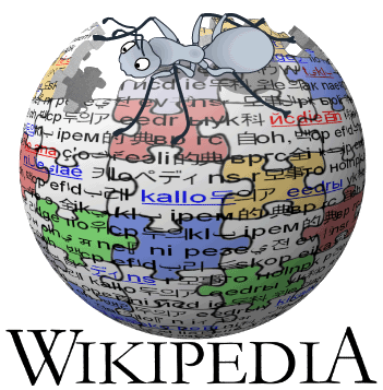
7: Book+ant by Anthere, Liad and user:Oliezekat
editThe logo submission from which these variants were made received 62 votes in the first round.
7a: Miwiki on stylized book
edit
7b: Ant on book with brackets
edit.jpg)
7c: Blue Miwiki on book with brackets
edit
7d: Red Miwiki on book with brackets
edit
7e: Ant on blue book with brackets
edit
.png)
.png)
.jpg)
This submission received 60 votes in the first round. There is only one variant of this logo.
![]()
large version (>200 KB)
This submission received 53 votes in the first round.
9a: Miwiki carrying letter (Bright blue)
edit
9b: Miwiki carrying letter (Strumph blue)
edit
9c: Miwiki see curiously (Bright blue)
edit
9d: Miwiki see curiously (Strumph blue)
edit
9e: Miwiki push letter (Strumph Blue)
editThis submission received 52 votes in the first round. There are variants of this logo, but none have been approved for the final voting round by the creator at this point.

larger version
XCF file with layers (Gimp)
This submission received 50 votes in the first round. Normally there would only be 10 finalists, but because this logo was briefly replaced (vandalized) with another one and therefore did not get as much "airtime" as all other logos, it is included for reasons of fairness. There are no variants of this logo.

0: Our current logo
editThis logo is voted on as a single set; individual variants are not voted on.
English version (also used by many non-English wikis)
edithttp://en2.wikipedia.org/upload/b/bc/Wiki.png
Esperanto version
editOnly visible if you use the standard skin -- the Esperanto wiki uses Cologne Blue by default.
http://eo.wikipedia.org/upload/wiki.png
Danish version
edithttp://da.wikipedia.org/upload/e/e3/Logo_roed.png
Dutch version
edithttp://nl.wikipedia.org/upload/wiki.png
Arabic logo
edithttp://ar.wikipedia.org/upload/wiki.png
French logo
edithttp://fr.wikipedia.org/upload/wiki.png
Spanish version
edithttp://es.wikipedia.org/upload/wiki.jpg
German variant
edithttp://de.wikipedia.org/upload/wiki.png
Italian logo
edithttp://www.wikipedia.org/upload/2/26/It_logo.png
Polish version (AKA "the egg")
edithttp://pl.wikipedia.org/upload/wiki.png
Romanian version
edithttp://ro.wikipedia.org/upload/e/ed/Propunere_wiki_ro.png
Swedish version
edithttp://sv.wikipedia.org/upload/wiki.png
Interlingua version
edithttp://www.bowks.net/wiki/ia/ia-wikipedia.jpg
Japanese version
edit