Wiktionary/logo/archive-vote-2
- Wikibooks
- Wikijunior
- Wikipedia
- Wikiversity
- Wiktionary
- Wikivoyage
- Wikidata
- MediaWiki
- 2020 change: process
- Wikifunctions
- Logo (current logos, guidelines, localisation)
Welcome to the process for finding a new logo for Wiktionary!
Phase 1 of the logo contest has been finished (archive); we have our four finalists! The finalists were determined by taking the logo group with the most votes and eliminating all logo groups which didn't have more than half of that amount. I arranged the various designs from the winning logo groups by similarity; if you disagree with my classification, please say so on the talk page.
In the phase 2, which will last until 30 September, you are invited to refine the existing designs and propose new ones which must be based on the basic design of the finalist logos (don't propose entirely new logos any more).
The next round of voting will be phase 3, during which we will determine which logos from each logo group will go to the final round.
If you have any questions, suggestions or complaints, please contact me on this page's or my own talk page. Thanks for participating!
—Nightstallion (?) 19:32, 21 September 2006 (UTC)
Important: If a logo proposal uses the Wikimedia colors, please upload versions in new, other colors. All logos should be clearly distinguished from the Wikimedia logo in color and form.
#A (Speech Bubbles, Magnifying Glasses and More) - 46 votes in phase 1
#A 1
-
 #1
#1 -
 #1 with text


Would be nice if you could get the letters a bit bolder and/or bigger (without destroying the nice look)... For small icon size a version with just one letter in the bubble would be nice.--Speck-Made 06:27, 26 September 2006 (UTC)
- It takes Wikimedia's colors and it's resembling with Wikipedia's logo. This one is very nice! --Dante, the Wicked 02:55, 27 September 2006 (UTC)
#A 2
-
 #2
#2

#A 3
-
 #3
#3

#A 4
-
 #4
#4 -
 #8 Combination of options 4 and 6a
 -
 #8 B
#8 B


#A 5
-
 #5 A
#5 A -
 #5 B
#5 B


#A 6
-
 #6 A
#6 A -
 #6 B
#6 B -
 #6 without


#A 7
-
 #7 Combination of proposal 7 and 10

#A 8
-
 #9 A
#9 A -
 #9 B
#9 B


#A 9
-
#S
New or slightly different versions (A)
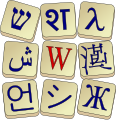
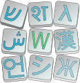
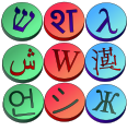
#B (Tiles) - 40 votes in phase 1
#B 1
-
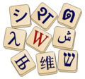 Proposed "Scrabble-Mah Jong" style logo

#B 2
-
 Circular w/ Wikimedia colours
#B 3
-
 Pyramid style

#B 4
-
 SVG Classic

#B 5
-
 SVG Modern

#B 6
-
 SVG Round

New or slightly different versions (B)
- Comment If anyone would line to suggest any other colours, please leave a note on my talk page. Smurrayinchester 16:23, 24 September 2006 (UTC)
#C (Calligraphic W) - 30 votes in phase 1
#C 1
-
 A calligraphy of Latin lettre "W" & Greek lettre "ω" & Hanzi character "文".
#C 2
-
 Test Wikimedia colours.
 -
 Crossing arms.
 -
 Crossing arms 2.
#C 3
-
 Colours and faces 1.
 -
 Colours and faces 2.
#C 4
-
Combination of proposal 7 and 10
New or slightly different versions (C)
-
 C2 with a map(?)
- The 8 variations above were made by me, if you have any other favorite color, (and can't do it yourself,) I'd be glad to try it. Kipmaster 21:16, 28 September 2006 (UTC)
- I like the last three (blue, red, and green globe). We could alternate them in Wiktionary-related branding, too, since they're so similar. – Minh Nguyễn (talk, contribs) 01:05, 30 September 2006 (UTC)
#D (book and translation) - 25 votes in phase 1
#D 1
-
 #1 by Rei-artur

#D 2
-
 #2
#2

#D 3
-
 #3
#3

#D 4
-
 #4a
#4a -
 #4b
#4b


#D 5
-
 #5 by Rei-artur

New or slightly different versions (D)
-
 #D1
#D1 -
 #D2
#D2 -
 #D3
#D3 -
 #D4
#D4


- Comment If anyone would line to suggest any other colours, please leave a note on my talk page. Smurrayinchester 16:23, 24 September 2006 (UTC)
- Regarding these versions, #D1 is quite nice; #D2 through #D4 are a little too... flashy for my tastes. —Nightstallion (?) 06:04, 25 September 2006 (UTC)
- If the designer of the D proposal could polish the proposals B and C, I would vote for one of them.
Proposal A is ugly. Proposals B and C have the best concepts but not very good design, especialy C. If they were more polished... Proposal D have the best design and colors. Unfortunely its design doesn't relate to dictionaries or anything word related. It's more of a street sign.
- I don't see how this logo represents Wiktionary either... Of course it is good looking, but the logo have to mean something (especially the Wiktionary logo...). Any explaination about it :) ? - Darkdadaah 17:11, 26 September 2006 (UTC)
- I was wondering why this proposal was called "book and translation". And then I noticed that the arrow in the center could be a book, open to the left and seen from above. That's really obscure to me, though, and I wouldn't've connected the side arrows to "translation". – Minh Nguyễn (talk, contribs) 18:42, 26 September 2006 (UTC)
- I think #D1 has the best colors, the others use bright colors which don't look very professional. Lcarsdata 20:01, 26 September 2006 (UTC)
#B 2 Circular w/ Wikimedia colours {colors}
-
Circular w/ Wikimedia colours

http://meta.wikimedia.org/wiki/Image:SmurrayinchesterWiktcircle.png
If I am too late, then, sorry; but, this would be my preference.
Hopiakuta 20:38, 6 October 2006 (UTC)
I am attempting to link to this on my wikipedia page, & have not figured how. Especially if it is not the chosen image, then I would want to. If you can, please scribe a reference to this message there: wikipedia : user talk : hopiakuta, &/or @: wiktionary : user talk : hopiakuta, w/ this image, in the appropriate format[s].
Thank You.