Brand/logo/da
Logo
Wikimedia Brandmark
This is the Wikimedia brandmark. It's used by some chapters and the Wikimedia Foundation. It’s got a friendly non-gendered vaguely human shape on it. The human looks to be raising their arms in celebration. It’s consistent with the joy of the Wikimedia movement as a whole. These are good things. They evoke the joy that people feel in using the movement's projects to give humans around the globe a hand in writing their own story in their own voice.
Wikimedia Foundation Logo
Originally designed in 2005 by Neolux, the mark that identifies the Wikimedia Foundation consists of a circular logo and a wordmark. The mark is intended to signify a character holding an open book. The font, Montserrat, is used to construct both the title and the descriptor of the mark.
The Foundation’s name is spelled out in a nice, wide, easy-to-read-and-translate typeface. And it’s an open source typeface! That’s pretty sweet.
Let's keep it flexible and accessible
We designed this to be open to constant evolution. Because that's what our brand is about. We have a few suggestions we encourage everyone to follow to keep the brand and logo consistent. The more consistent we are, the easier it is for everyone to recognise our work and understand our mission. Consistency is about maintaining familiar concepts. Reusing common patterns and concepts enables people all over the world to access the good feelings our mission imparts.
- Keep the relationship of the shape and the text the same.
- Keep the font in Montserrat (it’s a font licensed under a free, libre and open-source license!)
- Try and keep the shape the same.
Versioner
The logo consists of the Brandmark and the Logotype, and exists in one horizontal version and one vertical version. There will be instances where one of the versions works better than the other, depending on the format and context.
Farve
The logo comes in black and white. That makes it flexible and easy to use in different situations. This also goes for the brandmark.
Use of the logos on this page is subject to the Wikimedia trademark policy, visual identity guidelines and the Creative Commons Attribution ShareAlike 3.0 Unported License. Using the logos may require permission as outlined in the trademark policy.
Horizontal black
Vertical black
Horizontal white
Vertical white
Black mark
White mark
Clear Space
There should always be sufficient space surrounding the logo to avoid competition with other elements and to maintain its visual impact. The recommended clear space is relative to the small circle in the brandmark, and is 1x the height of the circle. Try to allow at least this amount of clear space — it will help give the logo clarity.
Størrelse
The official mark of the Wikimedia Foundation has an optimal minimum size specification. To ensure clean and legible lettering and art detail, the width of the mark should not be smaller than 12mm (.5in, 36px).
Placering
Most importantly, the logo should always be placed with sufficient clear space in a spot where it is clearly visible and readable, and in harmony with other elements. The top left and bottom left corners are the preferred positions, however you may also place the logo in the top right or bottom right corners, depending on what works best in the specific context. You may also place the logo on top of images or solid colors as long as there is sufficient contrast between the logo and the background.
The recommendations for placement of the logo also apply for the brandmark.
Logo misuse
Intentional or unintentional misuse of our brandmarks, logos and assets diminishes ability to be recognized as a connected global movement. While we can’t keep anyone from doing any of these things, we would rather they didn’t.
Community logo system: Chapters and User groups
Chapter logos
Wikimedia chapters are national or sub-national not-for-profit organisations created to promote the interests of Wikimedia projects locally.
Some Wikimedia Chapter logos use the same design as the Wikimedia Foundation logo, replacing the word FOUNDATION with the chapter name. The subline can be localised (e.g. name of the country in the relevant language/languages). It can consist of one or more lines and can be written in the relevant script/ideograms. The WIKIMEDIA part of the logo will not be localised. Organizations that wish to use this design must get an approval from the Wikimedia Foundation by contacting trademarks![]() wikimedia
wikimedia![]() org.
org.
User group logos
Wikimedia user groups are independent organizations of people who care about the Wikimedia movement. Many of these affiliates or groups have created their own unique logos or adapted the free to use Community logo to indicate their connection to the movement, specific Wikimedia projects or their thematic interests.
The Community logo was first uploaded to Wikimedia Commons by WarX in December 2006 as part of a set of icons to complement the official Wikimedia logos for use in non–official activities of the Wikimedia community.
Wikipedia og Wikimedia
Re-users of the official identities may face situations where the Wikipedia and Wikimedia Foundation identities appear side by side. A certain proportion and amount of space should be maintained when the Wikipedia and Wikimedia Foundation marks are displayed side-by-side.
The Wikipedia width and Wikimedia Foundation height must be identical to one another. The minimum clear space between them must be at least half of the width of the puzzle mark.
The marks must be featured on a white background and must bottom align.
In situations where the two marks or identities (or additional Wikimedia project identities) appear on the same page, but not side by side, then these guidelines may not apply (for example, when the Wikimedia Foundation identity is being used to brand or indicate an official publication about Wikipedia).
- A complete list of Wikimedia Projects
- Read more about the Wikipedia identity
- Find all the Wikimedia projects logos here
Wikimedia Sound Logo
The Wikimedia sound logo offers a new way to identify Wikimedia content across a range of uses and preserve the global reputation of Wikimedia, particularly in audio settings. Created by Thaddeus Osborne in 2022 for ‘The Sound of all Human Knowledge’ contest, it builds to "Wikimedia" announced as a warm five-syllable melody welcoming all to learn. Its sounds signify knowledge being consumed, growing and collected in our projects and include pages turning, typing on a keyboard, synthesiser instruments, a mouse click and a book shutting.

Length: 4 seconds
Key signature: C Major
Tempo: 144 BPM
Who the sound logo is for
The sound logo is freely available for anyone to use, subject to its Creative Commons license, as long as they are not themselves using it as a trademark or implying that their use has an official endorsement from the Wikimedia community or Foundation if it doesn’t. As summarised in our trademark policy, Wikimedia community members, Foundation staff and supporters of free knowledge can make some uses of it without permission but most uses require permission via a trademark agreement. If you are a third party that reuses Wikimedia content and are interested in implementing the sound logo, the Wikimedia Enterprise team is available to support and collaborate with you to find a solution for specific use cases.
Where and when to use it
The Wikimedia sound logo is our core sonic brand asset and should be used to sign off at the end of audio and audiovisual content that relies on or increases awareness of knowledge from any Wikimedia project, is created by Wikimedians or by the Wikimedia Foundation, no matter the length. The primary use case is for voice assistant devices, but the sound logo should play in any audio setting or alongside Wikimedia visual logos when they are used across touchpoints including:

The full-length 4-second sound logo should be used where possible. Two cutdowns are available for use should a shorter version be required – for example, the 1-second cutdown should be used on voice assistant devices. You should not create your own Wikimedia sound logo. If you believe your use of Wikimedia content requires the use of the sound logo, or are unsure, please send a request totrademarks![]() wikimedia
wikimedia![]() org
org

How to use it correctly
The sound logo should:
- Play in isolation after any audio (music, voice-over, sound effects etc).
- Not be mixed with or overlap any audio.
- Start after any audio has concluded or faded out completely, in a non-abrupt way.
- Have at least 0.25 seconds (250 milliseconds) of silence before and after it.
- Be applied at its highest resolution (48kHz/24-bit) before being dithered down.
- Play at the same peak dB level as all surrounding audio at its highest point.
- Not undergo a change in EQ, pitch, speed, fading or have audio effects applied without permission.
Branding audio content
With audio content such as voice assistant devices, podcasts and radio, the sound logo should be used alongside the name of the relevant Wikimedia project, group or organisation verbalised in the local language.
On voice assistant devices, content that comes entirely from Wikimedia should be identified by using the sound logo followed by the Wikimedia project that is the source - e.g. “According to Wikipedia…” or “Wikipedia says…” - followed by the answer to the search query.

This method is permitted to identify knowledge sourced entirely from Wikimedia during any piece of content.
With podcasts and radio, at the very end of the audio, the Wikimedia project, group or organisation responsible for the content - e.g. “This podcast was produced in partnership with Wikimedia” - should precede the sound logo.

As a rule of thumb, the 1-second sound logo should be used on voice assistant devices and the 4-second sound logo should be used in podcast and radio content.
Branding audiovisual content
With audiovisual content - including video, and during events, broadcasting and advertising - the sound logo should be used alongside the visual logo mark of the relevant Wikimedia project, group or organisation.
With static logo marks, the sound logo should commence when the logo is visible.
When using animated Wikimedia logos or visually fading into logos, the five-note melody of the sound logo should start as soon as the logo is static and fully visible. Animating or fading into a logo should conclude with enough time for the five-note melody to coincide with the fully visible logo.
This guidance applies when using multiple Wikimedia logos. They should all occupy the same frame and all be static, animated or faded in over the same timeframe.
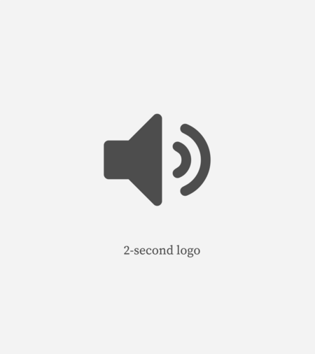
As a rule of thumb, if the content is:
- 15 seconds or longer, use the 4-second sound logo.
- 6 to 15 seconds, use the 2-second sound logo.
- 6 seconds or less, use the 1-second sound logo.

An example of correct placement of audio and the sound logo alongside the Wikimedia visual logo.
A collection of Wikimedia-branded video bumpers is available for permitted use through an approved request and/or trademark agreement. Please enquire via trademarks![]() wikimedia
wikimedia![]() org.
org.
Using the sound logo on apps and websites
The use of the sound logo on apps and websites should be approached mindfully to enhance the user experience and avoid listener fatigue. As an example, we may limit repeat playback of the sound logo on the same device and we may create short sounds (known as earcons) derived from the sound logo and provide them to use for key UX or UI moments.
Using the sound logo in closed captions
The Wikimedia sound logo should be used in closed-captioning and can also be referred to as the “Wikimedia sonic logo” and the “Wikimedia sonic brand”. If a sound logo description is required the following acts as guidance for the 4-second logo, to be rephrased as needed.
- Synthesiser chords/harmonies with book pages turning, a book shutting with a computer mouse click and a 5-note melody/jingle with 5 keys typed on a computer keyboard.
Co-branding content
Within the Wikimedia movement
When co-branding audio, include a mention of the creator (a Wikimedia Foundation-recognised affiliate or Wikimedian), what the content is for and the 4-second sound logo before any other brand mentions.
Co-branded videos should use Foundation-recognised visual logos for the creator and related affiliates, add text that addresses the logos and the content’s purpose, and then include the 4-second sound logo in one video bumper that comes before any others.
If you're making a bumper with several visual logos and the sound logo:
- You need permission via an approved request or trademark agreement.
- Follow the Wikimedia Foundation visual identity guidelines.
- Only use Wikimedia Foundation-recognised visual logos. If you're unsure whether your group or project is recognised, email trademarks
 wikimedia
 org
org - Do not include logos from outside of the movement.
When branding Wikimedia Foundation-sponsored audio, mention how the support was used before including the 4-second sound logo and use no other branding. In Wikimedia Foundation-funded videos, use the Wikimedia Foundation logo, add text addressing the support and the 4-second sound logo in one bumper without including any others.
If Wikimedia Foundation staff contributed to content as volunteers or if the content is for fundraising, the Wikimedia trademark policy requests a notice of this in the credits.

With partners outside of the movement
To co-brand audio that shares knowledge from Wikimedia projects, mention Wikimedia's input and include the 4-second sound logo before other branding. Co-branded videos sharing project knowledge should have a bumper with the project logo, text with Wikimedia's input and the 4-second sound logo, before any other bumpers.
In co-branded audio that promotes Wikimedia projects, mention Wikimedia’s input and the content’s purpose, then include the 4-second sound logo before any other branding. Co-branded promotional videos should have a bumper with the project logo, a mention of Wikimedia’s input, the content's purpose and the 4-second sound logo, with all other bumpers following.
For project-focused co-branded videos with partners outside of the movement, recognised groups can feature their logos alongside project logos and the sound logo on bumpers.

If you require the use of the sound logo or video bumpers, please send a request to trademarks![]() wikimedia
wikimedia![]() org
org

