Fundraising 2010/Updates/sq
| Hyrja | Parrullat | Komiteti | Testimi | Përkthimi | Përditësimet |
| |||||||||||||||||||||||||||||
|
Here we'll post the results of our testing, why they're significant, and plans for the upcoming week.
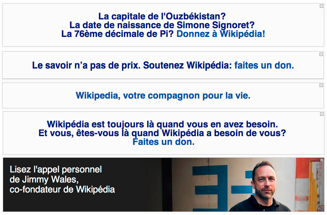
4 November: The ScheduleeditA memo to Wikimedia community, friends, staff, and other stakeholders. On Monday, November 15, we will launch the 2010 annual fundraising drive for the Wikimedia Foundation. As you know, our funding model relies on the support of our friends and community members. Our average donation is about $25, and we have received more than 500,000 donations in the lifetime of the foundation. This year, we have to raise $16,000,000. That’s our biggest target yet, but it’s still only a tiny fraction of what the other top-ten websites spend on their operations. It’s critical that we reach our goal to maintain the infrastructure necessary to keep Wikipedia and its sister sites running smoothly. We are a community that does great things, and does them routinely. As we begin to bring this year's fundraiser to a close, we will launch our 10th Anniversary year! It's hard to believe, isn't it? What would the world be like, if the wiki hadn't launched? If we hadn't jumped in to grow it? If we hadn't financially supported it? The world would be a far different -- and far more sad -- place, I think. This 10th anniversary year provides an opportunity for reflection and introspection, but it also provides a chance to refocus: to plan, to build, to grow. We've just completed the strategic planning initiative, and emerged with a cohesive, defined plan for the future growth and development of the Foundation, the projects, and the movement. Now is the time. So let's get going. Since August, a team of dedicated staff members and volunteers has worked to develop the fundraiser for this year. We committed early to radical and full disclosure of all the data we had, in keeping with the spirit of the transparent nature of the Wikimedia movement. We quickly identified three major points in the donation process that were "levers" we could pull to optimize the process: banner messaging, banner design, and landing/donation pages. Banner messaging: Wikimedia fundraising has always been driven by site notices -- banners -- that run at the top of project websites. We’ve known for years that different banner messages drive different numbers of people to click through and donate. Therefore, this year we began the fundraiser by inviting community members to propose new banner messages for us to test. Almost 900 people were involved in the creation and discussion of potential banner messages. We tested dozens of iterations of banner designs, including both graphical and text, and we will continue to do so. Many of the new banners did well. Unfortunately, none of them came anywhere near the 3% clickthrough rate of the winning banner from years past: “Please read: a personal appeal from Wikipedia founder Jimmy Wales.” But we’re going to keep trying. Our research indicates that banner wins because it is simple and direct with no attempt at marketing or manipulation. So we’re going to test, “A personal appeal from Wikimedia editor _____” and later in this memo, I’m going to invite you to be that editor and write an appeal for us to use in the fundraiser. Banner design: In our testing this year, we also quickly learned that graphical banners perform almost 100% better than text banners with the same message. Because of this, we will obviously be using more graphic heavy banners than we have in past campaigns. Landing/donation pages: Once a user clicks a banner, they land on a page that asks for a donation and provides payment options. We have spent a lot of time and energy optimizing those landing pages. Optimization of donation forms is an art and a science that involves messaging, graphic design, and usability research. We will have iterated through roughly 40 different designs before landing on the ones that we'll launch with. We are committed to encouraging people to beat us at our own game: we invite chapters and affiliated groups, organizations, and Wikimedians to create their own landing pages that they believe will work better than the ones we're running. If we see some that are exciting, we'll test them, and run the ones that perform best! In countries where there are Wikimedia chapters, the chapter has the option to create their own landing page to test along side the default. We hope that chapters will beat the default everywhere there is an attempt. In countries where there are no chapters, we’d like active Wikimedians to contact us about doing the same thing. As we proceed through the campaign, we'll be constantly testing. We'll test messages, banners, and landing pages. We'll also test timing, and font size, and hundreds of other small variations. But we're doing it all with an eye to integrity in data analysis, and an understanding of not only what the data tells us, but what it doesn't tell us. Our decisions are grounded in fact and well reasoned theories: not hunches or educated guesses. One thing is very different this year, though. Once we hit our goal - and we will hit our goal - rather than immediately removing all banners, we're going to use some of the banner space (with a reduced banner size, frequency, and using targeted appeals) to ask people to contribute - not financially, but with their knowledge. We will target readers, and encourage them to become editors. It seems logical to us that this reader conversion effort should flow naturally from our fundraising campaign: both are forms of contribution. We also believe that it will yield financial payoff in years to come by embedding new people deeply into our community and instilling them with our key values and an understanding of the greater mission. This is an aggressive campaign. It's an entirely achievable goal, however. The only way to have it work, though, is to have full buy-in from the community. Will you reach out to the people near you (either physically or virtually) and ask them to get involved? Tweet that you donated. Write a blog post about it. Deliver four donations from friends with your own. Help new users who make their first edit as part of the contribution campaign. Here are some key things to know:
We've billed this as "the fundraiser you can edit", and it's true. Community volunteers have been deeply embedded in our planning, including in all of our testing. Community suggested messages were requested and tested. We truly think of this as a fundraiser that is co-created by various parts of the community. There are still ways that you can participate directly, right now. We’re going to test appeal letters from Wikimedia editors. If you think you can write a letter that will beat Jimmy’s, please go to the meta page and sign up so we know to expect your letter. You can also just send one to me by email: donate I'm honored to be leading the effort this year, and ask you to join with me in making a contribution on the first day of the fundraiser. If you have any questions or comments, I'd love to hear them. Please tell me what you think by writing to donate 28 October 2010: Payment MethodseditOn Thursday we tested PayPal v. Credit Card donations, running one Jimmy banner for two hours with 5 landing pages at 10% each for logged out users on English Wikipedia.
26 October 2010: More Community BannerseditPosted by: Deniz Gültekin We increased the size of the text banners to match the Jimmy Appeal banner, and made them visible to anonymous, non-logged in users only. We ran the banners at 50% each total, except for the German test, which began at 10% and increased to 40% as to test their server strength. We used a significantly cleaned up version of the landing page for the test, removing the public comment box, and a lot of the text around the donation options.
Stay tuned for more updates, and of course, give us your feedback. --Deniz (WMF) 19:58, 28 October 2010 (UTC) 25 October 2010: More testingeditPosted by: Philippe Beaudette With that in mind, we're going to push the launch date back to either Friday the 12th or Monday the 15th. We believe that we are well positioned for the most successful fundraiser in history. Our hourly totals (during an off-peak hour) during the testing period are higher than the hourly totals of the highest hour of the biggest day of last year's campaign. We honestly believe that pushing the launch back will allow us to get a few more percentage points of performance out of the landing pages and that, when applied to the fundraiser as a whole, could potentially raise the overall totals substantially. We're aware, of course, that this fundraiser is critical for funding chapter programs over the next year. We want it to be maximally productive, and we think you'll be very pleased with the results this year. If you have any questions, as always, please feel free to email me (philippe And as always, give us your feedback! Philippe (WMF) 03:59, 26 October 2010 (UTC) 19 October 2010: Suggested DonationseditPosted by: Deniz Gültekin Earlier this week we ran one banner at 60% for logged out users, and six landing pages for two hours. The landing pages tested ascending and descending suggested donations or "ask strings," and three variations of the Jimmy appeal letter. For this test we also removed the public comment option and the photo header from the landing pages. We learned from the October 14th test that the suggested donation of $20, $35, $50, and $100 brings in more donations than the original $35-$250 suggestion; so this week we experimented with a descending donation suggestion starting at $100 versus ascending from $20. The landing pages had three different versions of the Jimmy letter: What did we learn?
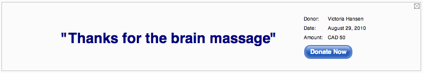
We're currently running another test, I'll update you on our findings tomorrow! And as always, give us your feedback!-Deniz (WMF) 00:56, 22 October 2010 (UTC) 14 October 2010: Landing PageseditPosted by: Deniz Gültekin Yesterday we completed our 11th test, running one Jimmy banner at 60% to anonymous users only, with four variations of the donation landing page. This test was to assess what variables on the landing page lead higher donation completion, what caused donors to abandon the transactions, and if lowering the suggested donation threshold affected the average donation. During our two-hour test the banners raised a total of $41,966. This week's variables included our typical suggested donations of $35, $75, $100 and $250 and a lowered set of donation suggestions of $20, $35, $50 and $100. We experimented with removing the public comment option to see if it had any influence on whether people “abandoned” their donation before completing it, and ran landing pages with and without Jimmy-image mastheads.
Landing Page 4 was the most successful landing page, with .98% of individuals who clicked the banner making a donation – bringing in $11,822 in two hours. It was the only page that did not have the “leave a public comment” option. Interestingly, Landing Page 1, the control page used during last year's fundraiser, raised the least, with only .65% of people who landing on the page making a donation - earning $9,262. However, Landing Page 1, which had a suggested donation amount starting at $35, had the highest average donation at $33, on par with last year's average of $34. The lowered suggested donation did bring down the average donation amount by approximately $6, but increased the total number of donations received by more than 100 on each page. On Tuesday, October 19th we'll be running our next test, running three versions of the Jimmy appeal with new suggested donation amounts and comment options. Tell us what you think on the Talk Page! --Deniz (WMF) 22:08, 15 October 2010 (UTC) 12 October 2010: A slew of community bannerseditPosted by: Philippe Beaudette Today we significantly stepped up our testing of community suggested banners - testing almost forty different banners that were community suggested against the control, the "Jimmy" appeal. We ran a mix of community proposed banners and consultant banners, which all had significant community support. We're still putting together the results (you can see them on the spreadsheet) but it's fairly clear that Jimmy's appeal still emerged the favorite. In addition to the 40 english banners, we also tested German and French banners. The same held true for those projects, we haven't found the magic combination that "beats Jimmy" yet, but we're narrowing in on it! The message that came in second to Jimmy was the donor quote banner. It had a .25% click-through rate, compared to Jimmy's 3.68%. We would like to experiment further with donor quotes and test more. We want to test adjusting the layout and design of banners as well; altering size and color, and introducing images and animation into text-only banners. Check out the full stats, and leave us your thoughts on the talk page! Philippe (WMF) 00:38, 13 October 2010 (UTC) 11 October 2010: Small changes bring big results!editPosted by: Philippe Beaudette
8 October 2010: Jimmy brings down our pages!editPosted by: Deniz The different versions of the Jimmy landing page were up for 2 hours to test certain elements of each one. We wanted the test to determine which of the following are most successful:
We received much higher traffic than we had anticipated or scaled for – it slowed page loads to a crawl, and brought down our donation pages at one point. Some individuals who clicked on a banner experienced load times as slow as a minute, for many others the page timed out. For 10 minutes, our servers gave up all together and users received a database error page. What we learned: While the fundraising team didn't get reliable data about landing pages from this test, we did establish that we need to expand our server capacity in order to handle the load from banners as successful as the Jimmy appeal. Our next test will take place on Monday, October 11th at 20:00 UTC/12:00pm PST. We will be testing different variations of Jimmy banners then to get an idea of the best performing layout and design of banners. Join us on Webex or IRC. Discuss this entry on the talk page. 23 September 2010editPosted by: Deniz
We have to get some new banner templates and landing page templates. Time for community involvement there! 16 September 2010editPosted by: Deniz
The banners that did the best fell under the following categories:
The banners that failed fell under the following categories:
Banners to Keep
Banners to Eliminate
Landing Pages | |||||||||||||||||||||||||||||||||||
