Learning patterns/Posters that work
_1893.jpg)
.jpg)
What problem does this solve?
editPosters can be a great way to share information about a project you're doing, or a new idea you have. However, sometimes people try to pack as much information into their poster as possible; this ends up making the poster into a wall of text that is not easy or interesting to read.
What is the solution?
edit
An effective poster can be useful in multiple ways. It serves as a conversation starter, an advertisement, a summary of your work, and a source of information about related work. However, you can't include every piece of information about your project in a single poster, or describe every detail of your work in a single poster session. A good poster should present a summary of your work, convey a message visually as well as textually, be readable from about four or five feet away, and have a clearly discernible organization and flow.
Before you start to design your poster, make a list of the most important pieces of information about your project. Then think about how you will communicate that information: full sentences are not usually the best way to get your message across. Instead, try to imagine how you can use images, diagrams, graphs, arrows, headings, and captions to communicate key findings, questions, project status, and other important information.
Remember: in most situations where you need to create a poster, you (or someone else on your project) will be available to talk about your project and answer any questions your audience might have. The poster is meant to be a tool you use to tell the story of your project, not a comprehensive summary. Things you can point at—such as images, graphs, quotes, and headings—will be more useful for telling this story than paragraphs of small-font text.
- Using a poster to describe your idea for a new project
In this case, your focus is on getting a broad range of input that you can use to refine your ideas, and plan and execute your project.
- Briefly describe your project's goals, and why your idea is interesting/important/innovative.
- Very briefly describe your proposed methods for achieving those goals.
- Point to related research, projects, or previous events that you are now building on
- List unresolved questions or anticipated challenges. What are you not certain of yet? What do you think will be difficult?
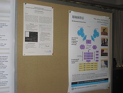
- Examples include posters about a community needs or project plans as seen in the gallery of Wikimania poster examples from Commons, shown below.
- Using a poster to get feedback on a work in progress
Here, your focus is on getting feedback on what you've done so far, so that you can update the way you're conducting the project and incorporate any new ideas that relate to assessing your outcomes or analyzing your data. You may also want to share any particularly interesting preliminary outcomes (or unanticipated challenges!).
- Briefly describe the project's goals, and very briefly describe your methods for achieving those goals.
- Outline your project plan and timeline. What have you done so far? What are you doing next? Diagrams are usually better for this than large blocks of text, because they make it easier for people to understand where you are in your process. Try not to use tiny text in diagrams.
- If you have preliminary findings, responses, or outcomes (like the results of a pilot event, or incremental responses from an open survey), share them! Be prepared to interpret them. Is this what you expected? Do you think you will change anything about your project plan, based on these findings?
- Examples include posters about a process and project status as illustrated in the gallery of Wikimania poster examples from Commons, shown below.
- Using a poster to report learning from a completed project
Your focus is to provide a general overview of the project from start to finish, but with an emphasis on the results and next steps. You should spend most of your time and space describing what you accomplished or found (and what that means), rather than how you got there.
- Prominently display some "data" from your project—this could be anything from a simple graph to a selection of pictures or pull quotes from participants
- Summarize one or two of the most important findings/outcomes of your project
- Be ready to describe the implications of these findings, as well as any next steps that these findings suggest—whether or not you plan to pursue these next steps yourself.
- Examples include posters summarizing a completed project, its results, and next steps as illustrated in the gallery of Wikimania poster examples from Commons, shown below.
-
 Poster describing a new project or idea - Should focus on community needs and project plans
 -
 Poster about an in-progress project - Should focus on implementation process and project status
 -
 Poster about a completed project - Should focus on the project activities, results, and next steps

_042.jpg)
_041.jpg)
General considerations
edit- Avoid text that is too small (18–24 pt minimum).
- Use no more than two or three font styles in all, and choose fonts that are easy to read on a poster.
- Avoid too much text (generally 800 words maximum, but much much less is usually more effective—especially if you are going to be present to talk about the poster with people who see it).
- Avoid large blocks of italics, which is harder to read than roman. Ration your use of bold face.
- Use columns, sections, headings, and blocks of text to organize the content.
- Choose a short title that illustrates what your poster is about. Your title should be at least twice the font-size of your regular text.
- Choose colors carefully and pay attention to contrast. Dark print on light background is usually best.
- Selectively incorporate charts, graphs, photographs, and other graphics that support the theme of your poster.
- All graphs should have labeled axes and descriptive captions (avoid tiny text). All images should have short captions unless this would be obvious. Avoid repeating caption text in the adjacent main text. All images and graphics that you didn't make yourself need to cite copyright information (even if they are from Wikimedia Commons).
- Avoid fuzzy images; make sure all graphics are high-resolution and easily visible.
- Make sure the poster contains your name, the names of your collaborators, and a link to a website that contains further information such as related project resources and contact information. If your project receives funding from external individuals or organizations, it's customary to include their names on the poster as well (some funding organizations require this).
- Edit your poster carefully before the final print-out (try to reduce the amount of text by 20% on the final run-through).
- Show a draft of your poster to someone before the event. Ask them to describe your project to you based on the information in the poster. Revise your poster based on their feedback. Ideally, this should be someone who is not familiar with your work, but knows something about the domain you are working in. Feedback from your direct collaborators and even complete strangers can also be very useful.
- Give a practice presentation for your poster to someone who can give you good feedback. Practice will make you more comfortable and confident describing your work.
- Time yourself as you present: in most poster sessions, you only have 1–2 minutes to get your message across to someone before they move on to another poster. Be prepared to give the same short "pitch" many times in the same session, as new people approach you and indicate interest in your project. Never read out your presentation.
When to use
edit- Wikimedia conferences like Wikimania
- Outreach events attended by new/potential contributors such as Edit-a-thons
- Outreach events attended by contributors to other free culture projects
- Research conferences like WikiSym
Endorsements
editSee also
editRelated patterns
edit- Drop-in demo booth
- Photographic evidence
- Let the community know
- Feedback cycle
- Short reports go a long way
- Communication tools Wikipedia what is about
- A playful logo builds identity and invites interaction
Elsewhere on Meta
edit- Poster design: a page meant to set the format for posters related to Wikimedia
- Organizing a poster session in a conference or event: advice and recommendations
External links
edit- Poster and presentation resources from the University of North Carolina, Chapel Hill
- Creating effective poster presentations from North Carolina State University
- Designing Conference Posters Blog
- Poster Design Tips and Techniques from Colorado State University Extension
- Effective Poster Design from University of Guelph
- Good Poster Examples from the University of Texas
- Bad Poster Example Blog
- Free powerrpoint poster templates