Wikivoyage/Logo/2013/R1/c/Wv logo second version R.png
Latest comment: 10 years ago by Nick1372 in topic Comments

- Votes for this proposal
- Proposal description
- Please sign your comments with
~~~~; try to be friendly and constructive. - Use
=== H3 headings ===for starting a new topic (if required at all).
Comments edit
The following conversation is taken from Wikivoyage/Logo 2013/Submissions#Option 25 - White-blue world:
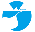
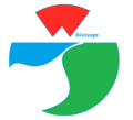
I prefere the white-blue logo. Which one do you prefere? let me know because I would like to use only one of them. Thank you in advance. Ah, Is the meaning of the image understandable? Horizon, mountains, route and W of Wikivoyage...Polloepollo (talk) 10:27, 24 July 2013 (UTC)
- It's a very good idea and has a lot of potential. The problem is that W. You cannot integrate the latin alphabet into the design, because not all countries covered by Wikipedia use it. Try to replace the W with something else and put the word Wikivoyage on the bottom.
- By the way, I like the first one far better. Try keeping it one solid color. Nick1372 (talk) 15:05, 20 July 2013 (UTC)
- Thank you Nick for your advices. I think you are right, so I came up with this new logo, which is my favorite one.
- The third is the best. As a thumbnail, it is hard to say if it looks good : . Cantons-de-l'Est (talk) 02:40, 23 July 2013 (UTC)
- I like the third, but I'm slightly concerned about the fact that taking away the W broke the circle-ness (is that a word?). I could get used to it, though. Nick1372 (talk) 04:02, 23 July 2013 (UTC)
- Maybe "circularity". :P πr2 (t • c) 04:08, 23 July 2013 (UTC)
- Yes, The logos are not perfect, but I ran out of (simple) ideas and the deadline is tomorrow. So I added a W in the first logo and then I'm going to wait for voting response. Thank you both for your hints. Finally it's my intention to submit to the voting only the logo with the constellations and the white-blue logo with the "W" mountain and the entire name wikivoyage written on the right (So it can be written in any alphabet).
- Maybe "circularity". :P πr2 (t • c) 04:08, 23 July 2013 (UTC)
- I like the third, but I'm slightly concerned about the fact that taking away the W broke the circle-ness (is that a word?). I could get used to it, though. Nick1372 (talk) 04:02, 23 July 2013 (UTC)
- I'm sorry, but with all of the options above it takes me a lot of staring and reading the description to understand what it depicts. Not the strongest contender in its current shape I'm afraid. Effeietsanders (talk) 11:14, 24 July 2013 (UTC)
- The third is the best. As a thumbnail, it is hard to say if it looks good : . Cantons-de-l'Est (talk) 02:40, 23 July 2013 (UTC)
- Thank you Nick for your advices. I think you are right, so I came up with this new logo, which is my favorite one.
- If the blue-green-red is used, I think it would be better for it to be the Wikimedia colors. Also, integrating the "W" right in the logo is a bit problematic for other languages. --Yair rand (talk) 11:50, 24 July 2013 (UTC)
- It's supposed to be upside-down mountains, not really a W. It's been brought up already.Nick1372 (talk) 20:27, 24 July 2013 (UTC)


