Trends at Norwegian (bokmål) Wikipedia
At the Norwegian (bokmål) Wikipedia there has been some very disturbing trends among editors the last years, and the same trend also exist at new articles. Data for the analysis comes from Erik Zachtes statistics about Wikipedia, more accurately Monthly counts & Quarterly rankings from the page published in December 2011 for the Norwegian (bokmål) Wikipedia.
All graphs are manually curated data from Zachtes statistics about Wikipedia which is then processed in Libre Office Calc. There is no automatic program involved so it isn't easy to do the same for a large number of other projects. It should although be easy to automate the process.
Editors
edit-
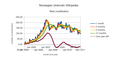 New editors with at least 10 contributions
Column B -
 Editors with at least 5 contributions
Column C -
 Editors with at least 100 contributions
Column D


All references to columns are to the previously mentioned table Monthly counts & Quarterly rankings. Numbers are for the given months (blue), but as a mean over 3 months (orange-red), 6 months (yellow) and 12 months (green). All means goes for the previous number of months inclusive the present month, that is a mean for 3 months before November 2011 will be September, October and November 2011. In addition it is calculated how big a difference there is for the numbers in mean over one year compared for the numbers one year back in time.
Artifacts for a graph will be shifted to the right when we take a mean of the values. This kind of phase shift is normal and is not an error in the calculation. This is especially visible for peaks in each months that give rise to very slow peaks several months later in the mean running over a year. Note especially that the comparison between means one year apart actually are influenced by values for months over a period of two years. The difference for November 2011 is the mean of the period for December 2010 to November 2011 compared to the period for December 2009 to November 2010, that is the whole period goes from December 2009 to November 2011.
When the comparison figures (the graphs in dark-red/maroon) are negative, then we are loosing editors, when they are positive we are gaining editors. Negative numbers for this graph is bad, bud sustained negative numbers will be critical over time.
The most critical numbers are for new editors, column B, which have been negative and large for a sustained time. New editors in this context are those that have contributed at least 10 times since their arrival, and because the number of contributions are so large spurious edits are screened out together with most vandalism. The number of new editors are really a descriptor for the number of potential future active editors, and if it dwindle it will ultimately induce problems in sustaining the level of active editors and the quality of the content will drop over time.
The number of editors that contributed at least five times last month, column C, also dwindles although not as fast as for the number of new editors. This can be explained as correct as it is somewhat influenced by both new editors and the group of very active editors.
The numbers for the very active editors, that is those that contributed more than one hundred times the last month, column D, is the most stable group even if that to dwindles although more slowly. If we do a closer inspection it might seems like the usual top in contributions during the winter hasn't arrived so far, and if we compare to w:no:Special:Statistics it might not even arrive in December. Some years this peak has arrived in Jauary or February so the overall numbers for the winter might still turn out normal.
Articles
edit-
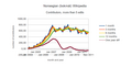
 New articles
Column G

The number of new articles also drops, column G, but this number is somewhat difficult to interpret. A closer inspection might indicate that there is a very weak growth the last months, but this could be the usual winter peak, although a very weak one. Later in the winter it will be clear if the winter peak drop off as usual.
The number of new articles is somewhat difficult to analyze due to another fact. As the number of articles grows the total amount of content that needs maintenance also grows. This eats work capacity from the editors and will ultimately start to influence the number of new articles produced. We could perhaps normalize the number of new articles against the total number of articles, but this will only be a proxy of the total amount of content.
If possible it would be nice to have a column in Monthly counts & Quarterly rankings of total amount of content, that is the accumulated size over all of the last revisions.
Summary
editIt seems like there is a large and sustained drop in the number of new contributors and it may have propagated into other user groups. It is not so clear if it has started to influence the number of new articles, even if this also dwindles. This number could also be influenced by the steady grow of overall amount of content.
It is likely that an automated approach to generating the graphs could produce a larger awareness that editor retention is in fact a rather large problem, and that this is a problem not only at English Wikipedia. It would also be a real boon if the graphs were included among the "official" pages produced by Zachte as any derived work, even if clearly sourced and explained, is viewed with distrust and even dismissed by the communities.